Monday, September 9, 2013

Watercolor Weekend

Another weekend, another fabulous art experience at my good friend Michele's art studio.  This time, all the way from San Diego, the multi talented Jane LaFazio led us through two days of drawing, watercoloring, and stamp making.  Yes, I know.  I am fortunate.  And supremely grateful.

I took a machine felting class with Jane at CREATE in July (I'll eventually get a blogpost up on that), so I already knew what a great teacher she is.  And I've wanted to improve my watercoloring skills for some time.  The perfect class for me!

We each received a muslin bag and a tag from Jane.....and made by Jane!


Jane's philosophy is fairly simple:  really look at what you're sketching, and draw what you see.  We began with flowers; each of us selected a bloom, took it to our tables and began by doing a quick and loose drawing with pencil.  Then going in and refining with detail, and finally going over the lines with ink.

I broke in my new watercolor journal.


We used fine or superfine Pitt pens.


Jane didn't specify any paticular brand of watercolors; she did say that even an inexpensive child's set would be fine.  I used the Sakura Koi set I already had, and a waterbrush.


When we drew, we were aiming for realism, but when we began to color, Jane encouraged us to change things up if we wanted to, and mix colors instead of relying on the premixed colors in our sets.
 
This is what my page looked like at the end of day one.


Throughout the day, Jane would often gather us together so she could demonstrate a particular technique.


On Sunday,  we started off with a review of everyone's work.  Look at these pages.  I won't tell you who, but some were done by people with absolutely no experience in sketching or watercoloring.


Then Jane showed us some of her journal pages, and talked about how to look at our drawings from the previous day, and create stylized versions of them.


If you look at the top right of Jane's page in the photo right above, you'll see the stylized versions of the center part of the flower.  What we would do with these new sketches is carve stamps.


All of the blades for carving are stored inside the handle. 
 
This is a page I did to illustrate the process.


This sketch was inspired by the center of the aster.


And it became this stamp.


This one came from the bud on the hibiscus.


And it became this stamp.
 
 
One of the petals of the hibiscus inspired this styized version.


Too many lines;  I simplified it for the stamp.


The stamps themselves.


Another technique was to stamp on tissue paper, cut it out and add it to a page with matte medium.  I added the bud stamp to my first page.


If all that wasn't enough, we also cut stamps from fun foam.  I'd previously done this using a die and my Vagabond, but this time we were cutting freehand or from a tracing.  This stamp was done by simply tracing an actual oak leaf on the foam.


The foam has adhesive on one side, so we attached the stamps to a piece of acetate.
 
This is the page that evolved from that stamp.


The darkest leaf was done with one of the new Ranger archival inks, but the rest were done with my watercolors.  The writing around the leaves is mostly just repeating color words, but I think it's a good design element.
 
We ended the day, and the weekend with a review.  We each held up our work and talked a bit about what we'd done.


Two fantastic days!  What's better than making art?  Making art with great friends and a wonderful teacher.  Massive thanks to Jane, and to Michele for bringing her to New York.


Sunday, September 1, 2013

Dr. Livingstone's Daughter, I Presume?

My friend Sue's field journal continues the explorations of the famed Dr. Livingstone, but this time it is his adventurous daughter Anna Mary traveling the earth.  When I received the book, our heroine was in Africa (Namibia, to be exact) and it is the late nineteenth century .  I decided to keep her in the continent, but moved things along to Morocco.  Many years (decades, really) ago I spent a week in that fascinating country, and I enjoyed looking at some of my old slides to get in the mood.


Tuesday, August 27, 2013

CREATE, Belatedly

It's been six weeks since I attended classes at CREATE in Somerset NJ, and I thought it was about time I blogged a bit about my experiences there.

Let me start by saying that the classes are every bit as wonderful as those I've taken at other retreats (many of the same teachers, so no surprise there), it's the venue that was sorely lacking.  A hotel in the middle of nowhere, horribly understaffed, and in desperate need of a major renovation.  Few dining choices, and even fewer if you don't have a car.  My room was fine, but the hallways had NO air conditioning, and the event was held at the height of our July heat wave.  The classrooms all had their own problems too.....too hot, too cold, poor lighting, not large enough.  You get the picture.  I hope that if CREATE is held on the east coast again next year, that the organizers wise up and choose a better location. 

Enough of that.  I took four classes and loved three.  I consider that a win.  The first class was painting on yupo paper with alcohol inks, led by Cathy Taylor.  What a revelation!  Sure, I've worked with AIs before, but not the way Cathy does, and I learned so much from her.  As for the yupo paper, it's not really paper at all, but a plastic product.  It was actually designed for watercoloring, but Cathy discovered the magic that occurs when it is combined with AIs. 

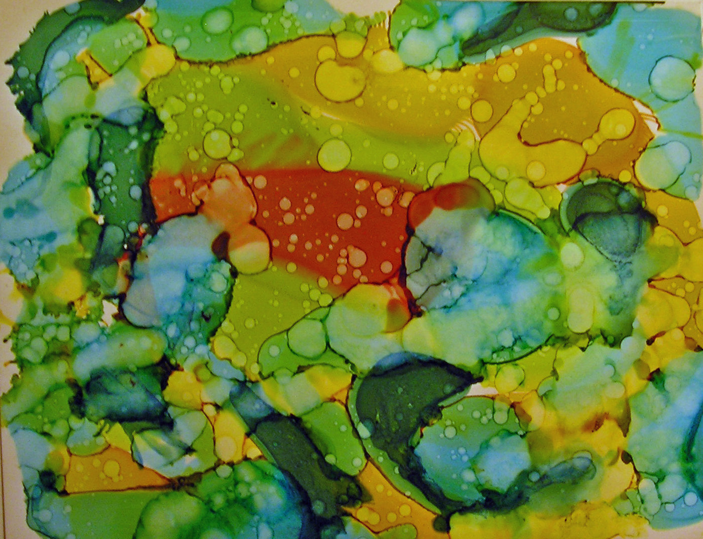
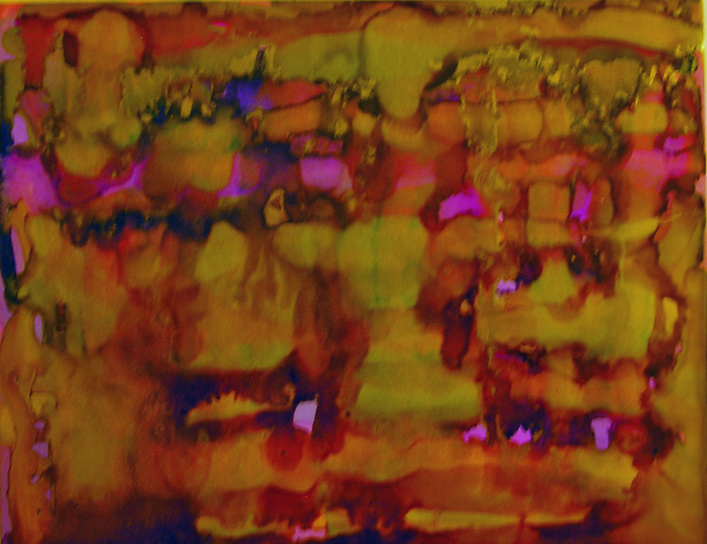
Cathy demonstrated several techniques....blowing the inks on the paper through a drinking straw was one.  Also, making the inks move around on the yupo by dropping rubbing alcohol (91%) on them.  She encouraged us to spend some time just experimenting with these techniques.  Here are some of my efforts.


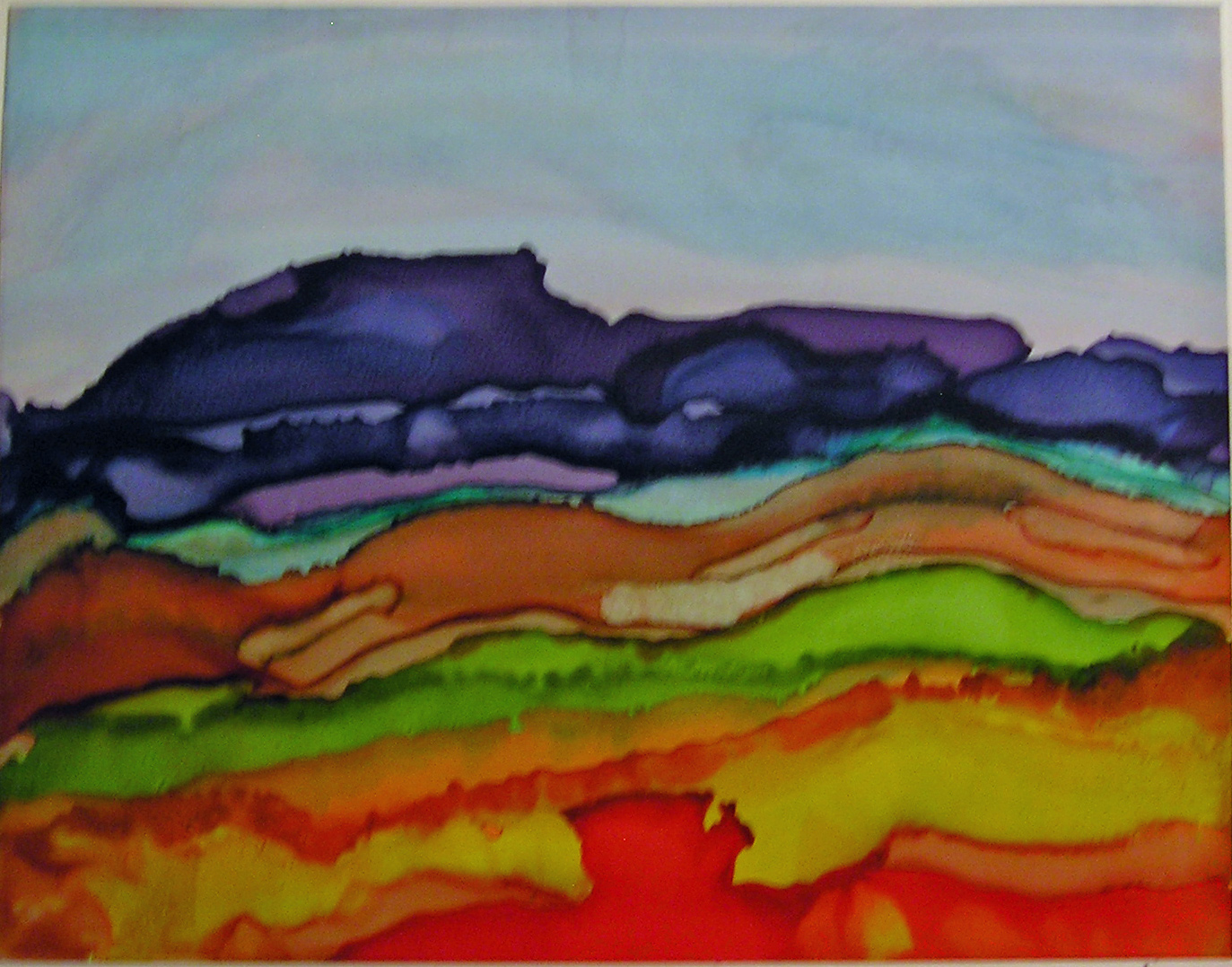
We learned how to control the inks enough to create a landscape design.


And how to incorporate stencils into the mix.


Actually getting recognizable images (my flowers are outlined with a micron pen).


This is one of my favorites.  I lifted the yupo off the table, and held it on an angle, and dripped different colors down the page, not overlapping any of them.  Then I filled in the blank spaces with black AI.  I had no idea if the black would migrate into the colors and result in a bunch of mud, but I took a chance, and look how it turned out.


Cathy also shared with us a technique using gold AI (the Jacquard Pinata brand).  Apparently it doesn't work with the Ranger brand.  A small amount was applied around a color and it sort of surrounds the color as though it had been painted in.  Hard to describe, and sadly, does not come through well in this photo, but believe me, it looked spectacular in person.


This was day one.  I'll blog about the other classes when  a)I actually finish one of the projects and  b)I photograph it.  It's been that kind of summer.  :)


Sunday, August 25, 2013

What's Black and Sepia and......

.....gorgeous all over?  Sox's World of Color journal (from the Kindred Souls group), that's what.  It arrived from Stephen's talented hands just two days ago, and I've already finished my page.  I was inspired by the journal itself (lace and fabric and paper and bling), as well as the pages already done.  I think that black and sepia is one of the most elegant color palettes, and I just dove right in.

First I filled my work table with everything (well, that's an exaggeration, so let's just say a lot) in my stash that supported Sox's colors, and gradually came up with a plan.  It began by covering both the front and back with different 7Gypsies tissue paper, because the patterns are printed in black on sepia paper.  Or so I thought.  It became clear that the sepia was really more like a gold, and that annoyed me.  I solved that problem by concocting a mixture of glaze medium and tan paint which toned down the gold and brought the background to a more sepia-ish look.  After that it was just a matter of layering papers, sewing them down, and adding some stenciling, stamping, and a tag as the focal point.


The tag itself is made of kraft cardstock.  The background was done by first layering on some tan, cream, and beige paints, letting that dry, then stamping (a Hero Arts background stamp) with black archival ink.  When that was good and dry a very thin layer of rock candy clear stickles was applied with a fingertip, which is what gives it a subtle sparkle.
 
The dress form was cut with Tim Holtz's Sewing Room die.  The phrase is a Wendy Vecchi stamp, and the dress form is covered with Claudine Hellmuth's sticky back canvas.


The buttons were sewn onto fabric that had been stamped with a tape measure stamp.  As for the thimble and scissors charms.....they dangle from Tim's memo pin.  They began life as a very cheap and garish looking gold, which was toned down by tapping them with a black archival ink pad.
 
The back of the page is much simpler, but there was just too much good stuff left on my table, so it was decorated a bit more than I had to.


Again, the tissue paper was treated with that glaze/paint mixture.  On top of that, archival ink (black and coffee) through two different Prima stencils.  Then I sewed on the fabric and paper that would hold a little tag.


The tag was created from some Graphic 45 embellishments, and on it, my information.


While searching for items to use, I came upon some Heidi Swapp designs printed on acrylic.  They must have been in my stash for years; she called them "clear extras".  I used a few of them.  I love it when something I bought and never used finally gets its chance.


I look forward to the next journal arriving at my door.