Lynne Perrella. Each artist chose a color palette for their book, and Lynne chose white. Ever since then I've wanted to do a primarily white book. If that seems boring, think again. As anyone who has ever headed to Home Depot to buy white house paint can tell you, there are at least 50 shades of this color.
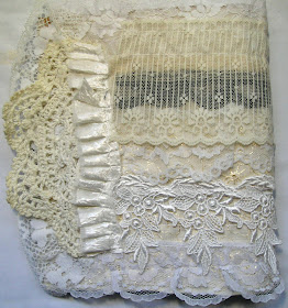
The Kindred Souls group I belong to is just finishing up our first round robin, and for our second we're doing a color theme. I signed up immediately and chose all the shades of white plus a touch of black. My first task, to create the journal itself. Here are my covers.
front:
close up:
back:
inside:
As you can see, I had a little a whole lot of fabric and lace leftover from my recent vintage lace round robin.
Next, my own page to get things started. I recently was fortunate enough to take a class with Anna Dabrowska, AKA Finnabair, and was happy to use many of the leftover elements from that class. And her techniques for making all those diverse pieces work together through color.
It began with a grid of scrapbook paper rectangles, most of which was covered with a dry brush application of white gesso. Then the image of the woman was added. Ribbon was twisted and adhered for her head scarf, and her clothing was gessoed over so I could decorate it with ink and stamps. Her sleeve was done with a Michelle Ward stamp, and the body with stamp I carved myself.
I then began adding my assortment of metal, wood, and paper embellishments. They were all covered with gesso, paint, and sprays. My last step was to add some stenciling (again, by Michelle Ward) to the background. I used black paint, then toned it down with a whitewash.
I couldn't be happier with the way it turned out, and I just can't wait to see what everyone else does in my book. It is packaged and ready to begin its journey. First stop, Michigan!


It's fabulous, really beautiful -- and I love that you're doing white. The best color choice! White is crystalline snow on a winter morning, parmesan cheese, grated and piled high, a soft kitten, a strand of pearls.
ReplyDeleteAnd you, Teri, are a poet!
ReplyDeleteAbsolutely stunning!!!
ReplyDeleteWow just wow. My cover is really plain. I figured I would add more to it when it returns.
ReplyDeleteits very beautiful Eileen
ReplyDeleteLill
http://www.canadianscraptramp.blogspot.com/
I love when all the classes and techniques come into play when you create something new. What a fabulous page. It's frame-worthy!
ReplyDeleteEileen
ReplyDeleteThis is Gorgeous! I love how you took Finebar's technique and made it your own. I love the wite...so pure...so like you!
Jacquie
Spectacular, truly spectacular! Love how this turned out, and who knew white could have so many shades! lol And yes, Teri's comment is hysterical. lol
ReplyDeleteVery beautiful! I love this.
ReplyDeleteGorgeous! When we did our color journal Ichosewhite with a touch of gold and I LOVE IT
ReplyDeleteabsolutely stunning!
ReplyDeleteOh this is SO my cup of tea! I love all white.... remember loving Elena's I dream in color that was all white and just loved it. And your cover is amazing, not to mention your Eileen Finnebar page to start it off. I think the this lady has set the bar pretty high!
ReplyDeleteBoth your book and most especially your page is an amazing mixed-media technique-driven masterpiece! You should be really thrilled with it. I aspire to take on all those wonderful techniques you describe.
ReplyDelete