Showing posts with label mixed media. Show all posts

Monday, August 19, 2013

Beautiful Faces and Dream Houses

About a month ago, I spent a wonderful weekend creating art on large (for me) canvases with a great teacher, Cindy Wunsch.  My friend Pat had taken a class with Cindy at last year's CREATE retreat, and I was happy to sign up for these two classes after seeing Pat's work.  And how's this for an endorsement.....Pat took these two classes as well. 

Some of Cindy's work:


Cindy's style is colorful, whimsical, and exhuberant.  Me, not so much, but I embraced her techniques and forged ahead.

Cindy, explaining something.  She was very thorough and prepared.


On Saturday we tackled faces.  I am no big fan of stylized faces.  At least not when I do them.  I actually like many I've seen, but they're just not me, so I am never too pleased with any I've attempted.  I received a lot of positive feedback on my redhead, but I do not love her.  Sorry, Red!  I did love the process, however, and even found a place for Red in my home.


What the photos probably do not show, is the finishing.  When the class was over, we didn't take our canvases with us.  They stayed behind, and Cindy gave each a nice thick coat of resin.  Not only will that protect the highly layered and textured work, but it just made the colors pop.  And as these workshops were a joint effort between Michele's Little Bird Studio and The Ink Pad, participants were given the option to pick up their pieces (once dry and cured) from either location.
 
Here is Cindy applying the resin, with Michele watching carefully.


Most people either did a second face or some stylized birds for the next canvas, but I just went in my own direction and did this collage:
 
 
On top of the many layers of collage elements went the circles.  Inside the largest is a stamped image from LaBlanche.  The other three fish are Wendy Vecchi stamps.  I stamped them on white tissue paper with embossing ink and applied white powder.  Once on the canvas I colored them.
 
On day two, the theme was Dream Houses.  Much more up my alley, and I created more of a dream shack than house, but it suits me.  It is near the ocean, and sits on stilts upon a foundation of books.  But let's not get too analytical.


My next piece was a cityscape, done on a long narrow canvas (12x24), which I love!  Lots of paper piecing and stenciling went into this one.


Monday, August 12, 2013

Fifty Shades of.....White!

Many years ago, my introduction to collaborative art journals began with the book True Colors.  It chronicled with breathtaking illustrations a collaborative effort between 15 outstanding mixed media artists.  The originator was one of my favorites,
Lynne Perrella.  Each artist chose a color palette for their book, and Lynne chose white.  Ever since then I've wanted to do a primarily white book.  If that seems boring, think again.  As anyone who has ever headed to Home Depot to buy white house paint can tell you, there are at least 50 shades of this color. 

The Kindred Souls group I belong to is just finishing up our first round robin, and for our second we're doing a color theme.  I signed up immediately and chose all the shades of white plus a touch of black.  My first task, to create the journal itself.  Here are my covers.

front:

 
close up:

 
back:

 
inside:


As you can see, I had a little a whole lot of fabric and lace leftover from my recent vintage lace round robin.
 
 
Next, my own page to get things started.  I recently was fortunate enough to take a class with Anna Dabrowska, AKA  Finnabair, and was happy to use many of the leftover elements from that class.  And her techniques for making all those diverse pieces work together through color.


It began with a grid of scrapbook paper rectangles, most of which was covered with a dry brush application of white gesso.  Then the image of the woman was added.  Ribbon was twisted and adhered for her head scarf, and her clothing was gessoed over so I could decorate it with ink and stamps.  Her sleeve was done with a Michelle Ward stamp, and the body with stamp I carved myself.


I then began adding my assortment of metal, wood, and paper embellishments.  They were all covered with gesso, paint, and sprays.  My last step was to add some stenciling (again, by Michelle Ward) to the background.  I used black paint, then toned it down with a whitewash.


I couldn't be happier with the way it turned out, and I just can't wait to see what everyone else does in my book.  It is packaged and ready to begin its journey.  First stop, Michigan!


Sunday, July 14, 2013

Finn-tastic!

I've been admiring the work of Anna Dabrowska (AKA Finnabair, or Finn) for years, and literally jumped at the chance to take a class with her at Michele's studio.  It took place on Thursday, and it was easily one of the best classes I've ever taken.

In case you don't know anything about Finn, she's from Poland, she designs for Prima and Sizzix, amongst others, and she is super talented, warm, funny, and a great teacher.  Just click on her name above and you'll see what I'm talking about.

Back to the class.  It was an all day event.  And when I say all day, I mean we started at 9am and finished up a bit after 6pm.  Michele provided lunch, so no one even left the studio for food; we just kept working.  Why do we say working?  It's really playing.  SO MUCH FUN!

So many goodies included in our class kit. Most are Finn's creations for Prima.   This isn't even the entire haul:


We used a Prima journal (Finn's design), took it apart and started decorating the covers.


In addition to all the embellishments Finn brought, we also could add our own favorite bits of grunge, so some rusty, crusty odds and ends from my stash found their way onto my journal covers.  In the above photo the covers had scrapbook paper glued on, the elastic closure was protected with masking tape, and we were ready to embellish.  I don't have any step by step photos, but here are some works in progress from around the room.
 
 
Marjie really isn't bored.  She's just waiting for glue to dry.  Click on her name to see the gorgeous pieces she created.


My friend Seth, dabbing his embellishments with Silks glazes (the most delicious colors in the world!)  If you don't already follow Seth's wonderful blog, The Altered Page, well, click on his name and get over there! 


Diane showing off her autumn colored beauties.

That's me in the middle, putting my journal back together.  In the back, Kelly, Karen, and Finn.  One of the (many) reasons I love taking classes at Michele's studio is the opportunity to create in the company of so many like-minded peeps in such a warm and inviting place.  Trust me, not all venues are so welcoming.
 
Finn, demonstrating a technique:


Aren't those sleeves the coolest?  They keep the paint and glue off her arms (and in the winter, off her shirt sleeves).
 
Marjie took this photo of me with my finished cover.  The color is a bit off, but I have more accurate pictures coming up.
 
 
Here are my front and back covers.


You can see how color unifies such a bunch of diverse elements.
 
The covers took all morning to complete.  In the afternoon we worked on some pages, and each double page layout featured different techniques.  All deceptively simple.  Deceptive, because they look like they took forever to do, and they really went very quickly.  Most people brought photos to use.  I didn't.  I brought some of the images I've collected.  I'm not even sure I'm going to insert them into this journal.  I like them well enough to mount and frame them. 
 
Finn taught three layouts, but by the third I was done.  Exhausted.  Happy, but exhausted.  So I only have two to show.


I love the technique of using scraps cut into squares and rectangles to create a graphic background.  Quick, easy, low-tech, low-cost, and very effective.  We also used stencils, sprays,shading with soft pencils,  and some stamping.  In the third layout, the one I didn't do, Finn demonstrated adding fibers and embossing to the pages.
 
Great picture of Michele and Finn:


And as always, we ended the day with a group photo.


Finn will be teaching in the US and Canada all summer.  If you can get to one of her classes, do it!  Here is her schedule:


Monday, May 13, 2013

Far Away Places

For the third May in a row I traveled to Connecticut for one of my favorite activities......taking a workshop with the fabulous Lynne Perrella.  This year was better than ever, for two reasons:  co-teaching with Lynne was Michelle Ward, and I was able to share the experience with three of my favorite peeps, Cheryl, Pat, and Teri.  Oh, I should have said there were three reaons this year was the best:  Cheryl drove, so we car-less city folk didn't have to do the Metro-North -(with a train change)-to-Wassaic-then-get-a-cab-to-the-hotel-with-two-tons-of-art-supplies routine.

The theme was Far Away Places, and we spent many hours in the weeks preceding the workshop deciding on our places, doing research, and gathering images and supplies. 

Of course I brought my camera; I even brought extra batteries.  Did I take any photos?  Not a one.  With my table full of materials and my hands full of paint and gesso, pulling out the camera was the last thing on my mind.  Luckily, Michelle posted a few nice snaps on her blog.  Check it out.  It also has pictures of both Lynne's and Michelle's sample pieces, a beautiful photo of Lynne and Michelle, and a group shot, which I have swiped here:


The workshop was held, as usual, at the lovely Interlaken Resort and Conference Center in Lakeville,  where they treat us very well, providing breakfast, lunch, day-long beverages and afternoon snacks.  Here are a few photos of the grounds taken at past workshops:


Actually, the grounds were even more beautiful and full of flowers this year.
 
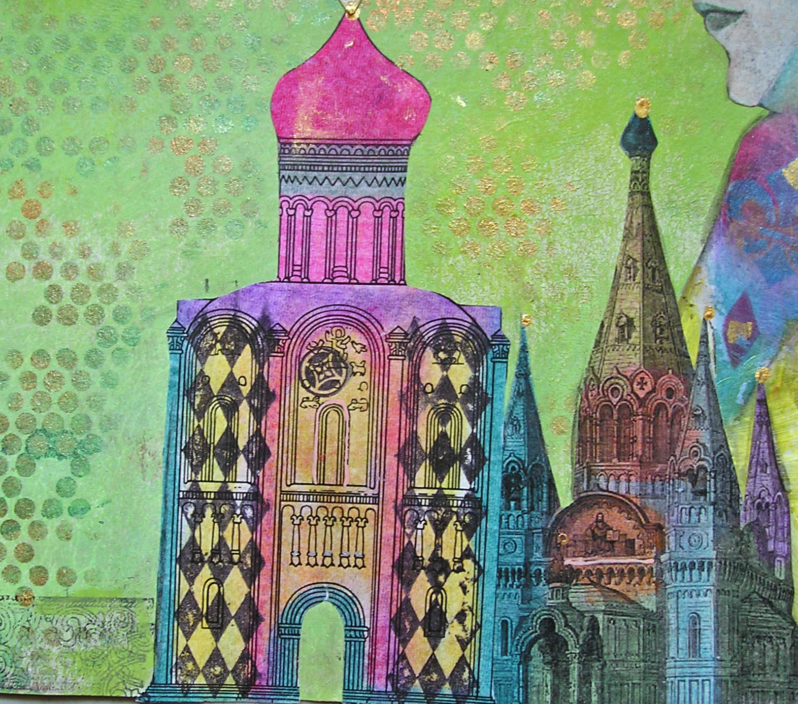
I decided on Russia as my far away place.  My grandparents came from there, and though their experiences both pre and post revolution were not exactly a day at the beach, it is where they came from, and I wanted to include that in my work.
 
On day one we did a project with Michelle.  She showed us how to make cuts in folded paper to create windows and shapes that either pop out or recede.  I loved it!  Here is that piece (all photos taken at home):
When folded, it looks like a book, and this would be the cover:


The cover with the windows opened:
 
The back cover:


The piece opened and standing:
 
Opened and lying flat:
 
Details:

 
The back:


On the second day, we did a long banner with Lynne.  While Michelle largely uses paint as her color source, Lynne is all about the Portfolio water soluble oil pastels.  I love them too. 


Day three was a project with Lynne and Michelle.  First they each demonstrated the way they approach making a grid design, and then we set out to do our own version.  My grid was made up of two inch squares of various papers, many left over from the previous days.  Although much of the grid wound up being covered by the focal image and stenciling, enough of it is evident and makes an interesting base for what came afterwards.


We were told that Lynne and Michelle are already talking about what they want to do next year.  Sign me up!