Showing posts with label Dyan Reaveley. Show all posts

Monday, September 1, 2014

A Documented Life -- What's Black and White?

The latest prompt in The Documented Life Project, that's what. And it coincided with the very happy rediscovery of my favorite hand carved stamps that went missing sometime in April.


They are very simple,  but can be used in so many ways, singly or in combination, depending on their orientation.


I stamped several sheets of white paper, using an india ink stamp pad, then cut the pages into 1" strips.


The strips were then cut into 1" squares.


I played around with their placement, and finally settled on the above design.


The silhouette was done with a Dyan Reaveley stencil (by Ranger) in black acrylic paint. One of the things I like most about silhouette stencils, as opposed to stamps,  is that you can use it on either side, so your silhouette can face in the direction you want.


I finished it off with an outline of white machine stitching. I'm toying with the idea of adding one pop of color, maybe a red hat, but haven't made up my mind. 


Saturday, June 21, 2014

A Documented Life -- Have a Heart

Just hours from the reveal of the new prompt, I've finished my response to The Documented Life's week 25 challenge:  include a heart.

First on the to-do list, spend a happy afternoon making Gelli Plate prints on deli wrap paper, then cut some up into heart shapes.


Next, use another Gelli print for the background, then arrange the hearts on it. Add some doodling on the hearts and a heart stamp (on the right, by Dyan Reaveley) and a quote (written with Sharpie water based poster paint pens). 


The final touch, some machine zig zag stitching down the center of the hearts.


Thursday, August 15, 2013

On A Roll

I discovered the secret to getting everything on my creative to-do list done, and done without procrastination.  I must also have a long list of  non-creative things I really should be doing first.  Bingo!  Of course the artsy list gets priority. 

At any rate, I have been checking off items on a daily basis (I do love making and completing lists), and have two more journal pages for Kindred Souls round robins finished and ready for mailing.

The first, for Mary-Beth, completes her "Illustrated Phrases" book.  I came upon a lovely sentiment, and knew instantly I had an image that was perfect for it.  Those of you who visit here regularly will doubtless recognize her.  I found her on the internet ages ago and have used her A LOT. 


The background is a 7 Gypsies paper that I altered a bit with a whitewash to mute it, and some stamping with clear ink and embossing powder. The frame is an old Stampin' Up embossing folder.  I cut the opening by hand, so to hide the wonkiness, ball chain was glued around it.  I know at least one of the flowers is from Prima, but the rest are just anonymous ones found in my stash. 


The next page is for Mary-Beth's World of Colors journal, and her chosen palette is blue and green.


The background consists of many layers of stenciling and pieces from a decorative napkin.  The focal image of the pear (a Tim Holtz stamp) is something I did for a card a while back, but never used.  The paper leaves are a Dyan Reaveley stamp, and the metal leaves above them are mostly of unknown origin, though I know a few are from Tim's idea-ology collection.
 
I am now all caught up with my journals....until the next one arrives, and I've been told that will be very soon.  Good!  I need another excuse to avoid that other "stuff."


Wednesday, August 14, 2013

Time For Love (And Ignoring A Mistake)

Rhea's theme in the Kindred Souls first journal round robin (now approaching the finish line), is Time For Love.  I was one of the last to receive her book, and it is full to the bursting point of gorgeous detailed pages.  Lots of clocks, hearts, steampunk embellishments, and other bits of beauty.  The bar had been set very, very high, and I put a lot of work into my contribution.  Oh, and I need to mention that by the time I received the book, there were no more blank pages, so I had to cut one myself.  (Rhea knew this would happen and said she'd rebind the book when it returned home).  And there was the origin of the mistake I would later choose to ignore.  I measured the page, even punched the holes, since Rhea had used her Cinch and I have one too.  And proceded to create.  And after all was done I noticed.....my page size was correct, but the way I oriented it was not.  So, this is how the page will look when inserted in the book:


Yep, it is sideways.  And I just didn't have the heart to start all over again.  Don't bother craning your neck; this is how it should be viewed.  I sure hope Rhea doesn't mind:


And from this point on, we ignore the mistake and procede as if it never happened.  :)
 
The background was done (pretty much in this order) like this:  paint and glaze, Wendy's gold embossing paste through a stencil, and Dyan's stamps with black archival ink.
 
Instead of a clock (Time for Love, remember?), I used Tim's Picture Wheel die; it conveniently has 12 slots, so I turned it into a clock.
 
Lastly, some metal and wood embellishments, colored uniformly with more paint and glaze (thank you, Finnabair!), and a Wendy stamp and sentiment.
 
And the back (which IS oriented correctly):


And since the current challenge over at EWV (Everything Wendy Vecchi) is to use a die cut along with at least one Wendy stamp, my page, mistake and all (oops, I said we'd no longer mention the M word), works for that too.  So there.


Thursday, April 11, 2013

Spray 'N Paste

Yesterday, Lori (list mom of Everything Wendy Vecchi) shared a link that really inspired me.  Britta Swiderski did a video of her technique of applying Wendy's metallic embossing paste over a background of Dylusions spray inks.  There is an interesting reaction between the two, and the results are just gorgeous.  Just click on Britta's name to see what I'm talking about.

Anyway, Lori decided that the new challenge at EWV would be to use that technique on a project.  First I pulled out my great big, nearly untouched Dyan Reaveley journal, and decided that this would be where I'd do my experimenting from now on.  With no worries about the finished product.  So far, it's working for me.

Here are a few of my experiments.  First, a background with some of the green Dylusions and a Michelle Ward Stencil Girl stencil with gold embossing paste.  Then, another part of the same background, same stencil, but this time I used the silver paste.


Next, I used Wendy's stripes stencil.  First I applied the gold paste holding the stencil so the stripes are vertical.  After it totally dried I repositioned the stencil right over the vertical stripes, this time holding it horizontally,  and applied the silver paste.  Before removing the stencil I very lightly pounced over the paste with a paper towel for a little extra texture.  This isn't the greatest photo; it's really striking in person.


Then I decided I should try the technique with different colored backgrounds.  Again, these do look way better in person.  First, some deep purples/blues with gold paste, followed by pinks/reds with silver paste.  And the stencils I used are Wendy's layered flowers. 


Before leaving the experimental phase and actually using this technique in a project, I started to wonder how it would work with a different spray.....namely Ranger's Color Wash.  Now, generally, the Color Wash sprays are darker and earthier than the Dylusions, so I just used the brightest that I had.....butterscotch, terra cotta, and red pepper.  And I didn't bother with a stencil.  I just scraped some gold paste over the dried ink with an old credit card.


I think the Color Washes work well, at least the shades I chose.  The next time I decide to play mad scientist I'll try this with some of the other colors.  And while I'm at it, I'll see what happens when the paste is applied over other sprays, ink pads, crayons, chalks......
 
Here is the journal page I did for the challenge.


The gold paste was applied over Wendy's lovely leaves stencil.  When the paste was nearly dry but still a bit soft I pressed a stamp onto the leaves (any old stamp; I wasn't trying for an image, just some texture).  I also used a stylus to make some dots. 
 
By the way, I keep a few sheets of deli paper on my table, and use it to blot off excess inks, paints, sprays, etc. After a day or two of blotting action, the paper is full of colorful goodness.  The two butterflies (Wendy stamps) were stamped onto one of those sheets, cut out, and then glued onto the page.  The page also has some random stamping, doodling, and little dots of paint.
 
**CAUTION**  If you're experienced in such things, this warning may seem as obvious as a take-out coffee cup announcing that the content is hot, but if you're new to all this, you'll be thankful.  WASH THE EMBOSSING PASTE OFF YOUR STENCILS AND STAMPS BEFORE IT DRIES!  I'm just sayin'.


Monday, March 25, 2013

Keys4Art 2013, Part III

MORE PROJECTS
 
 
Daisy showed us a lovely technique using alcohol inks.  A picture was stamped on glossy paper and heat embossed with black powder.  This created "wells" that allowed us to paint with the inks without them straying into other areas. 
 
This one I will probably use on a card or an art journal page.
 

These two I put directly into the little journal we worked on at the retreat.  More about that soon.
 
 
Jacquie taught a quick lesson on using plaster embedded gauze to create wonderful textures.  We made journal covers.  Some of my very industrious friends actually used them and made wonderful journals with exposed spine bindings.  Me, I just have these two covers.  Someday....
 
 
ROAD TRIP
 
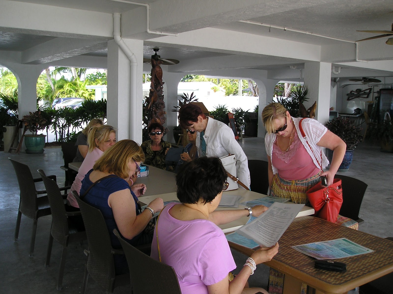
One afternoon we took a break and drove south to Islamorada, where the Lazy Days restaurant is located.  Last year we stopped there on our way back from Key West, and I ate the best lobster sandwich I've ever had.  I have been thinking about it for a year, so we took a road trip to get it again. And I wasn't disappointed.  One of the best sandwiches of any kind I've ever had.


On the way back from lunch we couldn't help but notice this rather large crustacean, drawing people into a mall of both touristy crap and very beautiful pieces made by local artists.


And I couldn't help but notice that there was something odd  unusual  sexual  interesting (?) about this tree trunk.


Poor Teri; she didn't have a clue what was happening on the other side of the tree, but we talked her into this pose. 


And mind you, sticking out her tongue was all her idea.  I swear.
 
 
BACK AT THE HOUSE


One of the gifts we received from Elena wss a smallish Maya Road chipboard album, and in between classes and mojitos (a big shout out to both Jen and Karen who were always ready to mix us up some cocktails) we worked on the album.  In fact, mine was nearly finished; all I had to do when I got home was add some photos.
 
See how great the key from the pillow fairies looks on the front cover! (Fleur de lis stencil is one of my favorites, by Michelle Ward for Stencil Girl).
 
 
The Hebrew lettering stencil on the back cover is also a Stencil Girl product.


This is the inside front cover.  Some gelli plate prints, pieces of a decorative napkin, and a Dyan Reaveley stencil.


The last gift the pillow fairies left was a decorated letter sized envelope.  I deconstructed, then reconstructed it to fit on the inside back cover, and it now holds all the small memorabilia that I didn't have room for within the journal.
 
 
Here it is, Keys4Art 2013 in a nutshell.


I think I have enough random pix to warrant a fourth installment.  Stay tuned.....