Showing posts with label portfolio pastels. Show all posts

Wednesday, May 22, 2013

Back to Russia

How Sue Acquired A Russian Ancestor
 
 
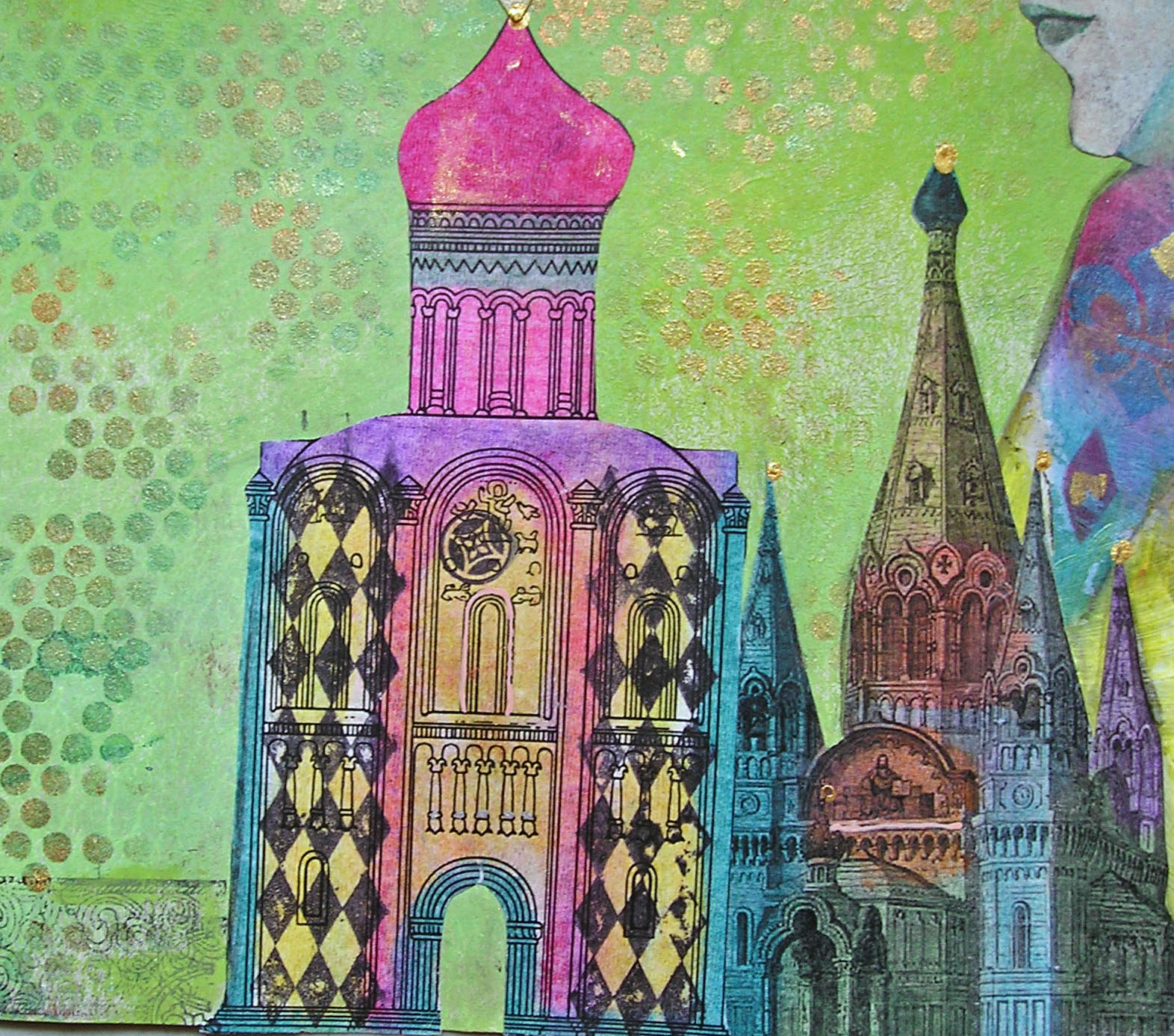
Clearly, I still have the desire to incorporate images of Russia into my art.  When I received Sue's Vintage Ancestors book this week, I knew immediately where her next ancestor would come from.
 
Sue structured her book a bit like a mystery (a very cool idea), setting her main character, Alice, off on a world wide journey to locate distant relatives.  Each one had a key (and Sue asked that we all use a key somewhere on our pages), and one of Alice's quests was to find the key that matched the one she herself possessed.
 
So naturally, I sent Alice to Russia, although an additional trip to Paris was necessary.  And I just had to throw in some Russian royalty as well as a rather emphatic nod toward my own Jewish Russian roots.  I knew all those years of reading mysteries would come in handy some day.
 
 
Very much under the infuence of Lynne Perrella, most of the coloring I did was with my Portfolio pastels.  The church which is furthest in the background is a drawing of the New Russian Orthodox Church in Paris.  Overlaid are some drawings of Russian churches as well as a few of the stamps I carved myself.  They have all been embellished with sparkly things, German scrap, and lots of doodling with my glaze pens.


The young beauty is Natalia, widow of Alice's distant cousin, Grand Duke Dimitri.  Below her photo is a pocket containing the explanation of all this, and to her left, the key she inherited from the late Duke.


After taking pictures of my pages, I decided that the litte faux Faberge egg atop the key needed more bling, so I added some.  Much more authentic now, LOL.


And here is the story of Natalia and Dimitri. 


I do love the challenge of inventing ancestors for my friends!


Monday, May 13, 2013

Far Away Places

For the third May in a row I traveled to Connecticut for one of my favorite activities......taking a workshop with the fabulous Lynne Perrella.  This year was better than ever, for two reasons:  co-teaching with Lynne was Michelle Ward, and I was able to share the experience with three of my favorite peeps, Cheryl, Pat, and Teri.  Oh, I should have said there were three reaons this year was the best:  Cheryl drove, so we car-less city folk didn't have to do the Metro-North -(with a train change)-to-Wassaic-then-get-a-cab-to-the-hotel-with-two-tons-of-art-supplies routine.

The theme was Far Away Places, and we spent many hours in the weeks preceding the workshop deciding on our places, doing research, and gathering images and supplies. 

Of course I brought my camera; I even brought extra batteries.  Did I take any photos?  Not a one.  With my table full of materials and my hands full of paint and gesso, pulling out the camera was the last thing on my mind.  Luckily, Michelle posted a few nice snaps on her blog.  Check it out.  It also has pictures of both Lynne's and Michelle's sample pieces, a beautiful photo of Lynne and Michelle, and a group shot, which I have swiped here:


The workshop was held, as usual, at the lovely Interlaken Resort and Conference Center in Lakeville,  where they treat us very well, providing breakfast, lunch, day-long beverages and afternoon snacks.  Here are a few photos of the grounds taken at past workshops:


Actually, the grounds were even more beautiful and full of flowers this year.
 
I decided on Russia as my far away place.  My grandparents came from there, and though their experiences both pre and post revolution were not exactly a day at the beach, it is where they came from, and I wanted to include that in my work.
 
On day one we did a project with Michelle.  She showed us how to make cuts in folded paper to create windows and shapes that either pop out or recede.  I loved it!  Here is that piece (all photos taken at home):
When folded, it looks like a book, and this would be the cover:


The cover with the windows opened:
 
The back cover:


The piece opened and standing:
 
Opened and lying flat:
 
Details:

 
The back:


On the second day, we did a long banner with Lynne.  While Michelle largely uses paint as her color source, Lynne is all about the Portfolio water soluble oil pastels.  I love them too. 


Day three was a project with Lynne and Michelle.  First they each demonstrated the way they approach making a grid design, and then we set out to do our own version.  My grid was made up of two inch squares of various papers, many left over from the previous days.  Although much of the grid wound up being covered by the focal image and stenciling, enough of it is evident and makes an interesting base for what came afterwards.


We were told that Lynne and Michelle are already talking about what they want to do next year.  Sign me up!


Wednesday, May 1, 2013

Heading East

Last weekend, with a to-do list longer than my arm, I abandoned everything I was supposed to do in favor of what I wanted to do.  I recently signed up for an ATC swap at Little Bird Creations, something I haven't done in years.  I literally have hundreds of these little works of art from years ago swaps, but have rarely done any since I've gotten into art journaling and collage.  Anyway, the theme is Japanese/geisha, and since I have a ton of related supplies, I decided to go for it.  They're not due until June, but you know how it goes with me and my stubborn muse....strike while she is hot or she will run away and hide.

I began by covering a sheet of 8 1/2 x 11" cardstock with some Japanese text.  I remembered a trick I'd read for getting 10 ATC from one such piece of paper, and cut them out.  Here's this handy tip:

1. Cut two lengthwise strips 2 1/2" wide, leaving one strip 3 1/2" wide.
2. Cut the strips crosswise: the 2 1/2" strips will be 3 1/2" wide, and the 3 1/2" strips will be 2 1/2" wide.

Then I added some texture with this embossing folder (I was able to do two ATCs at a time):


And then some transluscent color with these paints:


So much for the background; now onto the main image, which I got from this:


The above is 8 1/2 x 11", so I only used the head and shoulders, and that pretty much filled up the ATC.

All of this resulted in:


To color the images, I used my favorite cheap-o art supply:


And to decorate the colored kimonos, I used some of my favorite pens.  Because the Portfolios have a waxy surface, not every pen will write well over them.  I've ruined many a good pen learning this, but my Sharpie poster paint pens, Molotow acrylic pens, and Sakura glaze and souffle pens glide over the Portfolios with no problem.


Although the design is identical, the decoration changes from ATC to ATC.  And though it wasn't my intention,  even the faces all look different.  The face on the original image was very faint, so I had to go over the lines with a pen.  Even the slightest difference in my drawing changed the expression.  I'm not complaining, just explaining.  And of course I totally enjoyed coloring and doodling on the clothing, using varying colors and patterns on each.


I used very narrow red German scrap for the hair accessories.  The flowers are tiny Primas over small Stampin' Up blooms, with a dot of platinum stickles in the center.


Monday, January 14, 2013

Let's Face It....

You'd think I'd be tired of collaborative journals by now.  Nah!  So when Gloria, list mom of Kindred Souls, offered one, I jumped right in.  It's a nice sized group that signed up; there are ten of us, so I don't think this one will take a year to return home.

I selected faces as my theme, and used my Cinch, some book covers, and good quality watercolor paper to construct the book.  I used the largest coil so there would be plenty of wiggle room for pages made thick with embellishments. 

The cover:


The inside front cover introduces the participating artists:

 
My page:

 
I don't know who gave me the image, but I do know where I got it.....last year's Keys4Art retreat.  We'd all brought lots of faces to use in our workshop with Lynne Perrella, and shared our extras.  I love her face and have used it in several projects.  It is a black and white copy which I colored with my Portfolio water soluble oil pastels, and then decorated with metallic paint and stencils, stamps, rub-ons, and some bling.  You can't see much of the background, but it is made of many layers of paint and stenciling, and some french script from a stamp.
 
The back could be kept simple, and mine is:

 
For the back cover, I tore up some patterned tissue paper and applied it with Ranger's Glue N Seal Glossy.  I then took a set of face stamps I've had for ages (from I Brake For Stamps) and using archival ink, stamped them on plain tissue.  The were cut out and collaged onto the patterned tissue, again with the Glue N Seal.

 
We have a February 1 launch date, but since I'm mailing to Canada, I'll be getting this out soon.  Everyone has selected different and interesting themes, and I can't wait to get my first book to work in.


Monday, October 29, 2012

Radiantly Gothic

On Saturday I got to combine two of my favorite things:  taking a class with Lynne Perrella, and spending time with friends.  Pat, Heidi, Michele and I headed downtown to Westbeth's classroom to take the Ink Pad sponsored Radiant Gothic Triptych class.  Say that five times fast.

I've lost track of the number of classes and weekend workshops I've taken with Lynne.  Sometimes I'm asked if I don't get tired of it.  Short answer: NO!  Explanation:  I always learn something new.  Always.  And I just love the sense of community that Lynne promotes in every class.  As she always says, "you have to find your tribe."  If your friends and family don't understand your art, find some people who will.  Your tribe.

The current issue of Somerset Studio just so happens to have a full article by Lynne, in which she explains how the triptych came to be.  Our class project is based on the piece she did.  Check it out if you can.

We began with a wood triptych (unassembled at this point), which we sanded and painted.  We applied gothic images that we colored with oil pastels, added trim, gems, and a whole lot of stenciling.


I am not really great at photographing shiny stuff, and the bling and metallic paint are causing some glare.  The colors are way richer in person, and I am really happy with the way this came out.  I'm also thrilled to have figured out how to attach the hinges so they aren't visible from the front.  Don't ask how long that took.  My brain is just not wired that way.
 
 
While it really isn't necessary to decorate the backs of the three pieces, I decided to anyway.  I kind of like the way the triptych looks partially closed, with just the face peeking out, and I wanted the side panels to have a little something on them.  Lynne had given us extra images, so that's what I used.


Check out the fabulous stenciling on the back of the center panel.  I finally got to use the fleur de lis stencil Michelle Ward did for Stencil Girl.  Isn't it fabulous! I overlayed it on top of another stencil in a different color of metallic paint.  Very cool effect.  (And you can also see how the hinges were attached).


Speaking of Michelle Ward and Lynne Perrella, they are teaming up to teach a three day workshop called Far Away Places.  It is happening in May at the lovely Interlaken Hotel in Connecticut.  I know I'll be there.  How about you?  Details are on Lynne's site, and I believe there may be some spots open.