Showing posts with label Stampin' Up. Show all posts

Friday, June 27, 2014

A Documented Life - Quote Worthy

The current prompt at The Documented Life Project is to incorporate a quote from the Bible (or a favorite book) into the work.


Words to live by, I think.

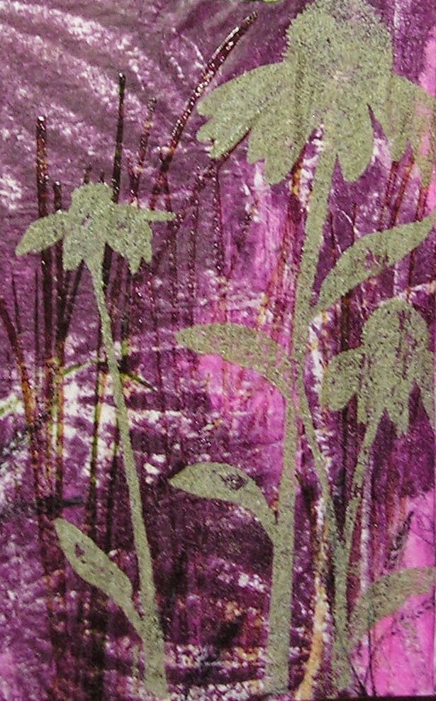
The background is (as usual), a Gelli Plate print on deli wrap paper, over which I did some stamping of grasses and flowers. The cornflowers(one of my favorite stamps, a VERY old one from Stampin' Up) were stamped with clear ink and embossed with Distress Embossing Powder.  The grass was also stamped with clear ink, but I used clear embossing powder there. I really like the contrast between the glossy embossing and the textured matte finish you get with the distress powders.


The lettering was done with a gold paint pen and outlined with a black Micron.

I often find myself wondering how I got along all those years without a Gelli Plate. 

Thursday, August 15, 2013

On A Roll

I discovered the secret to getting everything on my creative to-do list done, and done without procrastination.  I must also have a long list of  non-creative things I really should be doing first.  Bingo!  Of course the artsy list gets priority. 

At any rate, I have been checking off items on a daily basis (I do love making and completing lists), and have two more journal pages for Kindred Souls round robins finished and ready for mailing.

The first, for Mary-Beth, completes her "Illustrated Phrases" book.  I came upon a lovely sentiment, and knew instantly I had an image that was perfect for it.  Those of you who visit here regularly will doubtless recognize her.  I found her on the internet ages ago and have used her A LOT. 


The background is a 7 Gypsies paper that I altered a bit with a whitewash to mute it, and some stamping with clear ink and embossing powder. The frame is an old Stampin' Up embossing folder.  I cut the opening by hand, so to hide the wonkiness, ball chain was glued around it.  I know at least one of the flowers is from Prima, but the rest are just anonymous ones found in my stash. 


The next page is for Mary-Beth's World of Colors journal, and her chosen palette is blue and green.


The background consists of many layers of stenciling and pieces from a decorative napkin.  The focal image of the pear (a Tim Holtz stamp) is something I did for a card a while back, but never used.  The paper leaves are a Dyan Reaveley stamp, and the metal leaves above them are mostly of unknown origin, though I know a few are from Tim's idea-ology collection.
 
I am now all caught up with my journals....until the next one arrives, and I've been told that will be very soon.  Good!  I need another excuse to avoid that other "stuff."


Friday, May 17, 2013

Ornate Doors and Gates

That is the theme Pam chose for her book in the round robin happening in the Kindred Souls group.  The book itself is a masterpiece of creativity and paper engineering.  So much so, that each artist receiving it reported being at least a little intimidated.  Yep, me too.  We all wanted our pages to be as wonderful as the book Pam created.  So far, I think we've succeeded.  Just hope Pam agrees. :)

For this project, we are only doing one page, with our information and minor decoration on the back.
Here we go:


The image of the door comes from Graphics Fairy, a great site for free images, mostly vintage.  It was printed on plain copy paper, glued to cardboard, and enhanced with some ink, embossing powder, and a little metal on the top of the arch.  It is attached to the base with a combination of adhesive and brads, and it's a pretty strong connection.


The background is just a decorative napkin.  Some floral stamps were used to add some flowers from the background onto the door, and then a few very small Prima flowers with dots of stickles in the center finished that off.


The door does open.  I used one of those little photo tabs to hold it closed.


So, what lies beyond this garden door?  Why, a garden gate to a secret garden, that's what.


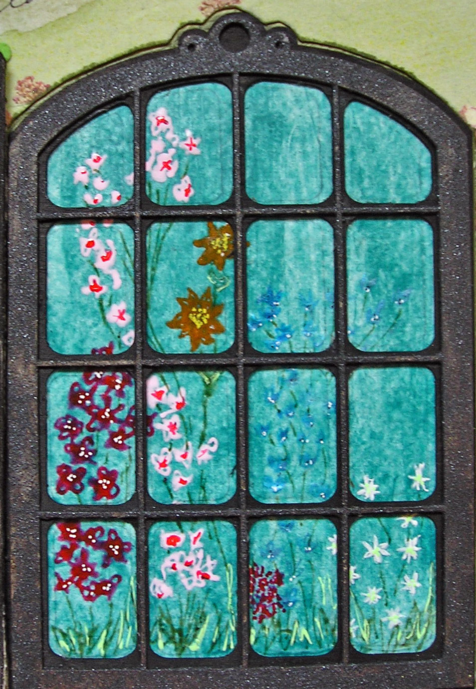
This door/gate is made of thin wood, but I covered it with micaceous iron oxide paint so it looks like old metal. I don't have the packaging it came in, so am not 100% sure of its origin, but I THINK I found it at Navel Jelly.   My apologies if I'm wrong.  So hard to keep track of all the supplies, you know.  The garden beyond is paint on deli paper;  the flowers were "painted" with both glaze and souffle pens.
 
Onto the back:


The background is some decorative paper from Stampin' Up that I've had for ages.  I stamped the LaBlanche garden gate stamp right over the text.  The little girl is another great image from Graphics Fairy, and I gave her some extra flowers to hold.  My personal information will go on this page.


Wednesday, May 1, 2013

Heading East

Last weekend, with a to-do list longer than my arm, I abandoned everything I was supposed to do in favor of what I wanted to do.  I recently signed up for an ATC swap at Little Bird Creations, something I haven't done in years.  I literally have hundreds of these little works of art from years ago swaps, but have rarely done any since I've gotten into art journaling and collage.  Anyway, the theme is Japanese/geisha, and since I have a ton of related supplies, I decided to go for it.  They're not due until June, but you know how it goes with me and my stubborn muse....strike while she is hot or she will run away and hide.

I began by covering a sheet of 8 1/2 x 11" cardstock with some Japanese text.  I remembered a trick I'd read for getting 10 ATC from one such piece of paper, and cut them out.  Here's this handy tip:

1. Cut two lengthwise strips 2 1/2" wide, leaving one strip 3 1/2" wide.
2. Cut the strips crosswise: the 2 1/2" strips will be 3 1/2" wide, and the 3 1/2" strips will be 2 1/2" wide.

Then I added some texture with this embossing folder (I was able to do two ATCs at a time):


And then some transluscent color with these paints:


So much for the background; now onto the main image, which I got from this:


The above is 8 1/2 x 11", so I only used the head and shoulders, and that pretty much filled up the ATC.

All of this resulted in:


To color the images, I used my favorite cheap-o art supply:


And to decorate the colored kimonos, I used some of my favorite pens.  Because the Portfolios have a waxy surface, not every pen will write well over them.  I've ruined many a good pen learning this, but my Sharpie poster paint pens, Molotow acrylic pens, and Sakura glaze and souffle pens glide over the Portfolios with no problem.


Although the design is identical, the decoration changes from ATC to ATC.  And though it wasn't my intention,  even the faces all look different.  The face on the original image was very faint, so I had to go over the lines with a pen.  Even the slightest difference in my drawing changed the expression.  I'm not complaining, just explaining.  And of course I totally enjoyed coloring and doodling on the clothing, using varying colors and patterns on each.


I used very narrow red German scrap for the hair accessories.  The flowers are tiny Primas over small Stampin' Up blooms, with a dot of platinum stickles in the center.


Wednesday, April 10, 2013

This and That

This is what I've been up to lately.  I was too tired yesterday to blog, so I posted some of these on FB.  But, there is something new here.  :)

One of the many gifts from Elena at Keys4Art was the complete collection of Julie Nutting's whimsical doll stamps.  Even a confirmed old anti-cutenik like me finds them irresistible.  I used them on a tag and a card.


Stamped on Ranger's Specialty Paper, colored with distress markers, doodled on with glaze pens and souffle pens, and cut out.  The conversation bubbles were traced and cut from a template of various sized and shaped bubbles I've had for years.  The words are all bits of two different (and very old) Stampin' Up stamps.


The tag (from Prima's tag book, the perfect size for Julie's stamps) was inked a bit.  Instead of coloring all of this doll, I stamped the clothing (and headband) on various papers from Jenni Bowlin mini paper pads, cut them out and attached them to the doll.  I added the bouquet of flowers and the two flowers in her hair.  The sentiments are also old Stampin' Up stamps.
 
The challenge at Everything Wendy Vecchi was to use distress embossing powder and at least one of Wendy's stamps.  I did that and then some on a journal page.


The two striped flowers are Wendy's stencil, filled with her gold embossing paste.  The third flower is from Stencil Girl, and that was embossed with broken china embossing powder.  More distress embossing on the leaves, and the rest is stamping.....Wendy's and even a few I've cut myself.
 
Remember my polymer clay mouse from last weekend?  The oil paint we used finally dried enough for me to add some embellishments.  Striped stockings, polka dotted sleeves, and some pretty shocking shoes.  And you can't see it, but....I filled her crown with gold micro beads.  As befits a royal mouse.


I received another book in the Kindred Souls round robin.  This one is Deb's, and her theme is "vintage feminine."  I used one of my favorite images.


By using both Tim's regular sized and mini cabinet card die as an insert, I was able to create the frame, which was embossed with Cuttlebug's vintage wallpaper folder.  It was cut from a piece of Ranger's foil tape sheet, and altered with a mix of Ranger/Vintaj patinas and distress paints.
 
The flourishes on the left are not stamps....they're Tim's rub-ons.  The flowers (sprayed with perfect pearls mists) are Primas, and the stick pins were made by my friend Carla.....she gifted everyone with a set of them at Keys4Art.  The pearls and lace are from my stash.
 
So, I'm caught up again.....just waiting for the next journal delivery.


Thursday, April 4, 2013

The 12 Tags of 2013 AND a metal etching update

April really snuck up on me.  I had an idea for the March tag but before I knew it, April was upon us.  Click HERE to see what Tim did on his April tag.  It was all about the new metallic distress paints, which, sadly, I do not yet possess.  However, I do have some fluid acrylic metallics, and as their consistency is similar to the distress paints, I thought I'd give it a go.  And finally get something done on time!

Instead of working on a tag I did a birthday card on a coaster (4"x4"). 


The background directly on the coaster is from a gelli plate print.  Within that is the piece I did with one of Tim's techniques.....swiping paper through small amounts of distress paints, including a metallic.  Over that I stamped the butterfly from Tim's mini blueprint set, using black archival ink.

On Tim's tag (he used the full size dragonfly blueprint stamp), he added wings cut from Wendy Vecchi's Clearly For Art.  I stamped the little butterfly on a piece of CFA twice.  Once with black and once with magenta hue archival ink.  I wanted to see which I liked better, and decided to use both!  So I have a double set of wings.


For the body of the butterfly I used a pen nib and yet another technique for working with the distress paints......dabbing them directly onto metal.  I used pickled raspberry and a bit of the gold metallic paint I had on hand. 

The sentiment is one of Tim's word bands.  I covered it with peeled paint and broken china distress paint and then wiped the paint off, so that it settled into the letters.  It was then strung on a piece of narrow ribbon that I colored with some of the leftover paint (after misting the paint with water).


The back of the card is ready to be personalized.


The cupcake is from Tim's Birthday Blueprint set.  It was stamped on the same paper the front image was stamped on, cut out and adhered to plain cardstock that I inked with just about all the red/pink inks I own.   I went over the cupcake with different colors of distress markers, and I'm happy to report that the metallic shine from the underlying technique still comes through.  The little birthday greeting is a Stampin' Up stamp I've had forever.
 
In my last post I mentioned that I was working on a better closure for my little book with the etched metal covers.  Here it is!


And I added just a few more charms to the spine.


Hey, sometimes less is more, and sometimes (this time) more is better.


Thursday, March 28, 2013

Vintage Ancestors - A Jilted Lover

Karen's Vintage Ancestors book begins with two lovers, separated by the Civil War.  Sarah and Lawrence write to one another, professing their undying love, until.....Elena gets her hands on the book, LOL.  Then, it's all about Sarah leaving Lawrence for his brother Timothy. 

As I continue the saga, Lawrence responds to Sarah's "Dear John" letter, and I do believe he takes the high road (while getting in a few well deserved zingers).

First, the two-page spread.


I used fabric and paper scraps to create what I thought a journal made by a young woman might look like. 


On the left, a pocket (a Tim Holtz glasseine envelope covered with 7 Gypsies tissue paper) holding the letter Lawrence wrote after receiving the bad news from Sarah.  Pinned to the fabric below is a bauble I had in my stash.  Yes, the heart opens, and yes, there is something inside.  A lock of hair, perhaps?  Too creepy?  Well, how about a lock of doll hair, then?
 
I did some research, and my friend Google found a photo of a Confederate officer.  Not a general (they all seemed so old); I think this one is a lieutenant.  And his sword is a Confederate foot officer's sword.  I printed it out and covered it with Glossy Accents and then cut it out with my trusty craft knife.  What I really liked about it is that the site where I found the sword said that it was made by a sword maker in New Orleans.  Karen's characters are from southern Louisiana.  Fate!


Although I have Tim's rosette dies, I made this one the old school way, by doing accordian folds.  I wanted it to look like it was made by hand, as I'm reasonably sure that Sarah did not own a die cutting machine.  In the center is a button from my stash.
 
The two brads on the cabinet card are from Stampin' Up, and I've had them for years.  I thought they kind of looked like the buttons you might find on a military uniform.  Speaking of cabinet cards.....the holder for the photo is not authentic; it is a replica, also courtesy of Mr. Holtz.  Because the back of the holder had cool stuff on it, I separated it from the front and will use it in another project.
 
And, lastly, here is the letter that broken-hearted Lawrence wrote.  If you have trouble reading it, click on it and it should get large enough to decipher.


Will Lawrence survive the war and find fortune and love in California?  Will Sarah and Timothy actually marry?  Will we ever even know?  Well, that all depends on those who receive the book after me.  They may continue the story or go off on another track.  And someone further down the line may decide to go back to the current story line.  That's one of the things I love most about this particular journal;  you just never know who might turn up in a family tree, and what they will be doing.


Friday, March 8, 2013

Don't Quote Me....(And A Little About Keys4Art2013)

The most recent journal I received in Kindred Soul's round robin belongs to my great friend Elena.
Her theme is shabby/inspirational quotes.  Let me tell you, her book is an inspiration; Elena used old book covers and bound beautiful art papers inside, using a lovely exposed spine binding technique.  The book is fabulous just as it is. 

As my mailing partner is Mary-Beth in Canada, I wanted to get this done and on its way before I leave for Keys4Art (more on that later), and luckily my mojo and my deadline didn't fight with each other for a change.

This isn't the greatest photo in the world (I tried to improve upon it too many times to count), but I think you'll get the idea. 


The backgrounds are gelli plate prints done on deli wrap, using many Stencil Girl stencils.  If you look closely enough, you'll see stamps from Tim Holtz, Wendy Vecchi, Dina Wakely, Graphic 45Claudine Hellmuth, and Stampin' Up.
 
The flowers are Tim's idea-ology foliage collection, all colored with his new distress paints.  I LOVE the way these paints color metal!
 
The silhouette stamp on the lower left (Dina's) was stamped with clear ink and embossed with faded jeans distress embossing powder.
 
The inspirational quote is a Wendy stamp, stamped onto white tissue paper and glued to the background.  In case you have trouble reading it, it says:
 
The purpose of life is
To be useful
To be responsible.
To be compassionate.
Is above all, to matter,
To count.  To love.
To stand for something,
To have made a difference
In this wonderful world.
 
 
You know that old hair dye ad that says, "don't hate me because I'm beautiful?" I think I should entitle this portion Don't Hate Me Because I'm Lucky. On Sunday I head out to LaGuardia to meet up with Pat and Teri for the start of the fourth (!) annual Keys4Art retreat in Key Largo. It's always a memorable (and fun) experience, but this year is going to be extra special. We've outgrown Elena's wonderful home, so she went ahead and rented this waterfront party house for us! I'll even have my own bedroom! There's a pool too. I think a few photos are in order.


Did I mention that I'm lucky?  Add blessed, happy, excited, and grateful.  I get to spend a week in paradise with some of the best, most talented women on earth.  And yes, in between laps in the pool and mojito breaks we WILL make art!


Sunday, December 30, 2012

Vintage Ancestors, Adventurous and Murderous

My friend Lee (who I hope to actually meet some day) from Australia has been a part of all the collaborative art journals I've done over the past five years or so.  I love the way she started off her Vintage Ancestors book, with a tale of two young sisters who somehow turn into the murderous seniors that Arsenic and Old Lace was based on.  All ficticious of course, but what fun!  Here are Lee's pages, which I will build upon to continue the story.


So, Lee asks the question, how did these young girls become killers, and what in their background led them down such a path?

I introduced their father, one E.J. Jones, who just so happened (according to me) to be the inspiration for another film character, the one and only Indiana Jones.  Boy, did I have a blast concocting this story, and the artwork that accompanies it.


This particular Dr. Jones was an explorer, working in rain forests throughout the world, in search of medicinal plants.  Along the way he discovered some poisonous ones as well.  Oh, and he was always accompanied by his two young daughters.  Hmmmm.....could there be a connection there to Lee's story?
 
Here are closer looks at the pages.


The backgrounds were made by first scraping several earth tone colors of fluid acrylics over the paper.  Then some stamping (stamps by Dyan Reaveley and Wendy Vecchi).  The photo of Dr. Jones is in a holder made from Tim Holtz's cabinet card die.  The leaves and birds were cut from a Sizzix decorative strip called Birds and Branches.  The label holder is a very old Stampin' Up accessory that started out in life a vanilla color, but was distressed to look rusty with nothing more than acrylic paint (black and shades of brown).
 
The story was printed on vellum.  I made the little envelope for the specimen (Specimen B stamp by Wendy Vecchi, by the way) from deli wrap.
 
I added the number tab (I believe it is from a 7 Gypsies set) because Lee had an index tab on her page, and I thought it would be a nice element to continue.
 
In mid January this book goes to Pat, and I can't wait to see what my creative pal does with the continuing story of the surprisingly (or not) homicidal siblings.