Monday, October 29, 2012

Radiantly Gothic

On Saturday I got to combine two of my favorite things:  taking a class with Lynne Perrella, and spending time with friends.  Pat, Heidi, Michele and I headed downtown to Westbeth's classroom to take the Ink Pad sponsored Radiant Gothic Triptych class.  Say that five times fast.

I've lost track of the number of classes and weekend workshops I've taken with Lynne.  Sometimes I'm asked if I don't get tired of it.  Short answer: NO!  Explanation:  I always learn something new.  Always.  And I just love the sense of community that Lynne promotes in every class.  As she always says, "you have to find your tribe."  If your friends and family don't understand your art, find some people who will.  Your tribe.

The current issue of Somerset Studio just so happens to have a full article by Lynne, in which she explains how the triptych came to be.  Our class project is based on the piece she did.  Check it out if you can.

We began with a wood triptych (unassembled at this point), which we sanded and painted.  We applied gothic images that we colored with oil pastels, added trim, gems, and a whole lot of stenciling.


I am not really great at photographing shiny stuff, and the bling and metallic paint are causing some glare.  The colors are way richer in person, and I am really happy with the way this came out.  I'm also thrilled to have figured out how to attach the hinges so they aren't visible from the front.  Don't ask how long that took.  My brain is just not wired that way.
 
 
While it really isn't necessary to decorate the backs of the three pieces, I decided to anyway.  I kind of like the way the triptych looks partially closed, with just the face peeking out, and I wanted the side panels to have a little something on them.  Lynne had given us extra images, so that's what I used.


Check out the fabulous stenciling on the back of the center panel.  I finally got to use the fleur de lis stencil Michelle Ward did for Stencil Girl.  Isn't it fabulous! I overlayed it on top of another stencil in a different color of metallic paint.  Very cool effect.  (And you can also see how the hinges were attached).


Speaking of Michelle Ward and Lynne Perrella, they are teaming up to teach a three day workshop called Far Away Places.  It is happening in May at the lovely Interlaken Hotel in Connecticut.  I know I'll be there.  How about you?  Details are on Lynne's site, and I believe there may be some spots open.


Tuesday, October 23, 2012

New Journal Pages

As two collaborative journal groups approach the finish line, another begins its journey.  The Asian themed journal and the artistic evolution journal are just about done, so we launched our latest project, Vintage Ancestors.  We each created books and started things off with a cabinet card (real, copied, or invented) and a story.  While we could use actual family photos and stories, what's the fun in that?  So, most of us went online, began collecting images and thinking up some juicy family secrets.

Last week I received Elena's book.  It is already amazing.  She found an actual cabinet card scrapbook and took it apart and reworked it.  Her story began with a group photo and the tale of a family separated by politics and circumstance, and leaving their native Spain for the United States and Cuba.  The year was 1899.  The family consisted of the two parents and their nine children.

I thought that was a great way to begin.  While we're free to do as we please, there are enough family members for each of us to choose one and continue their story.

I chose Miriam, aged 19, and here are the pages I did about her. (You can click on the photo for a better view).


Along with this book, Elena also sent me Sarah's artistic evolution journal to work in.  This is the book where the pages go up and down in size and each artist evolves in some way from the artist that came before.  Elena and I have very different styles.  Her page that is partially visible when looking at mine has lots of circles, so I took that as my inspiration.  My pages have embossed circle stamps, circle stencils, etc.  Oh, and Sarah requested purple, yellow and green as our primary color palette.
 
 
Believe it or not, I started with black paper, over which I samped my variety of circles with clear embossing powder.  Then came many layers of watered down perfect pearls, followed by paint, ink, and more stencils.  The shimmer of the perfect pearls makes it hard to photograph the pages without a lot of glare.
 
I outlined my text and the stenciled figures with white to 1) make them pop and 2) make them relate better to Elena's pages, as she used quite a bit of white outlining.
 
Here's what it looks like with Elena's page visible behind mine.


I think it looks like the girl is peeking out, trying to get a look at my pages.  Well, that's my theory and I'm sticking to it.
 
In December we're starting another round robin called Vintage Lace.  It's going to be a fabric journal.  I am hardly queen of the needle workers, so that should be interesting.  You ever notice how people use the word interesting to replace some other, usually negative word?  Just asking.


Sunday, October 14, 2012

Happy Autumn!

This is definitely my favorite time of the year; I love a typical autumn day in NYC when the skies are blue, the air feels crisp, and there isn't even a hint of humidity to cause hair problems.
I have been keeping up with Tim Holtz's 12 Tags of 2012, and as expected, his October tag is all about Halloween.  I know so many people who are into that holiday, including Tim, and try as I might, it just isn't my thing.  Autumn, however, is right up my alley.  So, my entry sort of nods at Halloween, but is really about the season.  And, it's not even a tag.

Another favorite regular challenge I like to participate in is the Making Art Challenge over at the Wendy Vecchi yahoo group.  Wendy did an autumn tag recently that was featured on the Ranger website, and our challenge was to use the featured technique (adhering sticky back canvas to Wendy's Clearly For Art) and at least one of Wendy's stamps in any sort of creation.

So.....I combined the two, tried several of the techniques Tim used, and the sticky back canvas/CFA technique Wendy used, and came up with this:


Tim demonstrated making custom colored glitter with the new rock candy dry glitter and alcohol inks.  I don't have any of that product (yet), so used what I did have.....some chunky glitter, and it sure didn't work the way Tim's did, LOL.  But I love taking part in these artistic science experiments.  The larger of the two jack-o-lanterns is covered with my version.  I glittered the smaller one with plain old orange just to show the difference.  When I get some of the rock candy stuff I'll be trying that again.  BTW, the jack-o-lanterns and letters are grungeboard, from two of the many sets of pre-cut shapes I have in my stash.  I don't know if they are manufactured any more; they date back to the days before the Vagabond and Tim's Sizzix dies.  But being a good hoarder collector, I still have tons of them.
 
The tissue paper background is straight out of Tim's demo, but over top I used Wendy's background stamp from Optical Art.  On the bottom left you will see her little spider stamp from Botanical Art.  To make it stand out a bit more, I used black soot distress ink and black embossing powder.
 
All of the autumn leaves were done on the canvas covered CFA.  For those who don't know, Clearly For Art is a wonderful product (some sort of plastic, I think) that can be heated to make it bendable.  Yes, lots of products do that.  But the cool thing about CFA is that it can be heated, manipulated, then reheated if you don't like it.  It goes flat again, hardens up in seconds, and can be heated and shaped that way countless times. 
 
I cut the leaves from both the regular sized and mini tattered leaves dies, and colored them with both distress stains and Dylusions sprays.  Although they don't match up exactly, I also stamped over the colored leaves with Tim's Falling Leaves stamp set.  I used black archival ink for that, and didn't press too hard.  I just wanted a hint of the leaf veins to add some texture and realism. 
 
Happy Autumn!


Saturday, October 13, 2012

More Metal, and "Etching" the Easy Way

When I was at CREATE this past summer I was lucky enough to take a wonderful class with Leighanna Light.  Click here to see what we did.  She had some samples of other projects with her, and one was for goddesses that really caught my eye.  So I was happy to take Faux Etching for the Folk Goddess at Art Is You.  I just love using bits and pieces of metal to create these unique wall hangings.  I'm especially fond of the one that uses a nicely aged Altoids tin as the goddess's body.

This is the very beginning of construction.  I was trying out different things for my first goddess.  Those legs are typewriter keys. 


The look of etched metal you see on the tin is the faux in the class title.  It couldn't be easier.  We stamped on the already darkened tin (torched, or, as Leighanna informed us, placed on the barbecue) with matte medium, and then coated the whole thing with a liquid patina.  It starts out black, but within a few days it was rusty.  You'll see that in a bit.  In the photo above you can just see the rusting in its early stages.  Once it got to the point I liked, I sealed everything I'd patinaed with a metal sealant.  Otherwise, it would just keep rusting until eventually it would fall apart.
 
 
This is a piece of metal that has the technique, waiting to be used on the next goddess.
 
 
Here are my two pieces right after construction.  One used the tin as the body; the other used flat pieces of metal.


And here they are at home, after some additional rusting and a coating of sealant.


Leighanna provided the faces and the metal for the bodies, and the set of typewriter keys.  We brought an assortment of charms, beads, metal scraps, etc. to finish our pieces.  The hat above is actually a leftover part from the sconce I used in Michael DeMeng's class.  If you take a close look at all the goddesses I think you'll recognize plenty of stuff you'd find in your own junk pile.


What follows:  Leighanna snapping photos of our creations, and then, the class goddesses (some finished, some still works in progress).


And how about this one; not a goddess at all, but a pup!


The organizers of Art Is You are actually accepting early registration for next year (no classes announced, just reserving a spot for the event), and you better believe I'm in!  If you only have the time and resources to attend one such retreat next year, my advice is to go with Art Is You.  And you have plenty of time to start saving.  It's truly a class organization.


Thursday, October 11, 2012

Two Birds and a Shrine

My Adventures With Polymer Clay
 
Two of the classes I took at Art Is You involved working with polymer clay.  While I am not exactly a polymer clay virgin, I'm also no expert.  Things I learned:  well conditioned clay is a must, as is an oven that keeps accurate temperatures.
 
First up, Mini Shadow Box Shrine with Laurie Mika.  Wonderful class, great teacher, and my fellow students were so very talented.  Laurie provided the shrine (a nicely deep shadow box), very clear and in depth instruction, stamps for texturizing, mica powders and paints for color, and we only had to show up with pre-conditioned clay, some basic clay tools, and assorted doo dads (optional) to use as decoration (if we wished....remember the word optional).
 
Here is what my shrine looked like at the end of class.  I couldn't decide what to place inside the shrine, so I waited until I got home for that step.  Everything except the costume jewelry on the top is clay.

 
At home I added some decorative paper to the back (the white part you see showing above), then built it up a bit with cork and attached a pin.  I may change that, but I wanted to see how it looked completed.  Fortunately, I can open the back and do whatever I want to the inside.
 
 The little triangles on top and bottom were supposed to be clay tiles, but I didn't measure them well, and they didn't fit.  At home I filled those spaces with rust colored micro beads.


 An angled view so you can see the depth of the shadow box.  The outside was painted then stamped with permanent black ink.


This is a close up of the top of the shrine so you can see those micro beads.
 
Here is Laurie discussing what each of us created.  Most of us finished our pieces, or came close to it; others left with a work in progress.  Finished or not, I think they all are awesome.
 
 
Check them out!


Two words I seldom use are delightful and whimsical, but both aptly describe my second polymer clay class, Sculpural Birds and Beasts Ornaments with Doreen Kassel.  The second I saw the illustrations that accompanied the description of the class I was hooked.  It was the first class I registered for.
 
We took plain glass ornaments and covered them with a thin layer of clay.  Then, with Doreen's assistance we added clay to form the features of our animals.  I stuck to the birds, but there was a dog, a cat, a cow, and even the man in the moon.  Here are some of the samples Doreen brought in.  One is more impressive than the next.  She is an inspiring teacher.


Here are my two guys, a bluebird and an owl, followed by a closer look at the owl.  After baking, we colored the creatures with oil paint, which results in the most beautiful kind of glowing effect.


A few more owls, done by my classmates.


My friend Pat working on her man in the moon.  You can see her completed owl on the table.


Next up, more metal!


Wednesday, October 10, 2012

DeLighted, DeLirious, and Totally DeMengled


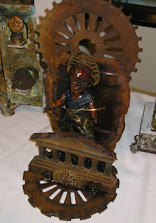
Just in case you don't know, Michael DeMeng is an extraordinary assemblage artist.  As I found out at Art Is You, he is also a wonderful teacher.  Michael's specialty is taking found objects and transforming them into true works of art.  His style is quirky (some say a bit creepy), not for everyone, but I am a big fan. The people in the class I took (great title: Patron Saint of Discarded Things), came in with buckets full of metal, wood, plastic, dolls, toys, gears, wheels.  Get the picture?

Michael helped each of us figure out how to put our modge podge of materials together, and his paint recipes turned our piles of junk into cohesive pieces. 

Here are some of Michael's pieces, on display in the front of our room:


I worked smaller than most people because a) there is always the possibility that I'll be traveling by train and b) I have limited space to display stuff in my apartment.  My base materials were a rusty old sconce, a plastic skull, and a small piece of wood.  Here is my piece in the process of being assembled:


The coils wrapped around the body of the sconce are made of epoxy clay, and it not only provides some texture, it is a great adhesive.  There is some on the top of the skull to hold the crown of pen nibs in place.
 
And here is the piece after about a gazillion layers of paint:


And yes, that is a tiny skull lurking behind the larger one.  And yes, again, he is wearing a beanie.  Doesn't everything, even the plastic, look like rusty crusty metal?
 
Although everyone was really absorbed in their work, I found this to be a particularly friendly and generous group of people.  We all brought so much, and only used a fraction of that, so sharing of supplies went on all day long.


Before we left, we put all our pieces on a table in the hallway and spent a good amount of time discussing each one, and that was a very valuable part of the class.  We learned how everyone else put their pieces together and how we used our paints and other materials to transform them.  Not all of the pieces are finished (you'll see one with parts temporarily held together with masking tape), but I think you can appreciate the amount of work that went into each one.


I would take another class with Michael in a heartbeat.