
Shortly before we left for the Keys, Teri and her husband moved from their home of 10 years, midtown Manhattan, to a (much) larger place on the Jersey shore. I know Teri loved living in "the city," but at this point needed to be closer to her grandkids. Pat had the idea of each of us creating a fabric 8x8" piece that both expressed our wishes for her happiness in her new home, and was also very much who we are.
This is the piece that I did. Machine and hand stitching and some beading as well.

And here are all the pieces. Will Teri turn them into a fabric journal? A wall hanging? A giant potholder?

One of my favorite projects was brought to us by Jen, my favorite Cali girl. She created (and pre-sewed) journal covers (from canvas fabric) that also double as a place to stow our pens, pencils, brushes and small watercolor kits. All we had to do was decorate them as desired and attach fabric strips to hold everything together.
This is my cover, and opened you can see there is room for my very large Documented Life Project journal and some art making tools as well. Closed up, it looks like a gift. Which, of course, it is.


And here are all our covers, laid out on our dining room table.


Another Jen project, in collaboration with Sue, was a Day of the Dead canvas. I don't know why I made my skeleton green; as you can see, I was the only one to do so. It seemed like a good idea at the time.

One of the gifts that Elena always provides is a journal so we can document the retreat as it is happening. Great idea! And with the addition of the Canon Selfy this year, my journal was about 90% complete by the time I got home. Fantastic! Here are all our covers. As you can see, someone (Jacquie, I believe) used her Day of the Dead pieces to decorate her covers, front and back. Mine is the pinkish and blue one with the stencil cityscape. The lettering was done with a stencil that Elena had the folks at Retro Art Cafe make just for us. Cool!


Just a few of my journal pages, as I was working on them.


Another excursion we took was a trip to Miami for two enjoyable outings. First, a few hours at Jacquie's beachfront condo, where we relaxed at the pool and beach.


In the late afternoon we left and headed for the harbor for a two hour boat tour. Every single house, tree, bird, bush, or boat that we passed, our captain had a story about. He knew the owners of each home, the name of each flower, etc. Truthfully, I think he made it all up as he went along. Who would know?


Merriment took other forms. Karaoke, for example.


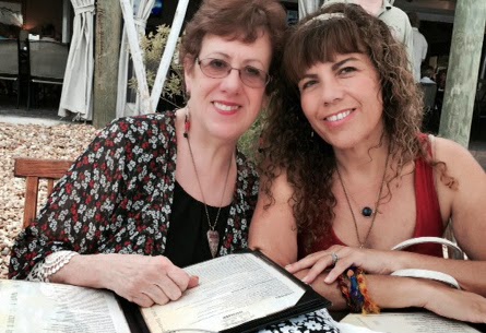
On our last night together, we headed for Snook's Bayside, hoping for good food, drinks, laughs, and the iconic Florida Keys sunset. Well, three out of four isn't so bad. All was well at our outdoor table.....


...until Mother Nature decided to act up. It's hard to tell from these pictures, but actual sheets of water came down, and if that wasn't enough, there was thunder too.


Fortunately, we watched the approaching storm and managed to get moved to an indoor (well, sort of indoor, but covered, at least) table seconds before the rain came. Did that spoil our good time? Not at all. We got home, soggy and cold, changed into dry clothing, and then this ensued.


The next day, at the airport, in the plane, waiting to leave the gate, we glanced out the window and saw this sight. The perfect way to say goodbye to south Florida. Too bad we couldn't hear the rhythm as well as see it.


Make your music wherever you are.


