Showing posts with label alcohol inks. Show all posts

Tuesday, August 27, 2013

CREATE, Belatedly

It's been six weeks since I attended classes at CREATE in Somerset NJ, and I thought it was about time I blogged a bit about my experiences there.

Let me start by saying that the classes are every bit as wonderful as those I've taken at other retreats (many of the same teachers, so no surprise there), it's the venue that was sorely lacking.  A hotel in the middle of nowhere, horribly understaffed, and in desperate need of a major renovation.  Few dining choices, and even fewer if you don't have a car.  My room was fine, but the hallways had NO air conditioning, and the event was held at the height of our July heat wave.  The classrooms all had their own problems too.....too hot, too cold, poor lighting, not large enough.  You get the picture.  I hope that if CREATE is held on the east coast again next year, that the organizers wise up and choose a better location. 

Enough of that.  I took four classes and loved three.  I consider that a win.  The first class was painting on yupo paper with alcohol inks, led by Cathy Taylor.  What a revelation!  Sure, I've worked with AIs before, but not the way Cathy does, and I learned so much from her.  As for the yupo paper, it's not really paper at all, but a plastic product.  It was actually designed for watercoloring, but Cathy discovered the magic that occurs when it is combined with AIs. 

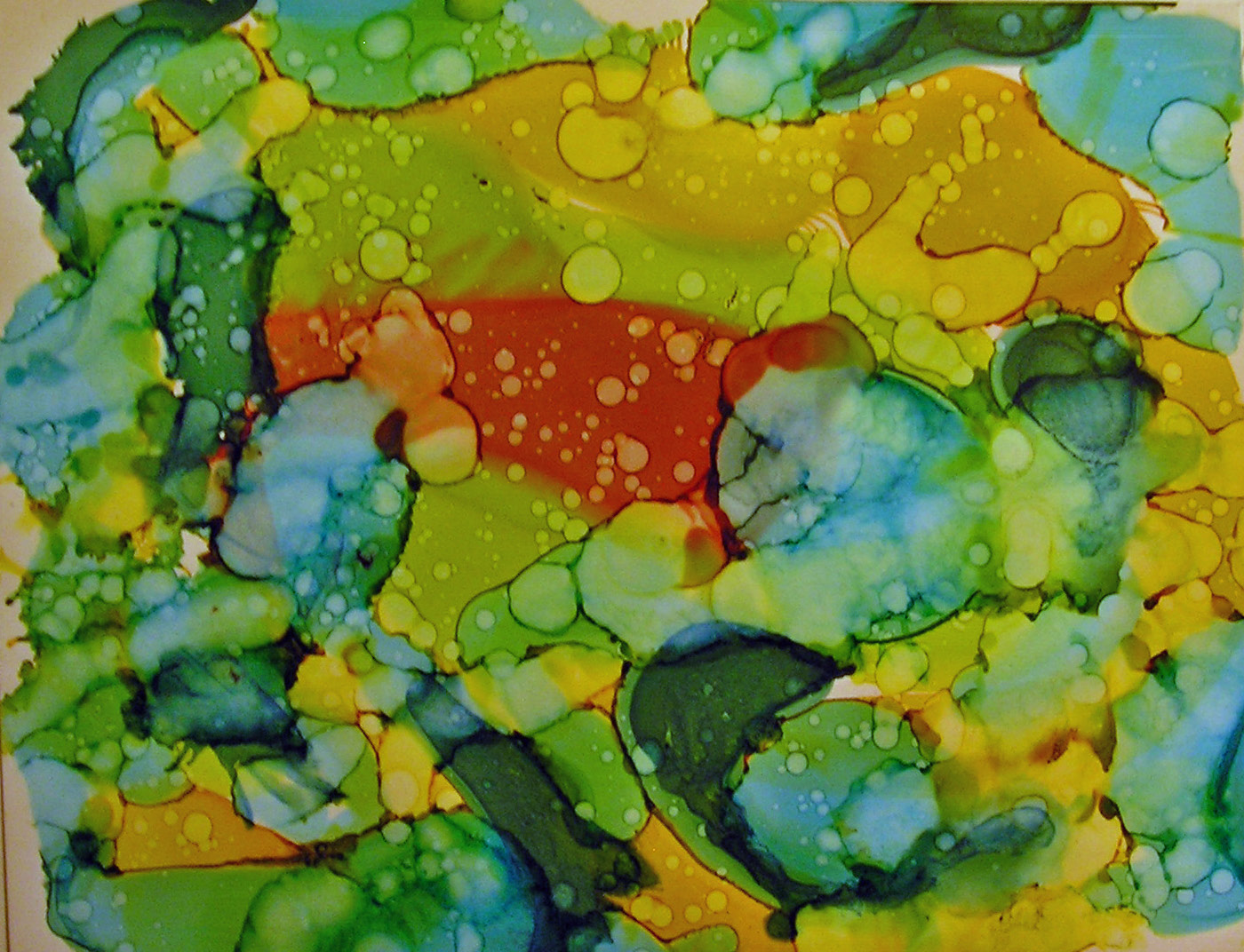
Cathy demonstrated several techniques....blowing the inks on the paper through a drinking straw was one.  Also, making the inks move around on the yupo by dropping rubbing alcohol (91%) on them.  She encouraged us to spend some time just experimenting with these techniques.  Here are some of my efforts.


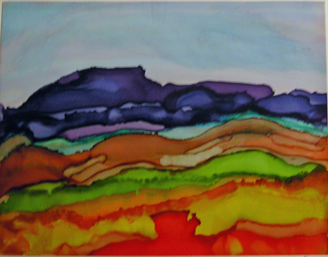
We learned how to control the inks enough to create a landscape design.


And how to incorporate stencils into the mix.


Actually getting recognizable images (my flowers are outlined with a micron pen).


This is one of my favorites.  I lifted the yupo off the table, and held it on an angle, and dripped different colors down the page, not overlapping any of them.  Then I filled in the blank spaces with black AI.  I had no idea if the black would migrate into the colors and result in a bunch of mud, but I took a chance, and look how it turned out.


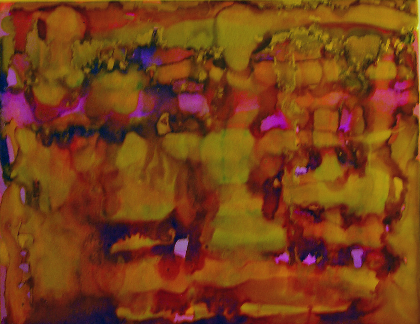
Cathy also shared with us a technique using gold AI (the Jacquard Pinata brand).  Apparently it doesn't work with the Ranger brand.  A small amount was applied around a color and it sort of surrounds the color as though it had been painted in.  Hard to describe, and sadly, does not come through well in this photo, but believe me, it looked spectacular in person.


This was day one.  I'll blog about the other classes when  a)I actually finish one of the projects and  b)I photograph it.  It's been that kind of summer.  :)


Tuesday, March 26, 2013

Eclectic Vintage Gentlemen

The title refers to the theme of Stephen's book in the Kindred Souls round robin.  NOT to my social life.  The book was waiting for me when I returned home from Key Largo, and in between posting about the retreat, I worked on my page for him.

The pages that were already done were so interesting and different (eclectic is the right word!).  I had an idea of what I wanted to do, and for a change it didn't take me too long to figure out how to accomplish it.  I wanted a steampunk feel and a bit of humor.  Oh, and it had to be easy to look at too.

So, here are the brothers Boeing, imaginary founders of Boeing aircraft, in the early days of air travel.


The background started with paper from Graphic 45's Steampunk Debutante line.  I liked all the hot air balloons on it, but the paper was very dark.  I lightened it up by scraping some Ranger picket fence distress paint over it with an old credit  card.  It was then light enough to add some stamping, stenciling, paint splattering, embossing, and so on.

The three gents are from a Tim Holtz stamp (embossed with walnut stain distress embossing powder). I did have to cut them apart and squish them together again to fit them into the basket.  Also from Tim is the compass (embossed with black powder), as well as the small images on the bottom right and the two balloons on the upper left. (All from the new Tiny Things stamp set).
The balloon carrying the brothers off is from Oxford Impressions, stamped on glossy paper, embossed with black powder, and colored with a variety of alcohol inks.  There are also some other balloons from Oxford Impressions, but I'm not sure if you can see them.  Both the balloon and basket are raised up off the page; the basket with pop dots and the balloon with a wiggly springy thingy.  It bobbles when you touch it!


The metal scallop border is by 7 Gypsies.  The balloon's basket is from me.  I just cut a shape, covered it with some scraps from my gelli plate print pile, and added some gold embossing.  The ticket on the top is also one of Tim's stamps.  Oh, and there is a tiny compass glued to the center of the compass stamp.  There are also two air travel related charms dangling from the page that you can't see much of in the photo.

The back of the page in this round robin is supposed to be finished, not highly decorated, and contain our information.  On the page Stephen did, he put Laurel and Hardy on the back, and everyone who followed did the same.  Who am I to argue with success?  I found an image from a film in which the funny men flew a plane.  Perfect!  And you can still see most of the Graphic 45 paper I used underneath.


If Stephen likes this even half as much as I enjoyed making it, I'll be satisfied.


Monday, March 25, 2013

Keys4Art 2013, Part III

MORE PROJECTS
 
 
Daisy showed us a lovely technique using alcohol inks.  A picture was stamped on glossy paper and heat embossed with black powder.  This created "wells" that allowed us to paint with the inks without them straying into other areas. 
 
This one I will probably use on a card or an art journal page.
 

These two I put directly into the little journal we worked on at the retreat.  More about that soon.
 
 
Jacquie taught a quick lesson on using plaster embedded gauze to create wonderful textures.  We made journal covers.  Some of my very industrious friends actually used them and made wonderful journals with exposed spine bindings.  Me, I just have these two covers.  Someday....
 
 
ROAD TRIP
 
One afternoon we took a break and drove south to Islamorada, where the Lazy Days restaurant is located.  Last year we stopped there on our way back from Key West, and I ate the best lobster sandwich I've ever had.  I have been thinking about it for a year, so we took a road trip to get it again. And I wasn't disappointed.  One of the best sandwiches of any kind I've ever had.


On the way back from lunch we couldn't help but notice this rather large crustacean, drawing people into a mall of both touristy crap and very beautiful pieces made by local artists.


And I couldn't help but notice that there was something odd  unusual  sexual  interesting (?) about this tree trunk.


Poor Teri; she didn't have a clue what was happening on the other side of the tree, but we talked her into this pose. 


And mind you, sticking out her tongue was all her idea.  I swear.
 
 
BACK AT THE HOUSE


One of the gifts we received from Elena wss a smallish Maya Road chipboard album, and in between classes and mojitos (a big shout out to both Jen and Karen who were always ready to mix us up some cocktails) we worked on the album.  In fact, mine was nearly finished; all I had to do when I got home was add some photos.
 
See how great the key from the pillow fairies looks on the front cover! (Fleur de lis stencil is one of my favorites, by Michelle Ward for Stencil Girl).
 
 
The Hebrew lettering stencil on the back cover is also a Stencil Girl product.


This is the inside front cover.  Some gelli plate prints, pieces of a decorative napkin, and a Dyan Reaveley stencil.


The last gift the pillow fairies left was a decorated letter sized envelope.  I deconstructed, then reconstructed it to fit on the inside back cover, and it now holds all the small memorabilia that I didn't have room for within the journal.
 
 
Here it is, Keys4Art 2013 in a nutshell.


I think I have enough random pix to warrant a fourth installment.  Stay tuned.....


Sunday, October 14, 2012

Happy Autumn!

This is definitely my favorite time of the year; I love a typical autumn day in NYC when the skies are blue, the air feels crisp, and there isn't even a hint of humidity to cause hair problems.
I have been keeping up with Tim Holtz's 12 Tags of 2012, and as expected, his October tag is all about Halloween.  I know so many people who are into that holiday, including Tim, and try as I might, it just isn't my thing.  Autumn, however, is right up my alley.  So, my entry sort of nods at Halloween, but is really about the season.  And, it's not even a tag.

Another favorite regular challenge I like to participate in is the Making Art Challenge over at the Wendy Vecchi yahoo group.  Wendy did an autumn tag recently that was featured on the Ranger website, and our challenge was to use the featured technique (adhering sticky back canvas to Wendy's Clearly For Art) and at least one of Wendy's stamps in any sort of creation.

So.....I combined the two, tried several of the techniques Tim used, and the sticky back canvas/CFA technique Wendy used, and came up with this:


Tim demonstrated making custom colored glitter with the new rock candy dry glitter and alcohol inks.  I don't have any of that product (yet), so used what I did have.....some chunky glitter, and it sure didn't work the way Tim's did, LOL.  But I love taking part in these artistic science experiments.  The larger of the two jack-o-lanterns is covered with my version.  I glittered the smaller one with plain old orange just to show the difference.  When I get some of the rock candy stuff I'll be trying that again.  BTW, the jack-o-lanterns and letters are grungeboard, from two of the many sets of pre-cut shapes I have in my stash.  I don't know if they are manufactured any more; they date back to the days before the Vagabond and Tim's Sizzix dies.  But being a good hoarder collector, I still have tons of them.
 
The tissue paper background is straight out of Tim's demo, but over top I used Wendy's background stamp from Optical Art.  On the bottom left you will see her little spider stamp from Botanical Art.  To make it stand out a bit more, I used black soot distress ink and black embossing powder.
 
All of the autumn leaves were done on the canvas covered CFA.  For those who don't know, Clearly For Art is a wonderful product (some sort of plastic, I think) that can be heated to make it bendable.  Yes, lots of products do that.  But the cool thing about CFA is that it can be heated, manipulated, then reheated if you don't like it.  It goes flat again, hardens up in seconds, and can be heated and shaped that way countless times. 
 
I cut the leaves from both the regular sized and mini tattered leaves dies, and colored them with both distress stains and Dylusions sprays.  Although they don't match up exactly, I also stamped over the colored leaves with Tim's Falling Leaves stamp set.  I used black archival ink for that, and didn't press too hard.  I just wanted a hint of the leaf veins to add some texture and realism. 
 
Happy Autumn!