Showing posts with label Making Art Challenge. Show all posts

Sunday, October 14, 2012

Happy Autumn!

This is definitely my favorite time of the year; I love a typical autumn day in NYC when the skies are blue, the air feels crisp, and there isn't even a hint of humidity to cause hair problems.
I have been keeping up with Tim Holtz's 12 Tags of 2012, and as expected, his October tag is all about Halloween.  I know so many people who are into that holiday, including Tim, and try as I might, it just isn't my thing.  Autumn, however, is right up my alley.  So, my entry sort of nods at Halloween, but is really about the season.  And, it's not even a tag.

Another favorite regular challenge I like to participate in is the Making Art Challenge over at the Wendy Vecchi yahoo group.  Wendy did an autumn tag recently that was featured on the Ranger website, and our challenge was to use the featured technique (adhering sticky back canvas to Wendy's Clearly For Art) and at least one of Wendy's stamps in any sort of creation.

So.....I combined the two, tried several of the techniques Tim used, and the sticky back canvas/CFA technique Wendy used, and came up with this:


Tim demonstrated making custom colored glitter with the new rock candy dry glitter and alcohol inks.  I don't have any of that product (yet), so used what I did have.....some chunky glitter, and it sure didn't work the way Tim's did, LOL.  But I love taking part in these artistic science experiments.  The larger of the two jack-o-lanterns is covered with my version.  I glittered the smaller one with plain old orange just to show the difference.  When I get some of the rock candy stuff I'll be trying that again.  BTW, the jack-o-lanterns and letters are grungeboard, from two of the many sets of pre-cut shapes I have in my stash.  I don't know if they are manufactured any more; they date back to the days before the Vagabond and Tim's Sizzix dies.  But being a good hoarder collector, I still have tons of them.
 
The tissue paper background is straight out of Tim's demo, but over top I used Wendy's background stamp from Optical Art.  On the bottom left you will see her little spider stamp from Botanical Art.  To make it stand out a bit more, I used black soot distress ink and black embossing powder.
 
All of the autumn leaves were done on the canvas covered CFA.  For those who don't know, Clearly For Art is a wonderful product (some sort of plastic, I think) that can be heated to make it bendable.  Yes, lots of products do that.  But the cool thing about CFA is that it can be heated, manipulated, then reheated if you don't like it.  It goes flat again, hardens up in seconds, and can be heated and shaped that way countless times. 
 
I cut the leaves from both the regular sized and mini tattered leaves dies, and colored them with both distress stains and Dylusions sprays.  Although they don't match up exactly, I also stamped over the colored leaves with Tim's Falling Leaves stamp set.  I used black archival ink for that, and didn't press too hard.  I just wanted a hint of the leaf veins to add some texture and realism. 
 
Happy Autumn!


Wednesday, June 13, 2012

Layers Without Lumps

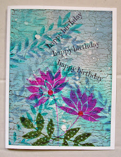
I love texture and layers and layers of embellishments as much as the next person, but sometimes (like when I want to send a birthday card without the extra cost of a padded envelope and additional postage) flat works best.  But it should only be flat, not look flat.

Just the other day I bought some masking fluid.  I know I made that purchase for a particular reason, but for the life of me can't remember exactly what the project was or where I saw it.  Sigh, story of my life.  Anyway, the universe decided to be nice to me today, and Splitcoast Stampers has a new tutorial on layering with masking fluid.  Bingo!  Rather than me trying to explain the technique, click on the link above and see for yourself.  It really is an easy way to create a richly layered look without adding a whole lot of bulk.

I was in the middle of working on a birthday card using this technique when I decided to take a break and check my email.  And once again, the universe was kind to me.  I'd been using rather bright colors on my card, and there, in my inbox, was a note from Lori, list mom of Everything Wendy Vecchi, announcing the new challenge......create something, use Wendy's stamps, and bright colors.  Bingo again.

Here's what my background looked like, after following the tutorial directions.


Except for the old wood background (a Stampin' Up stamp, stamped with coffee archival ink) all the stamping up to this point was done with one Wendy stamp (the leafy border stamp from It's Face Art) and several distress ink colors (broken china, faded jeans, peacock feathers and weathered wood).

Next step, some additional stamping.


The flower is from Wendy's Botanical Art set (I just stamped the flower, eliminating the leaves) stamped with magenta hue archival ink.  I decided to add leaves from another set (Nature's Art), and used olive archival ink.

Last step, adding the birthday wishes and just a tiny bit of bling.  Couldn't resist, but the sparklies don't add any real bulk, so I still consider this to be a flat piece.  That's my story, and I'm sticking to it.


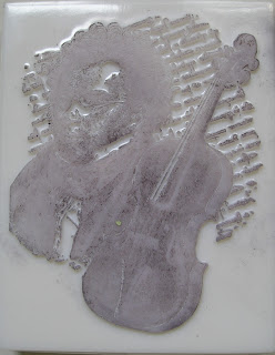
I recently received an order from one of the very best stores in the world, Absolutely Everything.  Patti, who fills all the orders always includes some extras, and not any cheapo ones either.  In that order I received this wonderful LaBlanche stamp:


These stamps are like no others.  They aren't rubber or acrylic, but are made of silicone.  They are definitely odd looking, but they stamp like a dream.  Here's what the stamping side looks like.


I used this stamp to make a birthday card for a musician friend.  All I had to do was add a bit of color, which I did with distress inks and markers.  Again, not a bit of bulk, but the stamp is so detailed and beautiful I think it doesn't really need any extra embellishing.


In addition to these two cards today I did something I've been wanting to do for some time.  I removed my large Stampin' Up background stamps from their wood mounts.  They were just taking up too much space.  I definitely feel I've accomplished a lot, so it is time to reward myself with some time on the couch and a few NCIS reruns.  What can I tell you?  Love me some Mark Harmon.

Wednesday, June 6, 2012

Tagathon, and more

I've been in a tag making mood this week.  Normally, when it comes to challenges I like to try to qualify for as many as possible with one piece, but for some reason, this week was different.

Tim's June tag for The 12 Tags of 2012 featured the technique of tinting photos with distress markers.  You can see his tag HERE.  My take is oddly romantic and feminine, a departure from my usual style.  Hey, I sit down and something inside me tells me what colors to grab and I take it from there.  My motto (well, one of many) is don't argue with the muse.  The muse doesn't like that and will retaliate by leaving you. 


The image I chose to tint is one I found ages ago on the internet.  The stamps are from a set by Darcie's that I've had for a while and never used. 


Over at the Everything Wendy Vecchi yahoo group, the current challenge is based on the piece on page 28 of Wendy's third book.  The deal is, create something that contains three circles and two hearts (and of course, at least one of Wendy's stamps).  I hope Lori meant AT LEAST three circles and not JUST three circles because I went a little circle happy.


The large circles in the background were done with a Crafter's Workshop stencil and a Dylusions spray, but everything else is a Wendy stamp.  In addition to the stamping, I punched several holes in the tag and then backed the tag with green paper.  Some of the circles were outlined with a black glaze pen, and some were also filled with glossy accents.  The hearts were accented with a white gel pen.


My third tag of the week is for the Simon Says Stamp and Show challenge, and the theme is texture. 


The tag itself has texture from a Cuttlebug embossing folder called clockworks.  Some antique linen distress crackle paint was applied kind of randomly on the right side and bottom of the tag for another kind of texture.  The gears were cut with Tim's steampunk on the edge die from a scrap of black cardstock that already had some embossing on it.....more texture.  The wire strung with tiny springs and fastened with the little staples in the tiny attacher is yet another layer of texture.  The small tag on the top (actually part of the packaging from grungeboard sets) has a suede feel to it, so more texture.  And last of all, the man (a Wendy stamp) was highlighted with both white and black glaze pens for even more.


That's it for the tags.  Remember my beaded cuff bracelet?  Sure you do.  If not, here it is again.


The other thing I was busy with this week was figuring out how to make a pair of beaded cabachon earrings.  I didn't have any pattern or directions to follow, and really winged it on the edging, but all in all, I think they're wearable.  I had planned to add some dangly things, but ran out of steam.  Well, I CAN go back and do that someday.


I just realized that I have no tag for the current Compendium of Curiosities 2 challenge.  Now, how did I miss that????  

Sunday, May 20, 2012

Another Two-Fer

Before I get into today's challenge(s) piece, I just noticed that my last blog post was my 600th.  And I wonder why my laundry never gets done.  Who knew?  Well, here's to having the right priorities, and onward to the next 600 posts. 

This week's Compendium of Curiosities 2 challenge can be found on page 38 of Tim's second book.  It is called Tissue Wrap Collage, and I'm sure you'll enjoy it as much as I have.  As an added bonus, The Funkie Junkie's Boutique is the sponsor, so there is a chance of winning a gift certificate.  Just sayin'.

When Linda announced the challenge I already had an (unexecuted) idea for the current Make Art! challenge on the Wendy Vecchi yahoo group, so I used the tissue wrap technique for my background and some Wendy stamps for the rest.  The challenge there was to make a tag and include a house.

So, here is my tag, ready to go out to the next person I know who is moving to a new home. 


Tim's Branch Tree die (cut from grungeboard) is what I used for the tissue wrap collage.  With a little snipping, I transformed Wendy's Art Market stamp (from the Destination Art set) into a pickup truck, hauling a house (which is also a Wendy stamp (from the Homemade Art set), also edited somewhat.  Both pieces were stamped with archival black ink on scraps of manila tag, and colored with distress markers.


Monday, May 14, 2012

Two Projects, Three Challenges, and a Cool Technique

I know I said no more challenges or swaps until I finished some old projects, but I couldn't resist this month's tag in Tim's 12 Tags of 2012.  It features the beautiful faux porcelain technique, and it found me in the mood to haul out the melt pot.

I don't like copying Tim's tags exactly, so I just concentrate on the techniques, and my tag includes the faux porcelain flowers (I also used Primas, plus some others found in my stash), as well as the tissue paper background.  Instead of a spool, I placed my bouquet in one of Wendy Vecchi's art parts....the flower pot, which was gessoed, inked with the new peacock feathers distress ink, dusty concord and (also new) shaded lilac.  It was then stamped with one of Wendy's fab backgrounds with berry purple archival ink.


The sentiment is a Wendy stamp.  Next, a close up of the flowers.  The small ones started out purple, but the others were white, and I tinted them with two of the new distress inks.....shaded lilac and squeezed lemonade (which is a great yellow) before dipping them in the melted UTEE.  Please click on the link to Tim's blog (above) to see the step by step details for this technique.


Since digging out the melt pot and actually using it is not an everyday event around here, I wound up making way more flowers than I needed, so I thought this would be a great opportunity to participate in the current challenge over at the Wendy yahoo group.  The theme is ATCs and the only rule, other than sticking to the theme is to use at least one of Wendy's stamps.  I did that, and more, and also included more art parts than you'd think would fit on a 2 1/2 x 3 1/2" piece.


The scallops, leaves and vase are all art parts.  Actually the vase started out in life as the base for a lamp, but I easily sliced off the lampshade.  I used pretty much the same colors on it as I did on the flower pot and added a dusting of lemon sparkle perfect pearls (which goes so well with the touches of squeezed lemonade distress ink I used throughout the ATC. 

I tried faux porcelain flowers once before with less success.  The difference this time, I think, is that I really filled the melt pot with UTEE.  It works much better if you can actually submerge the flowers into the UTEE.  It still requires a little finesse, and Tim's blog has some helpful hints,.

As luck would have it, this week's challenge at Simon Says Stamp and Show is "anything goes."  So, I'm submitting the ATC there as well.

And now, back to working on some of my unfinished "masterpieces," LOL.


Thursday, April 12, 2012

A Perfect Pair

What makes a perfect pair?  Well, today I'm talking about a Tim technique paired with some Wendy Vecchi stamps.  The current Simon Says Stamp and Show challenge is to make something featuring one of Tim's techniques.  I took one of my favorites from his online Creative Chemistry class...alcohol ink agates...and filled an entire 8 1/2 x 11" sheet with it.  I think if you're going to the trouble of doing a background, you may as well do it BIG and have lots on hand for future projects.  As I'm in need of a bunch of greeting cards, I cut the background up and used them for that purpose. 

Here is my entry for the challenge, a birthday card for my brother. Cards for men always give me pause, but Wendy's "serious" man (from the Serious Art set) works well.


Besides the "serious" stamp, I used the number background from Wendy's Dimensional Rose Art set, and the polka dots, which are also from the Seriously Art set.

Inside the card is the sentiment from Card Art Essentials, which you will see in the next card. 

Speaking of challenges, over at the Wendy yahoo group, our challenge is inspired by the piece on page 38 of Wendy's third book.  We're to do something that includes two eyes and a hand. 


The eyes come from the An Eye For Art set, and the hand is from Mail Art.  The sentiment you already know about; I've been using it a lot lately on my birthday cards.

Like I said before, I cut my original background into several pieces, and here are a few more cards.  These have no sentiments yet, though I did leave room on the bottoms for that.  You'll see the large weeds from Well Worn Art, the smaller ones from Botanical Art, and a swirly flower, also from Botanical Art.  Plus some twine and a little bling.


Oh, and I have to share something I discovered while making these cards.  I screwed up the stamping (archival ink, by the way) on one and really felt terrible about tossing it, so I tried something I'd never done before.  I swiped it with Stazon stamp cleaner and guess what?  It removed the archival ink but left the alcohol ink background untouched.  How cool is that?

One more card, not from the above group.  The background has distress inks, sprays, picket fence stain, patterned tissue paper, and some stamps by Wendy (those weeds again....love 'em! and the birthday sentiment too) and Tim (the splatter stamp from Urban Tapestry, and the curved floral spray from Fairy Tale Frenzy).


And you know what starts tomorrow.......can't wait......the first challenge from Tim's Compendium of Curiosities II.  Head on over to Linda Ledbetter's blog to get the scoop.

Wednesday, January 18, 2012

33 Is A Good Number

This week marks both the 33rd Grungy Monday challenge and the 33rd Making Art Wendy style challenge over at the Wendy Vecchi  yahoo group.

The GM challenge is to use the technique that Tim showed us on his blog back in August of 2008.  This particular technique has also appeared in this year's 12 Tags of Christmas, and if I'm not mistaken, in a past 12 Tags as well.  It involves fragments, alcohol inks, archival ink, and for most of us, a good deal of finger crossing.  A true challenge, but when it works, it rocks.

I used a large oval fragment and decided to use it as embellishment on a card.  Not sure yet what occasion the card will celebrate or who will receive it, but I think it turned out pretty good.


I used the script stamp from Tim's reflections set, so with this technique it shows up the right way, not backwards.  The oval fragment fits perfectly in the center of the fancy frame embossing folder, and I did that on glossy cardstock.  I don't think I've ever embossed on this paper before, and I love the way it looks.  It's important to use white paper with the fragment so that the technique really pops.  The embellishments on top of the fragment (attached with glossy accents) are from pink paislee.  Here's a sideways shot so you can see the dimensionality.


The Wendy challenge also involves a Tim technique....this one from tag #2 of this year's 12 Tags.  We're to use the kraft resist technique and some sticky back canvas and Wendy's stamps.  I created my own Wendy kraft resist paper by using her lace background stamp, clear ink and embossing powder on plain kraft paper.  For the canvas part, I stamped two of Wendy's flowers on the canvas, colored them, frayed the edges, and popped them on the background.  Quite a bit of perfect pearls mists were involved.  Oh, and I forgot to mention, I did this on 4x6 light chipboard, and it will be a postcard.


Sunday, November 27, 2011

My Attitude Is.....

.....Gratitude!   I have a lot on my plate lately (and unfortunately I'm not talking turkey here), so I do sometimes have to remind myself that there are still so many reasons to be grateful.  And those thoughts inspired this piece for the current Making Art challenge at the Everything Wendy Vecchi yahoo group.

Lori asked us to use at least one of Wendy's art parts, at least one of her stamps, and to stay with the Thanksgiving/autumn theme.  I worked on and off all day today, and came up with this:


The base is from the Artful Shrines art parts package.  It is covered with some Prima paper over which I used the background stamp (burlap, I think) from Funky Flower Art, as well as the weeds from Well Worn Art.

Here's a closer look at the fence:


It comes from the Outdoor Art art parts set.  I have some distress crackle paint from a Ranger Warehouse sale that was unlabeled.  I think they are broken china and antique linen, and I globbed them on very heavily, allowed it to air dry, then went over the whole thing with vintage photo distress ink.  (The bird, by the way, is from a Sizzix decorative strip die called Birds and Branches.  The branches can be seen on the top of the piece).

The garland of leaves were cut from shrink plastic with Tim's Tattered Leaves die, colored with both plain and metallic markers, then strung on twine after shrinking.

I used the round flower from Lower Case Art to make the pumpkin, stamping and cutting it three times, and gluing parts down on top of each other to make it dimensional.   Then I gave it a good spray with some Perfect Pearls mist.


The sentiment was done on the computer, and it is how I feel.  Today.


Monday, October 24, 2011

Two Hearts, One Color

This morning I worked on two challenges, the current Making Art challenge at the Wendy Vecchi yahoo group, and the Simon Says Stamp and Show challenge.

Lori, the EWV list mom, inspired us with a card Wendy did in her second book, and the only requirement was that we use two hearts.  Well, I interpreted this rather loosely to mean AT LEAST two hearts, not ONLY two hearts.  If that's not OK I'm sure Lori will send the challenge police to my house.  NOT!!   At Simon Says, we're to stamp and show......only one color.

I have a third challenge in mind, a personal one.  And that is to start cranking out some holiday cards.  So, from now on, whenever I decide to enter a challenge, my piece will be such a card.  And here it is:


My one color, obviously, is green.  The background paper (7 Gypsies, by the way) seems to have photographed somewhat brown, but green it is.

Do you recognize that I created a wreath?  I hope so, LOL.  I just stamped a bunch of hearts in every distress ink shade of green around a circle.  The heart is from Wendy's In Love With Art set, and I added a bunch of dots with patina Stickles.   The sentiment is from Card Art Essentials, stamped on white cardstock with olive archival ink.  Peeled Paint distress ink was blended over top, and it is mounted with pop dots to give it some lift. 

Oh, and in the center of the wreath, some dark green ribbon from my stash.

Don't tell the folks at Simon Says, but I think before I actually send out the card I'll add just a bit of red.  :)


Sunday, September 18, 2011

More Inspiration Showcase AND Another Wendified Steampunk Tag

Another early morning with Jennifer McGuire's wonderful Inspiration Showcase online class.  The last time I was so eager to see the new project and get going was during Tim Holtz's 12 Tags of Christmas, 2010.  Yep, I'm liking this THAT much.

Today Jennifer focused on stamping with other than ink and/or stamping on other than paper.  Here are my samples.

 stamping with markers

 stamping on canvas and stamping on vellum (wing)

 stamping with paint and paint texture (wing)

 painting with markers (my favorite, I think)

stamping on acetate and bonus rolled canvas rose technique


Meanwhile, I'm not neglecting my other favorite places to hang out online.  Over at the EWV (Everything Wendy Vecchi) yahoo group, list mom Lori announced the latest Making Art! challenge.  Well, she announced it last week, but I completed my piece yesterday.  The challenge is based on the project on page 27 of Wendy's second book, but if you don't have it, all you need to know is that you should include a face and polka dots.  Since I'm in the steampunk tag swap over at ATT, I fulfilled this challenge with just that.  I think it's a fun piece.


They're subtle, but there are polka dots in the background, achieved with one of the techniques from the Inspiration Showcase classes. And the dots came from a Wendy stamp.   The gears on the left are on an Oxford Impressions stamp, and (mostly hidden) is a very cool stamp I bought at Absolutely Everything last year, but sadly, I have no idea who makes it.  The gears are both grungepaper, cut with Tim's mini mover and shaper dies and from the idea-ology line.  More polka dots made with glaze pens.

But the star of this show has got to be art chick from Wendy's Art Rules set.  I did alter her up a bit.  First of all I gave her a big hat, which is often seen in steampunk images.  I just cut it freehand from some scrapbook paper, my intention being to use it as is.  It is a great paper with embossed gears from DCWV, but it didn't pop with the background, so I covered it with clear embossing ink and black embossing powder and that did the trick.  I also enhanced parts of her face with glaze pens.    More polka dots on the hat, and another of those birds I did yesterday when following along with Tim's technique on the Inspiration Showcase class.

Monday, September 12, 2011

Steampunk, Wendified

I can picture anyone new to this blog going, "huh?"  Well, in my world, Wendifying a theme just means using Wendy Vecchi's stamps to execute it.  It took me almost a week to create something for the current Making Art! challenge at EWV, but as it turns out, the delay worked in my favor, because the piece I did works perfectly with the new Simon Says Stamp and Show challenge.

The challenges:  at EWV, Lori says, make a tag and use stamps from no more than two of Wendy's sets; and Simon Says, show us some steampunk.

And here is my piece:


For the background, I ran one of Ranger's new (and fabulous) kraft tags through my Vagabond in Tim's steampunk embossing folder, and hit the high points with several distress inks....rusty hinge, vintage photo, and black soot.

The gears on the side were cut with Tim's on-the-edge die from grungepaper.  I painted it black, and when that was dry I dabbed it with brown and copper acrylic paint, very randomly so it looked like bits of rust.  And when that was dry, I covered the whole thing with a thick coat of rock candy crackle paint.  It is attached to the tag with glossy accents, applied only to the edge, so the gears sort of stand away from the tag and have a lot of dimension. (Especially since impatiently blasting the poor sucker with my heat gun made it kind of wonky.....sort of adds to the vintage charm, I think.  Well, that's my story and I'm stickin' to it.)

The steampunkish man and the words are all from Wendy's set Seriously Art, stamped on plain old white cardstock with black archival ink, then lightly colored with distress inks.  Mr. Serious got some enhancement (the shiny parts) with a black Sakura glaze pen....one of my most favorite art supplies, by the way.

The pointing hand (stamped on grungepaper with clear ink and embossed with black powder) is from another Wendy set, Mail Art.

By the way, the word seriously is actually part of the stamp of the man.....it appears right below the image.  I cut it off so it would fit on the brim of his hat instead.  It's always good to find variations when it comes to using your stamps.

Thursday, August 11, 2011

On The Borderline

This week's Making Art! challenge over at the EWV (Everything Wendy Vecchi) yahoo group was inspired by the card on page 30 of Wendy's first book.  Lori, our intrepid leader tells us we have now gone through all of that book.  Well, it is the 22nd challenge.....as Wendy would say, "yikes!"

For those who'd like to join in, but haven't been able to locate that out of print book (but I think Absolutely Everything still has some in stock), all you need to know is this:  include at least one scallop and two borders from any of Wendy's stamp sets.   I recently was the ecstatic winner of a gorgeous new one called Sentimental Art, and was anxious to use it, and so I did.

And since I have very limited creativity time lately, I once again did mine on a 4x4 coaster so it can be used in the birthday club I'm in,


The background, stamped directly on the white coaster is the dreamy lace background stamp from my wonderful new set.  I stamped it in Ranger's magenta hue archival ink (also dreamy!), then went over the whole thing with weathered wood distress ink.  Yummy combo.

I cut one edge with Tim's scallop on the edge die.  Peeking from behind that is the paper I used on the back of the coaster, this one cut with a Stampin' Up scallop punch.   I extended it a bit to bring the measurement back to an even 4x4.

Yet another scallop was stamped on a bit of manila.  First dusty concord distress stain was applied, then deep purple archival ink was used on Wendy's polka dot border stamp.  Three scallops when only one was required.....not bad for someone who was always being called out in school for underachieving.

The aqua dotted paper (which I think is from Webster's Pages) is under my second border.  First I colored another manila scrap with chipped sapphire distress stain, then stamped it with the flower background from Alphabetically Art using manganese blue archival ink.  Yep, I do love all the new archivals.  Rich intense colors that won't run no matter how much you wet them.  Back to the border.....I used a new (but forget the name) Stampin' Up border punch and then glued it onto the dotted paper.

The "perfect day" sentiment is also from the Sentimental Art set, and a few stick pins (one I know is from Maya Road, the other, I'm not sure) were tucked in behind it.

As for the flower....it is from the It's More Flower Art set.  I stamped it in deep purple archival ink on another piece of that aqua dotted paper, then changed the color with some pink markers.  Before cutting it out, I inked the back thoroughly with that rich magenta hue so that would show when I curled the petals a bit.

In the flower center.....a great new Clearly For Art technique directly from Wendy's blog this week.  Check it out here.  I cut the top off of yet another Maya Road stick pin and glued it in the center, allowing those crazy twisty bits to kind of circle it.

Wednesday, August 3, 2011

A Two Purpose Tag and Goin' Hauntin' Revisited

Good that I waited til today to work on my Simon Says challenge piece, because it now also works for this week's Making Art! challenge on the Everything Wendy Vecchi yahoo group.

Simon Says made everyone's life easier by just asking for a tag.  At EWV we are to use the pigment ink resist technique that Wendy demoed HERE.   Well, don't ask me where this came from, but it seemed like a good idea at the time, LOL:


 I did the resist technique on the background, the band in the center, and even on the torso art part, though it's hard to see on there.  I hope that Mr. Serious man forgives me for putting his head on what is clearly a woman's form, but the proportions were just right and I couldn't help myself.  Seriously.

As for my other serious friend, Mr. Skeleton from yesterday's project......I didn't glue him down too well, and he slid.  But I kind of like his new position and think I'll leave him this way.  What do you think?  Yesterday:


Today:


Thursday, July 28, 2011

It's About Time.....

That's what it says on the front of this birthday card I made.  Well, it's not actually a card; it's a 4x4" coaster.  Why?  Well, I'm in a birthday card club and one of my very clever friends suggested that instead of making cards, (which although lovely, tend to eventually be discarded or misplaced or damaged) we each make 4x4 greetings on sturdy material so that at the end of the birthday month, each recipient will be able to put them together to form a mini birthday book.....which will surely stand the test of time better than a bunch of random cards.  I do have very smart friends.

Anyway.....whenever possible, I try to do challenge pieces that serve double or even triple duty, and I turned this week's Making Art! challenge at the Wendy Vecchi yahoo group into a birthday 4x4.  Who will get it, I don't know, but I am accumulating a nice collection of these for future use.

The challenge (#20 already!), according to list mom (and my good friend) Lori,  is to do something with a divided background......4 separate designs/colors, etc. as shown on page 12 of Wendy's first book.  Beyond that direction, just make sure you've used at least one of Wendy's stamps.  And if you're still not a member of this lively group, now is a good time to join.  Next week Wendy will be giving some cool NEW things away to list members.  I'm just sayin'........


The background was done on Claudine Hellmuth's sticky back canvas.  I first stamped four different images (Wendy's, natch) on the canvas with coffee archival ink.  When it was dry I colored each image with Tim's distress stains.....scattered straw,  bundled sage, frayed burlap, and dried marigold.....I think.  There are now so many colors of these fabulous stains it's a little hard to keep track.  Anyway, I cut them into squares slightly less than 2x2", attached them to my previously painted black coaster and then enhanced the edges with some black from a sharpie.

The clock form is an Art Part by Wendy from the Watch Parts set.  I added the winder, which is from a different Art Part set (For The Guys),  and cut the handle down a bit so it would all fit on the coaster.   Oh, and I used black distress stain to color both art parts.  When dry I dabbed the tiniest amount of autumn gold and then green patina Rub-N-Buff on them to give a nicely aged look.

When the art parts were securely attached to the background (I used Claudine's matte multi medium for that), I filled the well of the watch with Glossy Accents and just sprinkled mini watch innards from my stash inside.  BTW, I didn't mention before, but before attaching the watch form I glued some black paper behind the opening, and that is why the area behind the watch innards looks so nice and black and shiny, like patent leather.

I added a few larger watch pieces and then finished it off with some copper colored ball chain.  The sentiment, "It's About Time....." was done on the computer and printed right on some sticky back canvas.  On the back I'll finish that thought with, ".....to celebrate your birthday!" or something like that.

Sunday, July 24, 2011

A Tag, A Pendant, and A Question

I've been pretty much MIA in the Wendy Vecchi group, but this weekend I did manage to complete a piece for the current challenge over there.  If you're not yet a member, now would be a GREAT time to join, because Wendy is giving away NEW stuff from the latest CHA, both to folks who commented on her blog, and to some random members of the yahoo group.    Anyway, this week's inspiration comes from page 38 of Wendy's second book, and the directions from Lori, our fearless leader, are to include at least one of Wendy's stamps, and a bird.

I came up with this tag:


The background is some old text and a crumpled up piece of Tim's glasseine paper. The text was colored with two of the new distress stains, mustard seed and shabby shutters.  A stencil was laid on top and the whole piece was sprayed with Adirondack Color Wash, in lettuce and sunset orange.  On the glasseine side, one of Wendy's leaf stamps was done in olive archival ink.

As for the bird, it (and the leaves) are from a Stampin' Up! punch, and I punched them from some of the scrap paper that lines my spray booth.  Now doesn't that sound professional?  It's actually just a cardboard carton from a UPS delivery, but it does contain the sprays.  And by always having an assortment of scraps on the bottom, there is a never ending and always changing supply of sprayed paper in very cool (sometimes) color combinations.

After I finished, I decided that the deep pink of the bird was a bit overwhelming, but I liked the color.  My solution this time was not to alter it, but to add some more of it elsewhere on the tag.  Hence the three pink stones on the bottom.  That's an old decorating trick, sprinkling a bold color in more than one area of a room.  It works on tags too.

The next bit of art I played with this weekend is a pendant.  I used one of Tim's facets.


Can you guess what that black and white patterned paper is?  OK, I won't make you guess.  It's from the inside of a security envelope.  Are we green, or what?  The black and white dots were done with Ranger's Enamel Accents.  The dangly thingies on the top are just some baubles I made with some of the many beads in my stash of discarded, unwanted, unloved costume jewelry.  Friends, relatives and neighbors all contribute regularly to that stash and I welcome and appreciate all donations.

And now for a question:   Do you queue?  I'm in several art journal groups, I participate in many swaps and try to make something for favorite challenges every week.  There are also other things like birthday cards, presents, etc.  Often when someone in one of my groups receives a journal to work on, they mention that it has been added to the queue.  In other words, they work on things in the order in which they are received.  Others have calendars and work on projects in the order of their due dates.

I have trouble with that.  For example, there are some things that are due by the end of August.  But I've been working on the ATCs I'm making to swap on the Tim cruise in late September.  Why?  Because I got an idea and just had to go with it. 

So, I was wondering.....do you work on projects in some orderly fashion, either by date received or date due?  Or do you work on what you're inspired to work on regardless?  Do you queue?

Having said that.....I am pretty obsessive about never being late for anything, so even though I may not do things in any logical order, I do get them all done before the due date.  Just thought I should mention that, because inspiration or not, being late for something you signed up for is not a good thing.


Friday, July 1, 2011

:Leavin' Town, But Had Time For A......

......threefer!   Here are the challenges I think I've met:

Grungy MondayTim Holtz    alcohol ink techniques

Simon Says Stamp and Show:  a word

Everything Wendy Vecchi Making Art!:  red, white and blue

And here is my piece.....and a Happy Fourth of July to all!

 
For the alcohol ink technique I did the splatter, which is what you see on the bottom layer.  You're supposed to use compressed air, but I couldn't find the can in my stash, so I blew through a straw instead.  Maybe not as much fun, and I think I collapsed a lung, but it worked well enough.
 
The next layer features one of my favorite images, Lady Liberty, a Viva Las Vegas stamp.  I used a little flourish/flower stamp from Wendy Vecchi's Botanical Art set around the edges.  That stamp has always reminded me of fireworks, so it seemed appropriate.  I used two of the new archival ink colors:  vermillion and manganese blue.  That takes care of the red, white and blue portion of our program.
 
As for "show us a word,"  well, I showed a few, but used Jenni Bowlin mini stickers to spell out LIBERTY.  The sentiment on the bottom is from Wendy's Evidence of Art set.
 
And since I'm using this piece as a way of wishing you all a happy and safe Independence Day, I'm thinking I actually accomplished a fourfer, or maybe let's just call it a quad.
 
Take care, and I'll be back as soon as I can!

Thursday, June 9, 2011

Making Art! Challenge 16

The latest Making Art! challenge at the EverythingWendyVecchi yahoo group is based on a piece in her first book (page 34 to be exact), but all members can participate even if they don't have the book.  Lori (our fab list mom) says, just be sure to include at least one of Wendy's stamps, and the following elements from the original piece:  ric rac, ball chain, and a circle in a square.  Okie dokie.

As I've mentioned before, I'm in a birthday card club and we decided that this year instead of sending traditional cards we'd send 4x4 pieces.  Each person could then assemble their "cards" into a little book.....something that will be a lasting memento.  So, whenever possible, I'm doing my challenges on coasters so I'll have a supply of cards to send out for the coming months. 


First I scraped some aqua and purple metallic paint (one of my current favorite things to do) on the coaster.  When dry, I used Wendy's houndstooth background stamp over top, in black archival ink.  The smaller square on the coaster was inked with dusty concord and chipped sapphire, then overstamped (in sepia archival ink) with Wendy's number background stamp.  The flower, from Wendy's It's More Flower Art set was colored with broken china and faded jeans, and highlighted with faded jeans distress stickles.  The leaves are from Dimensional Rose Art, and were inked with peeled paint and crushed olive.  You probably can't see it clearly, but I used the distressed lines background stamp, also from It's More Flower Art on the leaves (in olive archival ink).

For the circle part of the circle on a square, I used a large bottlecap that comes with those flowery scallops.  The birthday sentiment is an old Stampin' Up stamp.  Instead of using the ball chain as a hanger, which is what I probably would have ordinarily done, I used it an an embellishment for the bottlecap, glueing it in place with Glossy Accents.  Then more GA was applied over the birthday greeting.

The ric rac speaks for itself, but I did add a few silver brads to repeat the metal in the bottlecap.  I was going to end it there, but decided the piece needed one more touch of bright green, which you can see in the flourish, embossed with Zing's leaf embossing powder.

To change the topic, I totally missed my three year blogoversary back in March, so have been looking for some other blog related milestone to celebrate.  Well, the next time I blog, it will be my 500th post!  Don't know when that will be, or what I'll do, but some sort of giveaway will be involved.  Stay tuned.

Monday, June 6, 2011

Distressing Over Tags

No, that's not a description of my current mental state, just a shortcut title combining the Grungy Monday and Simon Says challenges this week.  For GM, Linda L. says go at it with your distress inks, and at SS, Linda E. says stamp and show a tag.  Actually, this is going to be a threefer, because I need some tags for a swap that showcases masking.  So I threw some of that in too.  LOTS of distress inks found their way onto my tags, my fingers, my clothes, and probably some other places I haven't looked at yet.


I started with one of Tim's most basic distress ink techniques.....wrinkle free distressing, and used dusty concord, milled lavender, worn lipstick and tattered rose.  I then stamped the dress (I won that Impression Obsession stamp in a raffle on the Ink Pad bus trip to the W. Springfield stamp expo last Saturday.  Yea!), covered it with a mask I made of it, and restamped it so it looks like one is behind the other.  I used black archival ink for that.

Next, I covered both dresses with masks and stamped over the whole tag with a Wendy Vecchi background stamp, using one of the newest archival ink colors.....sepia.  Which is one of the (many) things I purchased at that stamp show.   To continue with the masking theme, I put two Heidi Swapp mini butterfly masks on the piece (with the dress masks still in place), and using the blending tool, covered everything with some dusty concord.  After removing the masks I decided there was too much contrast and went over the lighter areas with a little broken china.

A little rose just under the waistline was part of the stamp, and I covered it with a tiny Prima flower to add a bit of dimension.  The sentiment is another Wendy stamp and it was cut with a Stampin' Up punch.  The final touch was the beaded trim, a ton of which I scored at a very good price at the stamp show.  Thanks to my friend Heidi for pointing me in the right direction or I would have missed it.

You know, if I had one ounce of patience I would have waited until Wednesday to see what Lori's Making Art challenge theme is going to be at Everything Wendy Vecchi this week.  Maybe I could have had a fourfer.  Or should we call that a quadfer?  No matter.  I lack patience.  I couldn't wait.  So I guess I'll be making something else on Wednesday.  Hey, another excuse to ignore the growing mountain that is my laundry basket.  A good thing.


Thursday, June 2, 2011

Bling It On

Yesterday, Lori (intrepid leader of the group of Wendy Vecchians known as EWV, or....Everything Wendy Vecchi) announced this week's MakingArt! challenge.  It is based on the card on page 14 of Wendy's second book, and besides using a Wendy stamp, the only requirement is that you add some bling. 

Well, artsy chick was still on my work table, so I thought I'd use her yet again.  I also went with a card and blinging it up was no hardship.


I had a few drops of paint on my palette from another project, and rather than waste them, I sponged them on a piece of white cardstock, and this became my background. 

Using some tape right on the stamp, I masked off the flower that is usually on her head before inking it. (Don't forget to remove the inky tape before stamping.  Sounds obvious, but oh so easy to skip this crucial step).  Black archival ink was used.

The crown was done with a Cuttlebug die/embossing folder duo on a piece of paper with a metallic finish.  Some crystals finished the bling portion of the crown.  I mounted this piece on black cardstock for the card base, then added the sentiment (from Wendy's Regal Art set).  When it comes to bling, sometimes less is more and sometimes more is FABULOUS.  So I continued with some gold German scrap around the perimeter of the card.

I'm thinking this may be a birthday card, and inside it will say something like,  "may you be treated royally on your special day."  Unless something more clever hits me.


Thursday, May 26, 2011

Making Art Challenge and Another Collage

Yesterday Lori announced the next Making Art challenge over at the Wendy Vecchi yahoo group....EWV (Everything Wendy Vecchi).  If you'd like to play along with us, just join the group and you'll have plenty of inspiration from a great bunch of talented people, including Miz Vecchi herself. 

This week's challenge is based on the project on page 26 of Wendy's first book.  If you don't have the book, no worries.  Lori makes sure that anyone can join in.  All you have to include in your piece (besides at least one Wendy stamp) is an ATC in the horizontal position and a chipboard circle. 

I did another piece on a 4x4 coaster, NOT in my usual color palette, and here it is:


I had some purplish paper cut from one of the collage pieces I did at the Lynne Perrella workshop and covered the coaster with it.  Over that I stamped one of Wendy's backgrounds in clear ink and embossed it with Zing's very tropical apricot powder.  Wowza.  I think I was so happy to see sun after almost two full weeks of gray skies and lots of rain, that I needed some brightness.

The ATC itself was a textured white paper colored with distress inks (spiced marmalade and mustard seed). The words were computer generated, something I do when I can't find a rubber stamp that says what I want it to say.   As for the chipboard circle.....I used Wendy's watch case Art Part, maybe not technically chipboard, but close enough, I say. I colored it with an eggplant paint dabber, highlighted with gold paint, and attached it to the ATC.  Inside I glued some interesting paper, and a ring of microbeads and glitter (AKA Beadazzles).

Final embellishments:  some Wendy flowers and a Tim wing and butterflies on grungepaper.  The significance of the #29?  This is for an occasion, and the number is a date. 

I still can't stop talking about, and thinking about the Lynne Perrella workshop, and happily, I also can't stop creating things inspired by it.  If your name is Elena, you can stop reading right now, because the next photo is of a piece that is for you!  Those of you who know my good friend know that she LOVES the zetti style of art made famous by the very colorful and talented Teesha Moore.  While I admire that work greatly, it is not my thing, but I wanted to do a collage for Elena that kind of gave a nod towards  the style, while still remaining "me."  This is about as zetti as I can get:


It was definitely influenced by what I learned at the workshop, it's a little bit zetti and also totally Eileen.