Showing posts with label Graphic 45. Show all posts

Sunday, August 25, 2013

What's Black and Sepia and......

.....gorgeous all over?  Sox's World of Color journal (from the Kindred Souls group), that's what.  It arrived from Stephen's talented hands just two days ago, and I've already finished my page.  I was inspired by the journal itself (lace and fabric and paper and bling), as well as the pages already done.  I think that black and sepia is one of the most elegant color palettes, and I just dove right in.

First I filled my work table with everything (well, that's an exaggeration, so let's just say a lot) in my stash that supported Sox's colors, and gradually came up with a plan.  It began by covering both the front and back with different 7Gypsies tissue paper, because the patterns are printed in black on sepia paper.  Or so I thought.  It became clear that the sepia was really more like a gold, and that annoyed me.  I solved that problem by concocting a mixture of glaze medium and tan paint which toned down the gold and brought the background to a more sepia-ish look.  After that it was just a matter of layering papers, sewing them down, and adding some stenciling, stamping, and a tag as the focal point.


The tag itself is made of kraft cardstock.  The background was done by first layering on some tan, cream, and beige paints, letting that dry, then stamping (a Hero Arts background stamp) with black archival ink.  When that was good and dry a very thin layer of rock candy clear stickles was applied with a fingertip, which is what gives it a subtle sparkle.
 
The dress form was cut with Tim Holtz's Sewing Room die.  The phrase is a Wendy Vecchi stamp, and the dress form is covered with Claudine Hellmuth's sticky back canvas.


The buttons were sewn onto fabric that had been stamped with a tape measure stamp.  As for the thimble and scissors charms.....they dangle from Tim's memo pin.  They began life as a very cheap and garish looking gold, which was toned down by tapping them with a black archival ink pad.
 
The back of the page is much simpler, but there was just too much good stuff left on my table, so it was decorated a bit more than I had to.


Again, the tissue paper was treated with that glaze/paint mixture.  On top of that, archival ink (black and coffee) through two different Prima stencils.  Then I sewed on the fabric and paper that would hold a little tag.


The tag was created from some Graphic 45 embellishments, and on it, my information.


While searching for items to use, I came upon some Heidi Swapp designs printed on acrylic.  They must have been in my stash for years; she called them "clear extras".  I used a few of them.  I love it when something I bought and never used finally gets its chance.


I look forward to the next journal arriving at my door.


Monday, June 17, 2013

Air Travel

Well, you don't know what
We can find
Why don't you come with me little girl
On a magic carpet ride
 
 
The lyrics from that Steppenwolf classic stayed in my head the entire time I was working on this page.  Dating myself, aren't I?
 
I had the entire weekend to do my page for Sox's book in the Kindred Souls round robin.  Her theme is air travel, the time period, late nineteenth century, and her preference is steampunk.  Naturally, images of zeppelins, hot air balloons and the like immediately came to mind, but I wanted to do something a little different.  So I put Sox's heroine, Magdalena, on a magic carpet as she comes in for a landing in Persia.


The background was mainly done with stencils that I thought supported my location.  I found the carpet image and buildings online.  My Magdalena is from Graphic 45's Steampunk Debutante collection, and I enhanced her hair with some tiny watch parts.


The satchel was constructed from grungepaper, inked with walnut stain distress ink.  Some faux stitching, the strap, the slide and the "hardware" made with dots from a glaze pen, finish it off.  I think it looks like leather.  Oh, and that's an old map of Persia peeking out of the outside pocket.
 
That same map, only larger, covers the back of the page.  I stenciled over part of it with black and gold paint, and used that area for my information.


Let's see......according to the artists that preceded me, Magdalena has also been to Cuba, London, Paris, and the far east.  I wonder where she'll turn up next......and how she'll get there.
 
On an unrelated note, I may be missing for a few days.  On Wednesday I'm flying down to North Carolina where I'm meeting up with my pals Elena and Jacquie for a long weekend workshop with DJ Petit at Donna Downey's studio.  I have wanted to take a class with DJ for ages, and to be able to AND hang with my Florida peeps.....priceless!


Tuesday, March 26, 2013

Eclectic Vintage Gentlemen

The title refers to the theme of Stephen's book in the Kindred Souls round robin.  NOT to my social life.  The book was waiting for me when I returned home from Key Largo, and in between posting about the retreat, I worked on my page for him.

The pages that were already done were so interesting and different (eclectic is the right word!).  I had an idea of what I wanted to do, and for a change it didn't take me too long to figure out how to accomplish it.  I wanted a steampunk feel and a bit of humor.  Oh, and it had to be easy to look at too.

So, here are the brothers Boeing, imaginary founders of Boeing aircraft, in the early days of air travel.


The background started with paper from Graphic 45's Steampunk Debutante line.  I liked all the hot air balloons on it, but the paper was very dark.  I lightened it up by scraping some Ranger picket fence distress paint over it with an old credit  card.  It was then light enough to add some stamping, stenciling, paint splattering, embossing, and so on.

The three gents are from a Tim Holtz stamp (embossed with walnut stain distress embossing powder). I did have to cut them apart and squish them together again to fit them into the basket.  Also from Tim is the compass (embossed with black powder), as well as the small images on the bottom right and the two balloons on the upper left. (All from the new Tiny Things stamp set).
The balloon carrying the brothers off is from Oxford Impressions, stamped on glossy paper, embossed with black powder, and colored with a variety of alcohol inks.  There are also some other balloons from Oxford Impressions, but I'm not sure if you can see them.  Both the balloon and basket are raised up off the page; the basket with pop dots and the balloon with a wiggly springy thingy.  It bobbles when you touch it!


The metal scallop border is by 7 Gypsies.  The balloon's basket is from me.  I just cut a shape, covered it with some scraps from my gelli plate print pile, and added some gold embossing.  The ticket on the top is also one of Tim's stamps.  Oh, and there is a tiny compass glued to the center of the compass stamp.  There are also two air travel related charms dangling from the page that you can't see much of in the photo.

The back of the page in this round robin is supposed to be finished, not highly decorated, and contain our information.  On the page Stephen did, he put Laurel and Hardy on the back, and everyone who followed did the same.  Who am I to argue with success?  I found an image from a film in which the funny men flew a plane.  Perfect!  And you can still see most of the Graphic 45 paper I used underneath.


If Stephen likes this even half as much as I enjoyed making it, I'll be satisfied.


Friday, March 8, 2013

Don't Quote Me....(And A Little About Keys4Art2013)

The most recent journal I received in Kindred Soul's round robin belongs to my great friend Elena.
Her theme is shabby/inspirational quotes.  Let me tell you, her book is an inspiration; Elena used old book covers and bound beautiful art papers inside, using a lovely exposed spine binding technique.  The book is fabulous just as it is. 

As my mailing partner is Mary-Beth in Canada, I wanted to get this done and on its way before I leave for Keys4Art (more on that later), and luckily my mojo and my deadline didn't fight with each other for a change.

This isn't the greatest photo in the world (I tried to improve upon it too many times to count), but I think you'll get the idea. 


The backgrounds are gelli plate prints done on deli wrap, using many Stencil Girl stencils.  If you look closely enough, you'll see stamps from Tim Holtz, Wendy Vecchi, Dina Wakely, Graphic 45Claudine Hellmuth, and Stampin' Up.
 
The flowers are Tim's idea-ology foliage collection, all colored with his new distress paints.  I LOVE the way these paints color metal!
 
The silhouette stamp on the lower left (Dina's) was stamped with clear ink and embossed with faded jeans distress embossing powder.
 
The inspirational quote is a Wendy stamp, stamped onto white tissue paper and glued to the background.  In case you have trouble reading it, it says:
 
The purpose of life is
To be useful
To be responsible.
To be compassionate.
Is above all, to matter,
To count.  To love.
To stand for something,
To have made a difference
In this wonderful world.
 
 
You know that old hair dye ad that says, "don't hate me because I'm beautiful?" I think I should entitle this portion Don't Hate Me Because I'm Lucky. On Sunday I head out to LaGuardia to meet up with Pat and Teri for the start of the fourth (!) annual Keys4Art retreat in Key Largo. It's always a memorable (and fun) experience, but this year is going to be extra special. We've outgrown Elena's wonderful home, so she went ahead and rented this waterfront party house for us! I'll even have my own bedroom! There's a pool too. I think a few photos are in order.


Did I mention that I'm lucky?  Add blessed, happy, excited, and grateful.  I get to spend a week in paradise with some of the best, most talented women on earth.  And yes, in between laps in the pool and mojito breaks we WILL make art!


Monday, January 28, 2013

Butterflies A Poppin'

The most recent challenge at the Wendy Vecchi yahoo group was to make something that included some sort of pop up (could be done with the Sizzix Pop N Cut die), hearts, glitter, and at least one of Wendy's stamps.  This coincided with my needing a birthday card for a friend, and I had immediate inspiration.

After completing the card (which was more involved and took longer than I normally take in my card making), photographing it, putting it in an envelope for mailing, and posting it on the group site, I realized one tiny little problem.  Oh dopey me....instead of using hearts, I used butterflies.  LOL!  Well, I appealed to a higher authority (that would be list mom Lori), who assured me in her unique style that there would be no challenge po po coming after me, and my entry could remain.  Phew!

Although I do have the Sizzix die, I was intrigued by an accordian fold pop up card by Sandi Genovese (remember her?).  You can find the video here. (Thanks Vic for sending us the link!)      So that is what I used as my inspiration.

Here is the front of the card.  Deliberately plain, because all the action is on the inside.


The background is Graphic 45 paper, over which I stamped four of my many butterfly stamps (the two on the right are Wendy's).  The very top one was cut from another Graphic 45 paper, and attached only in the center, so the wings could flutter a bit.  The stamped butterflies were colored with distress markers.
 
The inside.....which, you'll have to trust me, is more impressive in person.  A little difficult for me to photograph well.


The largest butterflies are stamped images which were colored and cut out.  The four in the front row and the one in the middle of the second row are from that same Graphic 45 paper from which I cut the one on the card front.
 
The birthday greeting is a Wendy stamp.
 
 
The bottom of the inside is a strip of Tim's tissue tape.  The two stamped butterflies are Wendy's again, and those were covered with Glue N Seal and then sprinkled with distress dry glitter in clear rock candy.


Oh, and all of the paper on the inside is Graphic 45 as well.  I'm not sure of the collections they came from as I was just grabbing papers from my stash.....my not terribly well organized stash.


Thursday, November 15, 2012

Evolving Journal Pages

I've completed pages for two more books in my Artistic Evolution group.  Carla's overall theme is sunflowers, and the pages I was evolving from had three huge ones as a border (visible from my pages), so I went for a straightforward evolution.  Here is my two page spread:


And here is my first page with Jen's sunflower border on the left, which I clearly needed to incorporate into my pages:


After literally searching for hours for an image I wanted to use, I discovered I had an old Sizzix sunflower die hidden away.  Who knew?  I used that for the focal image on the first page, but added lots of texture.


The background paper started off as some very pretty Graphic 45 paper, though I doubt it is recognizable after all the stenciling and embossing I did over it.
 
Here is the second page close up.  The beautiful statue head is also from Graphic 45, and I just glitzed her up a little, giving her a sunflower headpiece and a little shading.  Of course, it is really a daisy headpiece, but I'm calling it sunflowers.


Lori didn't give us a theme to work with, just a general color scheme of red, yellow and green.  The pages that preceded mine featured a witch (evolved from pages with fairies), so I continued the flying theme with butterflies.


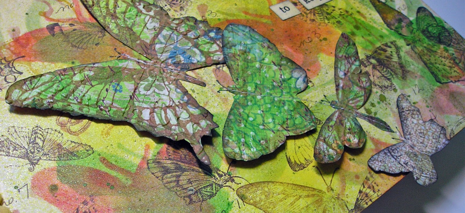
I started with patterned paper (old, from my stash, and I think from Stampin' Up) that already had butterflies on it.  I added stenciled, masked, and stamped butterlies, including one done with modeling paste.  Then I added some that I stamped on patterned paper,embossed to give them some texture, then cut out, and attached with some machine stitching, so their wings can flutter.  The off the edge border is made up of three butterflies cut with a ProvoCraft die, using some previously inked and embosed paper that I've had lying around for ages.  The right colors for this project.


Here is an angle shot of the butterfiles so you can see how they pop off the page.


And this is a closer look at the butterfly created with a stencil and modeling paste.


Looks like I'm all caught up with my journals.  Guess it's time to start thinking about some holiday cards.


Tuesday, September 25, 2012

Anyone For Tea?

It's been about three months since I've had any books to work on from my Asian inspired journal group.  On Saturday, I received two, and just finished the pages I did for my friend way up north, Lillian.

With these collaborative books, sometimes I know exactly where I'm going and sometimes I just start and hope for the best.  All I knew this time, is that I was going to use the stencil technique I've learned from workshops with the incomparable Lynne Perrella.  Using multiple copies of the same image, stencils are created by cutting away different parts on each copy.  Paints, inks, stains and pastels are applied in layers, decorative stencils are also used in sections, creating a final image that while inspired by the original, is unique and totally belonging to the artist.  I love this technique!  A bit of upfront work, yes, but ultimately so much more satisfying to me than simply cutting out an image, altering it in some way, and gluing it down,

First, the two page spread:


Here is a little closer look at my teacup holding lady:


She was done on watercolor paper, and I mainly used fluid acrylics.  Some details were done with glaze pens and souffle pens.  The characters were heat embossed, as was the teapot on the bottom.  The background paper is from Graphic 45's new Bird Song stack.  It was originally a pale pink, but I changed it to green with one of the acrylics, which is very translucent, so the original pattern is still visible.  The bamboo shoots on the right were heat embossed using Ranger's verdigris powder (one of my favorites).
 
An even closer look:


It was the teacup in the image that led me to the facing page.  I did a little online research into the Japanese tea ceremony.  The four words are the principals behind this ritual.
 
 
The background paper is also from the Graphic 45 stack, and it was altered with gold fluid acrylic paint, and the heat embossing in black and pink on the bottom.  The teapot was stamped on a piece of scrap paper that had been previously covered with that verdigris embossing powder, and it is stacked on two other pieces from the Bird Song collection.  Each layer was attached with pop dots, though I don't think that is obvious in the photo.


Thursday, September 22, 2011

Steampunk With A Feminine Touch

Yes, I know I said yesterday that would probably be my last post until after the cruise, but I got an inspiration for another steampunk tag, and had to roll with it.

Usually steampunk, being all about gears and machinery and Victorian images, has a masculine feel to it.  Thanks to Graphic 45's gorgeous Steampunk Debutante line, it can also be soft and lovely.  One of their images was really speaking to me and it wound up on this tag:


For the background I layered two DCWV papers.  I cut out the beautiful debutante and then added my own embellishments.....glossy accents, glaze pens, and a bunch of tiny watch parts from my stash to go with those already part of her hairdo.  I hope you can see all those details, and I also hope if you click on the photo the enlargement isn't a fuzzy mess, which has been happening lately.

And now, I really do have to stop and get packing!


Wednesday, September 21, 2011

More Steampunk And A Gift

I have two more steampunk tags to share with you; one came out of an Inspiration Showcase technique, the other was just me messing around.


This one used Jennifer's stamping on canvas technique for the background.  The man with the birdcage hat is from Tim's Pen and Pencil set, and he was heat embossed with black powder.  The tiny lightbulb was in my stash and I can't remember where I got it, but it's a size that has come in handy for several projects, so I hope I can recall the source and get some more.  The gears on the right are from Tim's on the edge die.  After cutting them from grungepaper, I ran them through the Cracked embossing folder, then inked them with several brown distress inks (but mostly walnut stain).  The words are rub-ons, found some time ago in Michael's dollar bin.


I admit, I love this one.  I used one of Ranger's new tags....the black one, and it is a great addition to their tag collection.  It went through Tim's Pocketwatch embossing folder, and the raised areas were highlighted with some copper paint.  The bird, standing on an idea-ology timepiece is from Oxford Impressions, as is the hat he's wearing.  Both were stamped with black archival ink, then colored slightly with old paper distress ink.  The bird was completely covered with glossy accents and the hat got the rock candy distress crackle paint treatment.  The words on the bottom are also from Oxford Impressions.  The tiny clocks are 7 Gypsys rub-ons.

As for the gift referred to in the title.  I'm in a yahoo group that has a monthly lottery, and the way it works, the winner (picked from those who participated in the prior month's lottery) gets to choose the theme for the gifts she'll receive.  My friend Angie was the winner for September, and being Angie, all she wanted was for us to "make art."  So, I did a small (5x7) altered canvas, using all of the layering techniques I love so much, and came up with this.


Lots of layers, lots of texture from tissue paper, paint, modeling paste, stencils, and random bits from my scrap pile.  The one really recognizable image, the woman on the right is from Graphic45's Steampunk Debutante set.  The piece on the left is one of Pink Paislee's artisan elements, white rubbery ornamental designs that can be altered in many ways, with ink, paint, stain, etc.  The canvas is already on its way to Angie and I do hope she likes it.

I don't know if I'll have any more blog posts until I return from the cruise.....and then I'll have plenty.  My plan for today is to clean up the studio and put everything away and begin the packing process.  We'll see how that works out.  Yesterday I received the three new limited edition seasonal distress inks, and I'm itching to play with them.  

Saturday, September 17, 2011

More Inspiration, A Wonderful Guest Teacher, And Another Steampunk Tag

Today's in depth review of some of yesterday's techniques from Jennifer McGuire's online class was fun, and I'm already thinking about how to use a few of them on this year's holiday cards. 

But, I have to tell you, (no surprise here), the biggest thrill was a bonus technique from Tim Holtz.  It involves grungepaper, distress stains and distress crackle paint, and it got me so excited I started cutting shapes at 5:00am!


I hope you can see the awesome texture on these pieces....click on the photo for a closer view.  BTW, if you have a base tray you can fit an awful lot of the mini movers and shapers on it to cut at one time with very little waste of the grungepaper.  I just had the most fun all morning, making these, and now I'll have plenty of embellishments on hand for future projects.

Yesterday I did another steampunk tag for the upcoming swap on ATT.


The background paper is from a stack my friend (and ATT list mom) Gloria sent me a while back.  I believe it is DCWV.  I punched some holes along the right side so that's another paper peeking through.  The lovely lady is one of Graphic45's Steampunk Debutantes....at least from the waist up.  I combined her with the bottom part of Tim's dressform stamp. 

The gears are a mix of idea-ology pieces and die cuts (those mini movers and shapers again), which were colored with black paint and then dabbed with copper.  Recognize that bird on her mechanical arm?  Yes, it's one from today's online class, and I couldn't resist adding it to this tag.

Oh, and I just have to say......one week from today I'll be winging it to Florida for the Tim Holtz cruise to the Caribbean.  Can't wait to take the classes and see all my crafty friends.  ONE WEEK!!!!


Tuesday, July 26, 2011

Rock On

So, the challenge on Grungy Monday is rock candy, not the cavity inducing kind, but what you find in Ranger's Rock Candy Distress Crackle Paint and/or their Rock Candy Distress Stickles.  Both products are clear, but do very different things.  Check out Tim's video here to learn more.  To fulfill this challenge use one or both in a project.

Luckily enough, over at my other favorite challenge site, Simon Says Stamp and Show, this week is an "anything goes" week, so I'm good to go there too.  Thanks, universe, for cooperating.

I did this piece, though I'm unsure how I'll use it.  It may turn out to be part of a larger project,  or a masculine card front, or the cover for a travel journal. 


Yes, this is a rather dark piece, but in person not nearly as dark as this photo.  Sorry about that!  I cut Umbrella Man from the advertising that came with some Graphic45 tags.  If you click on the photo to get a closer look, you might be able to see the writing, especially on the umbrella.  I inked it after cutting with stained walnut and black soot distress inks,  then applied a fairly thick coat of the crackle paint and allowed it to air dry.  After it dried I applied some additional black soot and worked it into the cracks.

As for the old jalopy.  I made a stamp using fun foam and the jalopy die, just like Tim showed us last December.  Click here for more on that.  The fender (or is it a bumper?) was cut with the die from some scrap Ten Seconds Studio metal.  I used the silver side but toned down the shine with some coffee archival ink.

All of the background was done with distress inks and a blending tool to get some depth and shadows.  And Umbrella Man was attached with foam so he has some extra dimension as well.

The sentiment is, of course, one of Tim's.  I think I have that in several sizes, and I find I use it a lot.

Monday, May 9, 2011

All Jazzed Up

Don't you just love it when your favorite challenges cooperate with one another?  This week's Simon Says challenge is called "anything goes."  Which means, of course, whatever I do for the Grungy Monday challenge will work for Simon Says as well.  You know me, I'm always up for a twofer.  Add to that a birthday card I needed to make, and yep, another threefer is born.

Linda, mastermind of Grungy Monday and recent Ranger U graduate, went back to 2007 for the technique we're to use this week.  Click HERE and you'll be taken to Tim's blog for all the details and how-tos.  Now, Tim originally demoed this for a Christmas tag, and came up with a weathered wood look.  My take is totally different, but as Linda pointed out, there are just so many ways this background can be used.  Enough talk....here is my card:


I used pool paint dabber and chipped sapphire distress ink for the background.  It's on white cardstock, which I cut to size (the finished card is a 5" square).  The jazz band stamp is from Graphic45, as is the strip of musical notes on the top.  The celebrate stamp is a very old one from Stampin' Up that I use a lot.  Love that script.

I had some leftover background paper and used it (along with another Graphic45 scrap) for the inside of the card where I'll write my message.


Monday, April 18, 2011

Grunge Goes Romantique

What do you do when you want to participate in all the cool challenges, get gifts and cards out in a timely fashion, but have a ton of other things on the must-do list?  If you're clever (as I like to think I am, or can be at times), you combine.  You become the master of the twofer or even threefer.  Like today.

For this week's Grungy Monday, Linda had us watch a video of Tim (what a chore that was, LOL!) demonstrating two techniques for using his texture fades (AKA embossing folders) and distress inks.  We could use either or both in our projects.  Over at Simon Says Stamp and Show, the UK Linda just said, show us a Tim technique.  Duh!  Instant twofer.  However, I need an anniversary card this week.  So, unlikely as it may seem, by pairing Tim with Graphic 45, I wound up with Grunge Romantique (Romantique is the name of the G45 line I used, not me trying to get all French and fancy).


For the background I applied bundled sage distress ink to the inside of the damask texture fade, and ran it through my Vagabond on pink prima paper.  All the images are from the Graphic 45 Romantique collection, and I cut some up, distressed them and put them together collage style.  The sentiment is from a Wendy Vecchi stamp.

As for the butterfly, that poor little thing went through so many changes, I'm not sure it still qualifies as using the challenge technique.  Here's what happened......first I cut it from Tim's new mini die set.  No problem there.  Then I decided to use the texture fade/distress ink method once again, and did, with bundled sage and the gridlock folder on the same pink paper.  Whoa!  Way too light.  It barely showed up on the card.  So, I edged it with forest moss.  Still didn't pop enough.  Then I covered the whole shebang with tea dye. Uh uh.
Finally, I gave it a spritz with lettuce color wash.  Bingo!  Somewhere, under all those layers is this week's technique.  I promise.

So, not the color palette of my comfort zone, but it seemed fitting for the project.

Anyway, later this week the card is going out to two of the best people and good good friends who just so happen to be married to each other.  You know who you are.  If you're reading this, just act surprised when you get it!