Showing posts with label round robin. Show all posts

Wednesday, August 14, 2013

Time For Love (And Ignoring A Mistake)

Rhea's theme in the Kindred Souls first journal round robin (now approaching the finish line), is Time For Love.  I was one of the last to receive her book, and it is full to the bursting point of gorgeous detailed pages.  Lots of clocks, hearts, steampunk embellishments, and other bits of beauty.  The bar had been set very, very high, and I put a lot of work into my contribution.  Oh, and I need to mention that by the time I received the book, there were no more blank pages, so I had to cut one myself.  (Rhea knew this would happen and said she'd rebind the book when it returned home).  And there was the origin of the mistake I would later choose to ignore.  I measured the page, even punched the holes, since Rhea had used her Cinch and I have one too.  And proceded to create.  And after all was done I noticed.....my page size was correct, but the way I oriented it was not.  So, this is how the page will look when inserted in the book:


Yep, it is sideways.  And I just didn't have the heart to start all over again.  Don't bother craning your neck; this is how it should be viewed.  I sure hope Rhea doesn't mind:


And from this point on, we ignore the mistake and procede as if it never happened.  :)
 
The background was done (pretty much in this order) like this:  paint and glaze, Wendy's gold embossing paste through a stencil, and Dyan's stamps with black archival ink.
 
Instead of a clock (Time for Love, remember?), I used Tim's Picture Wheel die; it conveniently has 12 slots, so I turned it into a clock.
 
Lastly, some metal and wood embellishments, colored uniformly with more paint and glaze (thank you, Finnabair!), and a Wendy stamp and sentiment.
 
And the back (which IS oriented correctly):


And since the current challenge over at EWV (Everything Wendy Vecchi) is to use a die cut along with at least one Wendy stamp, my page, mistake and all (oops, I said we'd no longer mention the M word), works for that too.  So there.


Monday, August 12, 2013

Fifty Shades of.....White!

Many years ago, my introduction to collaborative art journals began with the book True Colors.  It chronicled with breathtaking illustrations a collaborative effort between 15 outstanding mixed media artists.  The originator was one of my favorites,
Lynne Perrella.  Each artist chose a color palette for their book, and Lynne chose white.  Ever since then I've wanted to do a primarily white book.  If that seems boring, think again.  As anyone who has ever headed to Home Depot to buy white house paint can tell you, there are at least 50 shades of this color. 

The Kindred Souls group I belong to is just finishing up our first round robin, and for our second we're doing a color theme.  I signed up immediately and chose all the shades of white plus a touch of black.  My first task, to create the journal itself.  Here are my covers.

front:

 
close up:

 
back:

 
inside:


As you can see, I had a little a whole lot of fabric and lace leftover from my recent vintage lace round robin.
 
 
Next, my own page to get things started.  I recently was fortunate enough to take a class with Anna Dabrowska, AKA  Finnabair, and was happy to use many of the leftover elements from that class.  And her techniques for making all those diverse pieces work together through color.


It began with a grid of scrapbook paper rectangles, most of which was covered with a dry brush application of white gesso.  Then the image of the woman was added.  Ribbon was twisted and adhered for her head scarf, and her clothing was gessoed over so I could decorate it with ink and stamps.  Her sleeve was done with a Michelle Ward stamp, and the body with stamp I carved myself.


I then began adding my assortment of metal, wood, and paper embellishments.  They were all covered with gesso, paint, and sprays.  My last step was to add some stenciling (again, by Michelle Ward) to the background.  I used black paint, then toned it down with a whitewash.


I couldn't be happier with the way it turned out, and I just can't wait to see what everyone else does in my book.  It is packaged and ready to begin its journey.  First stop, Michigan!


Thursday, March 28, 2013

Vintage Ancestors - A Jilted Lover

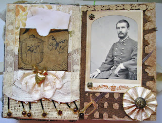
Karen's Vintage Ancestors book begins with two lovers, separated by the Civil War.  Sarah and Lawrence write to one another, professing their undying love, until.....Elena gets her hands on the book, LOL.  Then, it's all about Sarah leaving Lawrence for his brother Timothy. 

As I continue the saga, Lawrence responds to Sarah's "Dear John" letter, and I do believe he takes the high road (while getting in a few well deserved zingers).

First, the two-page spread.


I used fabric and paper scraps to create what I thought a journal made by a young woman might look like. 


On the left, a pocket (a Tim Holtz glasseine envelope covered with 7 Gypsies tissue paper) holding the letter Lawrence wrote after receiving the bad news from Sarah.  Pinned to the fabric below is a bauble I had in my stash.  Yes, the heart opens, and yes, there is something inside.  A lock of hair, perhaps?  Too creepy?  Well, how about a lock of doll hair, then?
 
I did some research, and my friend Google found a photo of a Confederate officer.  Not a general (they all seemed so old); I think this one is a lieutenant.  And his sword is a Confederate foot officer's sword.  I printed it out and covered it with Glossy Accents and then cut it out with my trusty craft knife.  What I really liked about it is that the site where I found the sword said that it was made by a sword maker in New Orleans.  Karen's characters are from southern Louisiana.  Fate!


Although I have Tim's rosette dies, I made this one the old school way, by doing accordian folds.  I wanted it to look like it was made by hand, as I'm reasonably sure that Sarah did not own a die cutting machine.  In the center is a button from my stash.
 
The two brads on the cabinet card are from Stampin' Up, and I've had them for years.  I thought they kind of looked like the buttons you might find on a military uniform.  Speaking of cabinet cards.....the holder for the photo is not authentic; it is a replica, also courtesy of Mr. Holtz.  Because the back of the holder had cool stuff on it, I separated it from the front and will use it in another project.
 
And, lastly, here is the letter that broken-hearted Lawrence wrote.  If you have trouble reading it, click on it and it should get large enough to decipher.


Will Lawrence survive the war and find fortune and love in California?  Will Sarah and Timothy actually marry?  Will we ever even know?  Well, that all depends on those who receive the book after me.  They may continue the story or go off on another track.  And someone further down the line may decide to go back to the current story line.  That's one of the things I love most about this particular journal;  you just never know who might turn up in a family tree, and what they will be doing.


Tuesday, March 26, 2013

Eclectic Vintage Gentlemen

The title refers to the theme of Stephen's book in the Kindred Souls round robin.  NOT to my social life.  The book was waiting for me when I returned home from Key Largo, and in between posting about the retreat, I worked on my page for him.

The pages that were already done were so interesting and different (eclectic is the right word!).  I had an idea of what I wanted to do, and for a change it didn't take me too long to figure out how to accomplish it.  I wanted a steampunk feel and a bit of humor.  Oh, and it had to be easy to look at too.

So, here are the brothers Boeing, imaginary founders of Boeing aircraft, in the early days of air travel.


The background started with paper from Graphic 45's Steampunk Debutante line.  I liked all the hot air balloons on it, but the paper was very dark.  I lightened it up by scraping some Ranger picket fence distress paint over it with an old credit  card.  It was then light enough to add some stamping, stenciling, paint splattering, embossing, and so on.

The three gents are from a Tim Holtz stamp (embossed with walnut stain distress embossing powder). I did have to cut them apart and squish them together again to fit them into the basket.  Also from Tim is the compass (embossed with black powder), as well as the small images on the bottom right and the two balloons on the upper left. (All from the new Tiny Things stamp set).
The balloon carrying the brothers off is from Oxford Impressions, stamped on glossy paper, embossed with black powder, and colored with a variety of alcohol inks.  There are also some other balloons from Oxford Impressions, but I'm not sure if you can see them.  Both the balloon and basket are raised up off the page; the basket with pop dots and the balloon with a wiggly springy thingy.  It bobbles when you touch it!


The metal scallop border is by 7 Gypsies.  The balloon's basket is from me.  I just cut a shape, covered it with some scraps from my gelli plate print pile, and added some gold embossing.  The ticket on the top is also one of Tim's stamps.  Oh, and there is a tiny compass glued to the center of the compass stamp.  There are also two air travel related charms dangling from the page that you can't see much of in the photo.

The back of the page in this round robin is supposed to be finished, not highly decorated, and contain our information.  On the page Stephen did, he put Laurel and Hardy on the back, and everyone who followed did the same.  Who am I to argue with success?  I found an image from a film in which the funny men flew a plane.  Perfect!  And you can still see most of the Graphic 45 paper I used underneath.


If Stephen likes this even half as much as I enjoyed making it, I'll be satisfied.


Wednesday, February 6, 2013

Vintage, Shabby and Blue

No, my friends, the title does NOT represent my mood, but the theme I worked with on my newest collaborative art journal project.  Not my first rodeo by any means, but the first round robin in the Kindred Souls group.  And my first pages (not counting what I did in my own book); these are for Kimberly, and vintage, shabby and blue is her theme.


I started with a background I did on deli wrap with my gelli plate, but that was the last paper I used.  It was into the lace and ribbon and bead stash after that.

The center piece began as a little heart with a printed image in the center, but the shape soon got obliterated by all the embellishments,


The blue lace was actually off white, transformed by a generous spritz of blue smoke Perfect Pearls mist.
 
Originally I'd planned to just do one or two rows of beads, but obviously got carried away.
 
The stick pins, to the best of my recollection are from Maya Road.....except for the largest one, which didn't start out as a stick pin at all.


I just glued a button from Tim Holtz's idea-ology accoutrements collection to a trinket pin (another Tim piece).  I used Ailene's super tacky glue, which is becoming my go-to adhesive lately.


Another close up.


The back just needed to be finished, not decorated, and I began with another deli wrap gelli plate paper, and added a little stamping (stamp from The Stampsmith's Art Nouveau 2 set) and collaging.


As soon as everything is totally dry, this journal will be on its way to Mary-Beth in Canada.  I LOVE these round robins!


Tuesday, December 11, 2012

Another Ancestor, Found

I mentioned before that one of the latest round robins I'm in is called Vintage Ancestors.  It is so much fun, because we're all searching the internet, garage sales, and flea markets for cabinet cards (or making faux ones) and giving everyone an ancestor with a back story.  I am having the best time with this, and have been working on my friend Sox's book.  Sox started things off with a relative who was a circus performer and though I didn't start out with that in mind, I gave her one who was also quite the rebel.

Without further ado, the tale of Claudine Romanov-Mercurio, gypsy, dancer, actress, runaway, and so much more.

Here is the photo that started it all:


First, a quick look at my two page spread:


Where is the cabinet card?  Well, it's hiding behind the narrative.  I printed the story on transparency film.  Originally I was just going to put it over the second page, but decided to back the transparency with vellum, which also makes it easier to read.  Time to backtrack a bit.
 
The title, "A Misspent Youth," continues on page two, with the question, "Or was it?"  The story answers that question.
 
The first page consists of many tags and other memorabilia that our wayward Claudine collected in her youthful travels.  They are strung together and pop out of their pockets easily so they can be looked at.


The transparency, vellum, and underlying page were machine stitched together on one side so the story can be lifted to reveal page two.


And this is Claudine's story:


You just have to love a project that allows you to be both artist and storyteller.  Can't wait to get my next victim, I mean book.


Tuesday, October 23, 2012

New Journal Pages

As two collaborative journal groups approach the finish line, another begins its journey.  The Asian themed journal and the artistic evolution journal are just about done, so we launched our latest project, Vintage Ancestors.  We each created books and started things off with a cabinet card (real, copied, or invented) and a story.  While we could use actual family photos and stories, what's the fun in that?  So, most of us went online, began collecting images and thinking up some juicy family secrets.

Last week I received Elena's book.  It is already amazing.  She found an actual cabinet card scrapbook and took it apart and reworked it.  Her story began with a group photo and the tale of a family separated by politics and circumstance, and leaving their native Spain for the United States and Cuba.  The year was 1899.  The family consisted of the two parents and their nine children.

I thought that was a great way to begin.  While we're free to do as we please, there are enough family members for each of us to choose one and continue their story.

I chose Miriam, aged 19, and here are the pages I did about her. (You can click on the photo for a better view).


Along with this book, Elena also sent me Sarah's artistic evolution journal to work in.  This is the book where the pages go up and down in size and each artist evolves in some way from the artist that came before.  Elena and I have very different styles.  Her page that is partially visible when looking at mine has lots of circles, so I took that as my inspiration.  My pages have embossed circle stamps, circle stencils, etc.  Oh, and Sarah requested purple, yellow and green as our primary color palette.
 
 
Believe it or not, I started with black paper, over which I samped my variety of circles with clear embossing powder.  Then came many layers of watered down perfect pearls, followed by paint, ink, and more stencils.  The shimmer of the perfect pearls makes it hard to photograph the pages without a lot of glare.
 
I outlined my text and the stenciled figures with white to 1) make them pop and 2) make them relate better to Elena's pages, as she used quite a bit of white outlining.
 
Here's what it looks like with Elena's page visible behind mine.


I think it looks like the girl is peeking out, trying to get a look at my pages.  Well, that's my theory and I'm sticking to it.
 
In December we're starting another round robin called Vintage Lace.  It's going to be a fabric journal.  I am hardly queen of the needle workers, so that should be interesting.  You ever notice how people use the word interesting to replace some other, usually negative word?  Just asking.


Sunday, July 31, 2011

More Journal Pages

In addition to the many collaborative art journals I've worked in and continue to be a part of (and some new ones that haven't started yet), I recently began a smaller project....two art friends and I are trading journals back and forth.....no rigid time lines or rules or themes.  When we get a journal, either our own or one of the others', we do one page, two, whatever comes to mind.  I'm enjoying this a lot; in my previous round robins there could be 15 or more participants, and everyone works in each journal once.  It has taken as long as 18 months for a journal to return home.  Very exciting, but a long wait.  In this one, with only three of us, we see our own journals regularly, work in them too, and I love that.

Here are some pages I've just completed.  In the first two I altered photocopied images with one of my favorite supplies, Portfolio Water Soluble Oil Pastels, and then used several stencils and paint over sections.


Close ups of each page:


In the next journal I raided my favorite scrap box and used bits and pieces left over from previous work, and some phrases from magazines I've been collecting.


The background, which is mostly covered was done with metallic paint (the very cheapest kind you can sometimes find at Michael's for way under a dollar a bottle) and stencils.  Close ups:


Although the pages in each journal are very different they all do reflect where I was at the time.  Though I have enjoyed working in themed books, there is something very liberating about just doing whatever comes to mind at the moment.


Sunday, April 25, 2010

Frida!

I've been fascinated by the art (and the life) of Frida Kahlo for a long time, and when my Australian friend Lee proposed yet another collaborative journal with Frida as the inspiration, I jumped at the chance.  Yes, even though I'm currently in four other journal groups and have an overflowing plate.  Couldn't resist.
I decided on a compact size (6x6), as we are a very international group, and concerned about postage costs.
Here is my newly completed cover art:
I drew a (deliberately) crooked border and filled it with colorful doodling, my version of Mexican folk art.  Wasn't at all trying to be authentic, this is just what Frida's art inspires in ME.
Inside the frame I created the background with Portfolio water soluble oil pastels and torn paper used as a mask.  After buffing it with paper towels, I painted over it with gold mica paint, which I'm sure doesn't show up in the photo, but it is nice and shimmery.
The picture of Frida began with some clip art.  I put into practice the drawing technique Jen taught us on the retreat.  I lightly gessoed over the image of Frida and then drew and colored over the gesso, so the original image served as a guide.  Since it was a portrait, I added the skirt (which has dimensional flowers) and scarf (a piece of ribbon).
The wonderful letters that spell out Frida were stamped with black ink, using a great Tim Holtz foam alphabet set (sadly, no longer available), which I was lucky enough to get last year on the Mexico cruise.

Wednesday, April 21, 2010

I Dream In Colors

Time out from my Key Largo posts.  I just completed pages for Jen's journal in our I Dream in Colors group.  Her color palette is chocolate brown, robin's egg blue, and lilac.
Not my usual colors (except for the brown, which I believe goes with everything), but had fun with it, and guess what?  Those who know me well won't believe it, but I sewed on it!  Me, sewing!
I have disliked sewing but love the look of stitches on paper, so a few weeks ago I went ahead and bought a basic machine and put it in a closet.
Something made me take it out yesterday.  I just knew it would end with much tears and cursing, but miracle of miracles, it really was as easy to thread as promised.  Can't believe it!  Not that I did anything elaborate, just some freehand stitching and attaching ribbon, but this is a very big deal for me.  I've always believed that I am totally incapable of using a sewing machine.  Yea, me!
Anyway, here is the first of the two page spread:
I used some of Tim Holtz's gorgeous new paper.  It's the right shade of blue, and I overpainted it in some areas with lilac paint.  I used the bracket from Tim's "Hanging Sign" die as the holder for the cage from his "Caged Bird" die.  I didn't use the bird from that die.  The smaller one is a stamp, inked and stickled.  The larger one is from the "Nature" grungeboard set.  I used Val's inlaid embossing technique on it.  Covered it with light purple embossing powder, then used a floral background stamp (Wendy Vecchi) over top, embossed with blue powder.
The second page is the one where I really tried out the sewing machine:
I LOVE Tim's "Fanciful Flight" die.  That butterfly is great, isn't it?  I put blue vellum under the chocolate card stock outline.
I chose the words I used, after searching for hours for a suitable quote about flying, because of the word "fairy."  If you read my post yesterday about the retreat, you know that each night we were visited by the pillow fairies (aka Gina and Marita).  I thought that whenever Jen looked at these pages she'd also be reminded of our wonderful days together in Key Largo.
Jen included some tags with her journal for us to use as a sign in.  She asked that we include a photo of ourselves.  I found a vintage NYC postcard, (well, a reproduction) Bethesda Fountain in Central Park in the 40's (I think), and used that as my base.  Here it is:
And no, I did not make up that corny caption.  It was actually on the bottom of the postcard!

Thursday, April 8, 2010

The Keys 4 Art

The countdown has begun.....well, actually, I've been counting days for a while now, but since it is less than a week away, I'm really excited.  What am I talking about?  A fantastic loooong weekend in Key Largo with some of the best friends I've never met!

You know from my blog posts that I'm in several collaborative art journal groups, and our ringleader, Elena, lives in Key Largo, has a large home, owns every art supply ever invented, and somehow made  a random remark turn into reality.

A year or so back, when the first journal got underway, and I was so thrilled with the art being done in them, I commented how great it would be if we could actually get together and have some quality art time as a group.  Sounded like a nice fantasy, but Elena is a very determined woman, and she is making it happen!  I leave for Florida next Wednesday and don't return until Sunday night.  How cool is that!   Elena has lots planned, and several of us will be sharing techniques.  We also expect that some of our sisters-in-art who cannot be with us physically will join us on Skype!

I've been busy gathering together things to take, mostly art-related, but I will bring some clothes too, and finalizing my plans for what I'll be teaching.   I also made a little commemorative somethin' somethin' for everyone.....all 12 of us!

You can be sure that once I get back I'll have LOTS to share here.  Key Largo, look out!

Oh, and the very impressive logo above,  is courtesy of one of the women who is coming....the very talented and generous Valerie.

Wednesday, March 24, 2010

I Dream In Colors

About a year ago the I Dream In Colors collaborative art journal group began.  I've worked in many books with a wide range of color palettes.   This past week I've been creating pages for Sarah's (one of my friends from Australia) journal.  Her colors are red, black, and white.  These are the pages I came up with, and the book will be heading for Jacquie in Florida today:


The pages are 8x8".  I went through my stash, but primarily took elements from scraps.  The elaborate headdress I added to the figure was cut freehand from a scrap of embossed Ten Seconds Studio black metal.  The bird on the second page was punched from the same metal.  The birdcages are die cuts I received with an online order.  Most of the papers I used to create the collaged background were also from the scrap pile.
I did a bit of doodling with my black and white Sakura glaze pens.....love them!  They add instant shine and dimension and write over virtually every surface.  
The quote, of course, is from the Maya Angelou poem, "I Know Why The Caged Bird Sings."

Friday, February 26, 2010

Another Journal of Dreams

It snowed again today....all day.  So, I stayed indoors again and worked on the next journal, which belongs to Lillian.  Carla's was a petite 6x6", but Lillian's is much larger; she altered an existing book, something I've done and am partial to.  No worries about binding when you use an altered book.
 
Lillian included a note with her journal, in which she mentioned some things she is partial to......foreign languages, architecture, anything French, vintage, rust.....  I did my best to incorporate many of these features in my page for her.

I was thinking about dreams of travel.  As an experienced traveler, I am usually prepared, know what to expect, and through careful planning, don't miss much.  When I was a very young traveler, too dumb to be cautious, I just went where the spirit took me, with very little in the way of preparation.  At first, I was going to say that I miss the spontaneity of my youth, but do I really?  I wouldn't want to be that girl again.  Not really.

Well, be my travels well thought out or spur of the moment, my message is the same.....it's all about the journey, not the destination.

I started by spraying watercolor paper with several colors of homemade mica spray, then inked the paper and added strips of music sheets and old text (in a few languages).  More ink.  Combed my stash for exotic images and architectural elements.  Added a central image of a 40's pin-up girl (why not!), and some bling.  Oh, and I just noticed that the charm dangling from that little chain was turned backwards when I took the picture.  Just so you know, it says "journey."
More snow is expected tomorrow, so I just may get to Lee's journal as well.

Thursday, February 25, 2010

Journal of Dreams

My collaborative art journal drought has ended!  After months with none reaching my door, I suddenly had three to work on.  All from the Journal of Dreams group.  Today I worked on Carla's.

I used the spray starch technique for the background, and almost everything else on the page came from my scrap pile.  So there are leftover bits of embossed metal, old text, scraps from various techniques,  and cut off pieces of collages.  Also, LOTS of shimmer from distress stickles.  The mermaid is from PID, though she didn't start out as a mermaid.  I made her tail from glitter paper which I then embossed and distressed.

Monday, November 23, 2009

Through The Eyes of An Artist

The first collaborative art journal group I joined was Through The Eyes of An Artist, and this wonderful journey is almost at an end.  This weekend I did pages for Tracy, and I am the last in the circle for her book.  So when this beautiful journal leaves NY, it will be heading home.  I know Tracy is excited, and when she sees the pages in person, she will be thrilled.
Here is my contribution:


As I've been doing in all my journals lately, I begin by creating a collage background with bits of random scraps of paper, including music sheets, old text, advertising, scrapbook paper, etc.  Then I'll add some paint,  including metallics,the water soluble oil pastels Lynne Perella turned me onto,  stamping, and whatever other embellishments I feel belong.

Although the look is very different, I used the same technique on Sharon's pages.  The color palette is just more vivid.
Here is the two page spread:


Page 1:


And page 2:


My art goddess is a stamp from a Wendy Vecchio set called Art Rules, and I love the image. I just gave her some color and bling, and a rather voluminous cloak.  Are you really an art goddess without a voluminous cloak?  I think I like the word voluminous.  It kind of rolls off the tongue.  And it's not every day you get to use the word cloak in a sentence.
Before I digress even further, let me end this now, and as my (new) friend Wendy Vecchio says, "Go Make Art!"