Tuesday, August 27, 2013

CREATE, Belatedly

It's been six weeks since I attended classes at CREATE in Somerset NJ, and I thought it was about time I blogged a bit about my experiences there.

Let me start by saying that the classes are every bit as wonderful as those I've taken at other retreats (many of the same teachers, so no surprise there), it's the venue that was sorely lacking.  A hotel in the middle of nowhere, horribly understaffed, and in desperate need of a major renovation.  Few dining choices, and even fewer if you don't have a car.  My room was fine, but the hallways had NO air conditioning, and the event was held at the height of our July heat wave.  The classrooms all had their own problems too.....too hot, too cold, poor lighting, not large enough.  You get the picture.  I hope that if CREATE is held on the east coast again next year, that the organizers wise up and choose a better location. 

Enough of that.  I took four classes and loved three.  I consider that a win.  The first class was painting on yupo paper with alcohol inks, led by Cathy Taylor.  What a revelation!  Sure, I've worked with AIs before, but not the way Cathy does, and I learned so much from her.  As for the yupo paper, it's not really paper at all, but a plastic product.  It was actually designed for watercoloring, but Cathy discovered the magic that occurs when it is combined with AIs. 

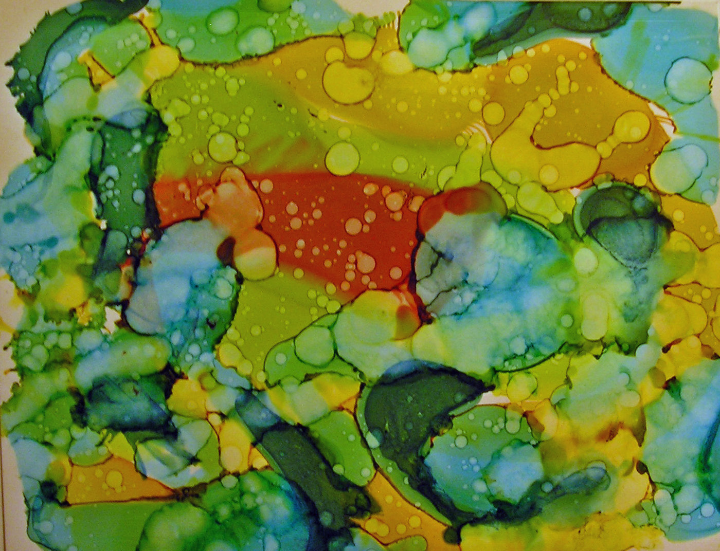
Cathy demonstrated several techniques....blowing the inks on the paper through a drinking straw was one.  Also, making the inks move around on the yupo by dropping rubbing alcohol (91%) on them.  She encouraged us to spend some time just experimenting with these techniques.  Here are some of my efforts.


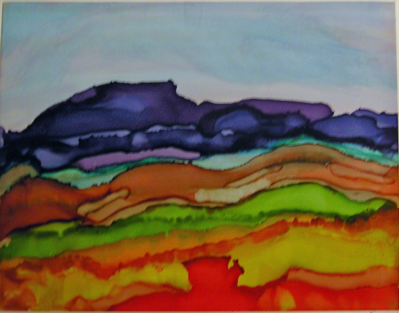
We learned how to control the inks enough to create a landscape design.


And how to incorporate stencils into the mix.


Actually getting recognizable images (my flowers are outlined with a micron pen).


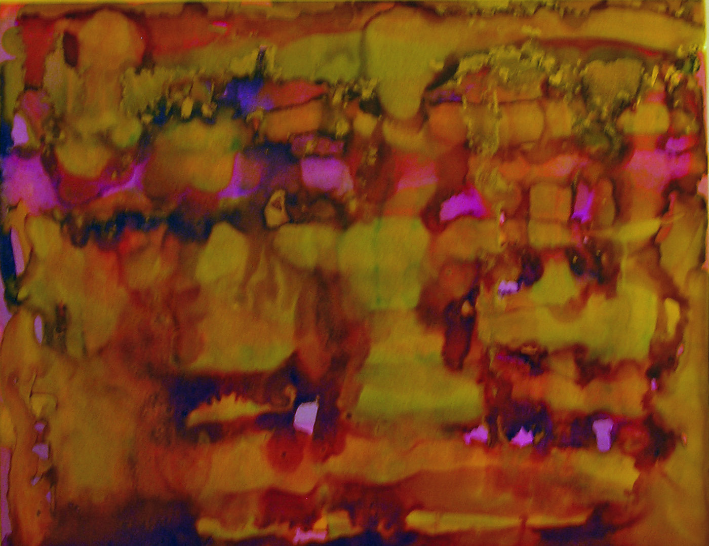
This is one of my favorites.  I lifted the yupo off the table, and held it on an angle, and dripped different colors down the page, not overlapping any of them.  Then I filled in the blank spaces with black AI.  I had no idea if the black would migrate into the colors and result in a bunch of mud, but I took a chance, and look how it turned out.


Cathy also shared with us a technique using gold AI (the Jacquard Pinata brand).  Apparently it doesn't work with the Ranger brand.  A small amount was applied around a color and it sort of surrounds the color as though it had been painted in.  Hard to describe, and sadly, does not come through well in this photo, but believe me, it looked spectacular in person.


This was day one.  I'll blog about the other classes when  a)I actually finish one of the projects and  b)I photograph it.  It's been that kind of summer.  :)


Sunday, August 25, 2013

What's Black and Sepia and......

.....gorgeous all over?  Sox's World of Color journal (from the Kindred Souls group), that's what.  It arrived from Stephen's talented hands just two days ago, and I've already finished my page.  I was inspired by the journal itself (lace and fabric and paper and bling), as well as the pages already done.  I think that black and sepia is one of the most elegant color palettes, and I just dove right in.

First I filled my work table with everything (well, that's an exaggeration, so let's just say a lot) in my stash that supported Sox's colors, and gradually came up with a plan.  It began by covering both the front and back with different 7Gypsies tissue paper, because the patterns are printed in black on sepia paper.  Or so I thought.  It became clear that the sepia was really more like a gold, and that annoyed me.  I solved that problem by concocting a mixture of glaze medium and tan paint which toned down the gold and brought the background to a more sepia-ish look.  After that it was just a matter of layering papers, sewing them down, and adding some stenciling, stamping, and a tag as the focal point.


The tag itself is made of kraft cardstock.  The background was done by first layering on some tan, cream, and beige paints, letting that dry, then stamping (a Hero Arts background stamp) with black archival ink.  When that was good and dry a very thin layer of rock candy clear stickles was applied with a fingertip, which is what gives it a subtle sparkle.
 
The dress form was cut with Tim Holtz's Sewing Room die.  The phrase is a Wendy Vecchi stamp, and the dress form is covered with Claudine Hellmuth's sticky back canvas.


The buttons were sewn onto fabric that had been stamped with a tape measure stamp.  As for the thimble and scissors charms.....they dangle from Tim's memo pin.  They began life as a very cheap and garish looking gold, which was toned down by tapping them with a black archival ink pad.
 
The back of the page is much simpler, but there was just too much good stuff left on my table, so it was decorated a bit more than I had to.


Again, the tissue paper was treated with that glaze/paint mixture.  On top of that, archival ink (black and coffee) through two different Prima stencils.  Then I sewed on the fabric and paper that would hold a little tag.


The tag was created from some Graphic 45 embellishments, and on it, my information.


While searching for items to use, I came upon some Heidi Swapp designs printed on acrylic.  They must have been in my stash for years; she called them "clear extras".  I used a few of them.  I love it when something I bought and never used finally gets its chance.


I look forward to the next journal arriving at my door.


Monday, August 19, 2013

Beautiful Faces and Dream Houses

About a month ago, I spent a wonderful weekend creating art on large (for me) canvases with a great teacher, Cindy Wunsch.  My friend Pat had taken a class with Cindy at last year's CREATE retreat, and I was happy to sign up for these two classes after seeing Pat's work.  And how's this for an endorsement.....Pat took these two classes as well. 

Some of Cindy's work:


Cindy's style is colorful, whimsical, and exhuberant.  Me, not so much, but I embraced her techniques and forged ahead.

Cindy, explaining something.  She was very thorough and prepared.


On Saturday we tackled faces.  I am no big fan of stylized faces.  At least not when I do them.  I actually like many I've seen, but they're just not me, so I am never too pleased with any I've attempted.  I received a lot of positive feedback on my redhead, but I do not love her.  Sorry, Red!  I did love the process, however, and even found a place for Red in my home.


What the photos probably do not show, is the finishing.  When the class was over, we didn't take our canvases with us.  They stayed behind, and Cindy gave each a nice thick coat of resin.  Not only will that protect the highly layered and textured work, but it just made the colors pop.  And as these workshops were a joint effort between Michele's Little Bird Studio and The Ink Pad, participants were given the option to pick up their pieces (once dry and cured) from either location.
 
Here is Cindy applying the resin, with Michele watching carefully.


Most people either did a second face or some stylized birds for the next canvas, but I just went in my own direction and did this collage:
 
 
On top of the many layers of collage elements went the circles.  Inside the largest is a stamped image from LaBlanche.  The other three fish are Wendy Vecchi stamps.  I stamped them on white tissue paper with embossing ink and applied white powder.  Once on the canvas I colored them.
 
On day two, the theme was Dream Houses.  Much more up my alley, and I created more of a dream shack than house, but it suits me.  It is near the ocean, and sits on stilts upon a foundation of books.  But let's not get too analytical.


My next piece was a cityscape, done on a long narrow canvas (12x24), which I love!  Lots of paper piecing and stenciling went into this one.


Party Like It's Mardi Gras

Stephen's World of Colors book (from the Kindred Souls group) landed in my mailbox last week, and seeing his color choices (purple and gold) just made me think of the jewel tones of mardi gras.  I began by painting my page black, knowing that would make his colors pop.  Then came the search for images.  I'm sure many of you get Somerset Studios magazine.  You know those free art papers that they put inside for our use?  Well, I usually pull them out and save them in a folder, and that's where I found the two partiers.  Don't know which issue they were in, but the page is called Bohemian Souls.  I printed it in black and white and colored the characters with pastel crayons, inks, markers, stains, paint, etc. And altered the costumes a bit more with stencils and sparkly bits.   Here they are, dancing the night away with great abandon.


Before glueing them down, I decorated the black page with stencils and doodling, in various shades of gold and purple.  Then I found some sari ribbon for the "curtain" above.  The ribbons photographed kind of blue and brown, but they are purple and gold. 
 
The quote is a rubber stamp I've had for about six years or so....I purchased it at the first stamp expo I ever attended (along with a few MANY others), and sadly have no idea who manufactured it.  It was one of those unmounted inexpensive stamps you often find at those shows, piled together in a shoebox.  I've used it before, and have always appreciated the sentiment.
 
A closer look at the dancing duo:


The backs of the pages in this round robin are kept fairly simple, just containing our information.


Gold paper, and the rays are a Julie Fei-Fan Balzer stencil, with Wendy Vecchi's gold embossing paste applied over it.  More doodling with glaze pens, souffle pens and gel pens, a little bling in the center, and that's it.


Sunday, August 18, 2013

Field Journal Project

Another round robin journal begins.......Journey of Dreams.......we're doing it field journal style.......small books, sized for easy transport, and containing the notes of people (real or imagined) on some sort of journey.  I constructed my journal months ago, but with a launch date of August 15, only very recently decided on my theme.  Click HERE if you'd like to see how my book was made (it's a very easy, no-sew method).

Here is the opening page of my journal, revealing my theme:


My adventure begins in Japan.  Totally imagined, as I've never been there.  But if I were fortunate enough to take such a trip, these things could  happen......
 
 
See that little sketch of me with the sushi master?  Well, it was tweaked from this one that my good friend Pat (aka Pat-Zee in this field journal ) did a few years back for our Tim Holtz cruise to New England.


A little gesso, a little drawing, and the stamp pad became a bowl of rice and the stamp, chopsticks.  I've been on so many artsy adventures with Pat, I just couldn't resist including her in some way. 


As for the other images, I just trolled the internet for photos of sushi (and Tokyo) and did my best to sketch them.  Now, Kyoko and Naomi are real.....two wonderful women from Japan who have been on several Tim cruises with us.  And I know if I visited their country I'd do my best to meet up with them.  So although this entry came from my imagination, it is something that could happen....and maybe someday will.


Teri's field journal arrived in my mailbox, and it was such fun to work in.  She and her husband recently returned from a trip to Hawaii, where she snorkeled for the first time.  Obviously, sketching underwater is not an easy task, so she asked that we help her fill her journal with ocean life that is endemic to the Hawaiian islands.  It just took a while with my friend Mr. Google, but I found three interesting creatures to sketch and write about.


Yesterday I handed both journals off to Pat (who was tickled to see her alter ego serving up some sushi), and I look forward to seeing how she continues them.
 
(BTW, all the sketches were done initially in pencil, then my Micron pen.  Nothing too difficult for the coloring.....just markers and paint pens from my stash.)


Thursday, August 15, 2013

On A Roll

I discovered the secret to getting everything on my creative to-do list done, and done without procrastination.  I must also have a long list of  non-creative things I really should be doing first.  Bingo!  Of course the artsy list gets priority. 

At any rate, I have been checking off items on a daily basis (I do love making and completing lists), and have two more journal pages for Kindred Souls round robins finished and ready for mailing.

The first, for Mary-Beth, completes her "Illustrated Phrases" book.  I came upon a lovely sentiment, and knew instantly I had an image that was perfect for it.  Those of you who visit here regularly will doubtless recognize her.  I found her on the internet ages ago and have used her A LOT. 


The background is a 7 Gypsies paper that I altered a bit with a whitewash to mute it, and some stamping with clear ink and embossing powder. The frame is an old Stampin' Up embossing folder.  I cut the opening by hand, so to hide the wonkiness, ball chain was glued around it.  I know at least one of the flowers is from Prima, but the rest are just anonymous ones found in my stash. 


The next page is for Mary-Beth's World of Colors journal, and her chosen palette is blue and green.


The background consists of many layers of stenciling and pieces from a decorative napkin.  The focal image of the pear (a Tim Holtz stamp) is something I did for a card a while back, but never used.  The paper leaves are a Dyan Reaveley stamp, and the metal leaves above them are mostly of unknown origin, though I know a few are from Tim's idea-ology collection.
 
I am now all caught up with my journals....until the next one arrives, and I've been told that will be very soon.  Good!  I need another excuse to avoid that other "stuff."


Wednesday, August 14, 2013

Time For Love (And Ignoring A Mistake)

Rhea's theme in the Kindred Souls first journal round robin (now approaching the finish line), is Time For Love.  I was one of the last to receive her book, and it is full to the bursting point of gorgeous detailed pages.  Lots of clocks, hearts, steampunk embellishments, and other bits of beauty.  The bar had been set very, very high, and I put a lot of work into my contribution.  Oh, and I need to mention that by the time I received the book, there were no more blank pages, so I had to cut one myself.  (Rhea knew this would happen and said she'd rebind the book when it returned home).  And there was the origin of the mistake I would later choose to ignore.  I measured the page, even punched the holes, since Rhea had used her Cinch and I have one too.  And proceded to create.  And after all was done I noticed.....my page size was correct, but the way I oriented it was not.  So, this is how the page will look when inserted in the book:


Yep, it is sideways.  And I just didn't have the heart to start all over again.  Don't bother craning your neck; this is how it should be viewed.  I sure hope Rhea doesn't mind:


And from this point on, we ignore the mistake and procede as if it never happened.  :)
 
The background was done (pretty much in this order) like this:  paint and glaze, Wendy's gold embossing paste through a stencil, and Dyan's stamps with black archival ink.
 
Instead of a clock (Time for Love, remember?), I used Tim's Picture Wheel die; it conveniently has 12 slots, so I turned it into a clock.
 
Lastly, some metal and wood embellishments, colored uniformly with more paint and glaze (thank you, Finnabair!), and a Wendy stamp and sentiment.
 
And the back (which IS oriented correctly):


And since the current challenge over at EWV (Everything Wendy Vecchi) is to use a die cut along with at least one Wendy stamp, my page, mistake and all (oops, I said we'd no longer mention the M word), works for that too.  So there.


Monday, August 12, 2013

Fifty Shades of.....White!

Many years ago, my introduction to collaborative art journals began with the book True Colors.  It chronicled with breathtaking illustrations a collaborative effort between 15 outstanding mixed media artists.  The originator was one of my favorites,
Lynne Perrella.  Each artist chose a color palette for their book, and Lynne chose white.  Ever since then I've wanted to do a primarily white book.  If that seems boring, think again.  As anyone who has ever headed to Home Depot to buy white house paint can tell you, there are at least 50 shades of this color. 

The Kindred Souls group I belong to is just finishing up our first round robin, and for our second we're doing a color theme.  I signed up immediately and chose all the shades of white plus a touch of black.  My first task, to create the journal itself.  Here are my covers.

front:

 
close up:

 
back:

 
inside:


As you can see, I had a little a whole lot of fabric and lace leftover from my recent vintage lace round robin.
 
 
Next, my own page to get things started.  I recently was fortunate enough to take a class with Anna Dabrowska, AKA  Finnabair, and was happy to use many of the leftover elements from that class.  And her techniques for making all those diverse pieces work together through color.


It began with a grid of scrapbook paper rectangles, most of which was covered with a dry brush application of white gesso.  Then the image of the woman was added.  Ribbon was twisted and adhered for her head scarf, and her clothing was gessoed over so I could decorate it with ink and stamps.  Her sleeve was done with a Michelle Ward stamp, and the body with stamp I carved myself.


I then began adding my assortment of metal, wood, and paper embellishments.  They were all covered with gesso, paint, and sprays.  My last step was to add some stenciling (again, by Michelle Ward) to the background.  I used black paint, then toned it down with a whitewash.


I couldn't be happier with the way it turned out, and I just can't wait to see what everyone else does in my book.  It is packaged and ready to begin its journey.  First stop, Michigan!


Friday, August 9, 2013

Time To Get Surreal

**Note:  I can't believe it's been almost a month since I last blogged. No, I did not fall into a hole, nor was I abducted by aliens.  I've just gotten kind of bogged down with life, and I'm working on eliminating some of the things that have been cluttering things up for me, both literally and figuratively.  Now, back to the scheduled program....


"If you see a bus crash into someone’s front porch while a caged dog barks in the side yard, near a man in a business suit who is grilling hamburgers, you might call that a surreal image. Things that are surreal combine unrelated elements to create a bizarre scene."

That's the definition of surreal that I found on Vocabulary.com.  It is also the theme of the current ATC swap at Michele's Little Bird Studio.  What to do, what to do?

I've always loved phrenology head images and find them to be rather surreal, so I decided to start there, and used the Invoke Arts stamp.  And I decided that the head exploding and releasing butterflies would do the trick.


I figured the back should be as surreal as the front, and I always like to refer to my home town and favorite city in the world, so I came up with this:


C'mon, Lady Liberty with my head on a platter, gotta love it.
 
I'm delivering my swaps to Michele today, and I look forward to seeing what I'll be getting in return.