Sunday, September 30, 2012

Distress Markers/Inspired by Asia

Before I sat down to work on my friend Lori's (no, not Lori of I Been Thinkin' 'Bout Inkin' fame; another Lori) Asian inspired journal, I decided to head over to Linda's blog to check out this week's Compendium of Curiosities 2 challenge.  As luck would have it, the technique (on page 50 of Tim's book) coincided with my plans for the journal.

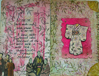
It's all about distress markers this week; using them for coloring, using them for stamping.  Here is the page where I used them on just about everything:

 
The kimono (a Judikins stamp I've had forever) was stamped on Ranger's specialty paper.  I used embossing ink and black powder.  I like to emboss the outline of a stamp I plan to color; the embossing helps keep each color from straying into other areas.  The color palette used:  tattered rose, worn lipstick, scattered straw, shabby shutters, crushed olive, and wild honey.
 
You can also see those colors in the background, which is layered.  I started with paper run through a Cuttlebug folder (from their Asian set).  I highlighted the raised areas with worn lipstick and shabby shutters, which came out way too bright.  So I covered the whole thing with tissue paper.  That helped a little, but not enough, so I then dry brushed some gesso until I got the look I was after.  Then the bamboo leaves (a Stampin' Up stamp) were applied around the edges and colored with crushed olive.
 
The kimono was attached with pop dots to paper that had been embossed with another folder from that Cuttlebug set, colored with worn lipstick (and then some vintage photo to tone that down), then sprayed with Perfect Pearls Mists in forever red for a little sparkle.  Here's a closer look at the kimono:


This is what the two page spread looks like.  The background for the other page is similar.  Bits of joss paper were applied and covered with dry brushed gesso to soften the bright colors.


The photos on the bottom came from an old Japanese catalog, given to me by my friend Kyoko on the last Tim Holtz cruise.  I've made great use of that gift in this particular journal group.  And by the way, the bits of color in those photos came from.....you guessed it.....distress markers.


I haven't said it lately, but thanks to Linda for hosting these challenges; they always inspire me.  And if that isn't motivation enough, this week Linda is going to randomly select a participant to receive a gift, courtesy of Mario and Tim.




Thursday, September 27, 2012

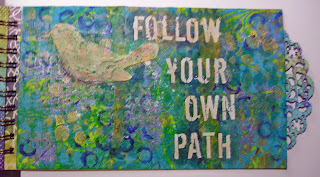
Follow Your Own Path

One of my most interesting collaborative journal groups is Artistic Evolution, in which each artist's pages must evolve in some way from the pages that came before.  What inspires the evolution is up to the artist and it can be anything; color, theme, image.  The other unique thing about this journal is that the pages step up and down in size, so bits of prior or later pages can be seen behind your own.  Makes for a fun creative challenge.

I've been working on Inge's book, and I am the next to last person to do so.  Which means I get to see all the glorious pages that came before.  Very cool. 

Inge's preferred colors are blues in the aqua/teal family, greens and purples.  The person who went before me was Elena, and her pages had some bird images and a quote: "you are right where you should be."  This is what her work inspired me to do:


Two of the birds (the second one on the left page and the one on the right page) were done by spreading fiber paste through a stencil.  The others were cut (using the same stencils as a template) from some papers left over from the Lynne Perrella/Anne Bagby workshop I did last May.  They were collages done on deli wrap paper.
 
I didn't plan this out ahead of time, but when I started attaching the birds, I realized that the one done with the fiber paste on the right page was the only one facing in that direction.  At first I thought I'd cut a few more from the collage to put on that page, also facing towards the left.  Then I had a little "aha" moment. The majority heading in one direction, but one going its own way.  So I left it as is, and that's how "follow your own path" evolved.


The background began by applying a crumbled decorative napkin (blue and green) to the chipboard substrate, then adding MANY stencil designs using regular acrylics, metallic paint, and fluid acrylics.  There is also quite a bit of splattering.
 
The decorative edge you see on the right page was cut from cardboard using Tim Holtz's Distressed Doily die.  It was colored with blue and green ink, covered with clear embossing powder and heat set.  Afterwards some french script was stamped across it with deep purple archival ink.
 
The letters are actually Heidi Swapp rub-ons, and I love the fact that they are already distressed looking, so I didn't have to mess with them too much to make them look like they aren't rub-ons.  I did ink over them a little so they aren't as starkly white as they started out.
 
Just one more person to do their thing and this beauty of a book will head back to Inge in Belgium!


Tuesday, September 25, 2012

Anyone For Tea?

It's been about three months since I've had any books to work on from my Asian inspired journal group.  On Saturday, I received two, and just finished the pages I did for my friend way up north, Lillian.

With these collaborative books, sometimes I know exactly where I'm going and sometimes I just start and hope for the best.  All I knew this time, is that I was going to use the stencil technique I've learned from workshops with the incomparable Lynne Perrella.  Using multiple copies of the same image, stencils are created by cutting away different parts on each copy.  Paints, inks, stains and pastels are applied in layers, decorative stencils are also used in sections, creating a final image that while inspired by the original, is unique and totally belonging to the artist.  I love this technique!  A bit of upfront work, yes, but ultimately so much more satisfying to me than simply cutting out an image, altering it in some way, and gluing it down,

First, the two page spread:


Here is a little closer look at my teacup holding lady:


She was done on watercolor paper, and I mainly used fluid acrylics.  Some details were done with glaze pens and souffle pens.  The characters were heat embossed, as was the teapot on the bottom.  The background paper is from Graphic 45's new Bird Song stack.  It was originally a pale pink, but I changed it to green with one of the acrylics, which is very translucent, so the original pattern is still visible.  The bamboo shoots on the right were heat embossed using Ranger's verdigris powder (one of my favorites).
 
An even closer look:


It was the teacup in the image that led me to the facing page.  I did a little online research into the Japanese tea ceremony.  The four words are the principals behind this ritual.
 
 
The background paper is also from the Graphic 45 stack, and it was altered with gold fluid acrylic paint, and the heat embossing in black and pink on the bottom.  The teapot was stamped on a piece of scrap paper that had been previously covered with that verdigris embossing powder, and it is stacked on two other pieces from the Bird Song collection.  Each layer was attached with pop dots, though I don't think that is obvious in the photo.


Sunday, September 23, 2012

A.R.T. - Altered, Riveted, Taped

I've had this paper mache mannequin for years, and it has been on my never ending list of things to be altered.  Yesterday it finally made it off the list.  Thanks to Linda's Compendium of Curiosities 2 challenge.  We're working this week on Tim's riveted patchwork technique, which is not only on page 57 of his CofC2 book, but is also the featured technique on his September tag.  Linda said we could use our tag for this challenge, but I decided to try in on the mannequin instead.

As luck would have it, the challenge over at Simon Says Stamp and Show is.....tape.  Now, it says quite clearly on the label that the Ranger product I used is a foil TAPE sheet.  The caps are mine, but you get the point.  They say it's tape, who am I do disagree?  So, my piece will also be an entry there.

Before I show you my A.R.T. (Altered, Riveted, Taped....aren't I clever? LOL) let me just say that as a complete amateur at photography, taking a decent picture of  a shiny piece is just ridiculous.  And by the way, any pink you see is not in the piece, but a reflection of the blouse I'm wearing.  Ridiculous.


I enhanced (?) her lady parts with some of Tim's idea-ology pieces, and she is wearing a necklace (dangling off her back) I made some years back on a Tim cruise.  I think she'll look nice on my dresser showing off a favorite necklace (or two).
 
Why not join in the challenges?  At Linda's the possible reward is a gift certificate thanks to The Funkie Junkie.  And as always, the Simon Says site will be giving away one from their shop.


Thursday, September 20, 2012

Great Technique From Wendy Vecchi

Wendy Vecchi is an artist/designer I really admire for many reasons, not the least of which is how she is always coming up with new ways to use the supplies I already own.  Check out her video here for a great technique involving white pigment ink, distress inks, stains, and markers, and black paper.

Meanwhile, over at the EWV (Everything Wendy Vecchi for those who don't know) yahoo group, list mom  (and my good friend) Lori  has been motivating us with various challenges for quite some time, and the current challenge is to use the technique that Wendy demonstrates in the video.

I'll give you a minute to check out the video.  OK, time's up.  You saw what Wendy did, now here is my entry for the challenge:


For the background I really followed Wendy's directions pretty much exactly.  I used the fish and the flourish from the Art For Men set.  The tiny letters are from the Art Inspiration set.  The "seaweed" is actually the stem from the Funky Flower Art set, and now that I'm looking at it, I think it would also make great octopus tentacles.  Not that I imagine myself needing an octopus in my art, but hey, you never know.
 
As for the fish that is NOT part of the background, I used the variation of the technique, stamping the fish on kraft instead of black paper.  I also did one other thing a bit differently.  While the white ink (Ranger's Adirondack snowcap) was still wet I sprinkled it with clear embossing powder and heat set it.  After coloring it with distress markers and inks I decided to add a little color to the embossed parts.  Distress inks won't stick there, so I used some archival inks.  The fish was then cut out and adhered with pop dots for dimension. 


Wednesday, September 19, 2012

Blended Stains

Blended stains:  not a weird laundry problem, but this week's technique featured in Linda's Compendium of Curiosities 2 challenge.  Turn to page 45 in Tim's C of C 2 book and try it yourself.  It's easy, and it results in a very pretty background.  And this week all entries are eligible for a $25 gift certificate from the lovely peeps at Simon Says Stamp.

Although I did follow Tim's directions, I added one of the new metallic stains to the mix (antiqued bronze), and love the bit of shimmer it gives.  I'm not sure just how much of the background you can see once I finished embellishing it with stamps, rub-ons and flowers, but here is my piece, a 4x4 card for the birthday club I'm in:


The main image is one of my new purchases, a Dina Wakley stamp called Grungy Silhouette, stamped in black archival ink.  On the left, in sepia archival ink, the blueprint stamp from Tim's steampunk set.  On the right, stamped vertically, also in sepia,  bits of an old French script Stampin' Up stamp.
 
Both the stitching and the birthday greeting are rub-ons from K&Company.
 
The flowers, leaves and stem are Prima, and I added the tiny pearls around the head and the somewhat larger ones in the center of the bouquet for a little bling.  It felt like something was missing, and that's how the brown lace made an appearance.


Tuesday, September 18, 2012

Birds of a Feather

On Saturday Pat and I trekked downtown where we met up with Michele for breakfast. We then headed over to Westbeth for Dina Wakley's "Birds of a Feather" class. (Brought to us by The Ink Pad, NYC's only stamp store).
This is Dina's project sample that made us want to take the class when we first saw it advertised:


Everyone received a black and white copy of the picture Dina used:


Dina shared an easy low-tech technique (my favorite kind) for transferring an outline of the picture to our substrates. We started with a practice piece on gessoed watercolor paper.
First, the background was quickly done, then the birds. Referring to the photocopy, we painted in the dark areas, then the highlights (lightest areas) followed by the midrange. We used whatever colors we wanted, and the black and white copy made that easy. All you see are the values, not confused by color.
This is my first piece. My background is blue and my birds mainly orange. Since blue and orange are complementary colors the birds really pop off the paper.


We learned brush strokes to emulate feathers, some tricks to make life-like eyes, and finally added some stencils to the background. At home I also snuck in some rub-ons. I like it a lot.
The second piece was done on wrapped canvas. I got it started in class, and completed it the next day at home. I chose different colors, and am happy with this one too.


If you get the chance to take a class with Dina, do it! Besides being a knowledgable and organized teacher, she is a warm and funny person, and the three hour class ended way too soon.

Wednesday, September 12, 2012

A Compendium of Curiosities 2

I love the technique in this week's Compendium of Curiosities 2 challenge, and was happy to have the time to play with it.

If you have Tim's book, enameled stamping can be found on page 44. As Linda said, easy peasy, and makes for a beautiful background. I started with two sample backgrounds, just to practice and check out different stamps and colors, though I didn't use either in my finished piece.


I ultimately decided I was definitely ready for fall, so did my background using autumnal colors and Tim's wood stamp.


Here are some details.


The leaves (Tim's mini tattered leaves) were cut from some unused paper from an older project, inked and then the two in the foreground were covered with glossy accents.


The bird (another of Tim's minis) was covered with music paper; his crown with dictionary paper which was inked and covered with rock candy crackle paint.


Mr. Bird is perched on a branch (part of Tim's branch tree die) enhanced with some rusty barbed wire. Yep, you heard right. For those who wondered why I'd want barbed wire and what I'd do with it, now you know. (Big thanks to Gloria and Julie who both have sent me the wire, and I have no idea whose was used here).

- Posted using BlogPress from my iPhone

Monday, September 10, 2012

Text Tiles With Seth Apter

My friend Michele did it again! What, you might ask? Well, she booked yet another great artist to teach at her awesome studio in Manhattan.
Friday night we (and by we I mean a boatload of my artsy pals) filled the studio to learn from the wonderful Seth Apter. I took a class with Seth at CREATE this summer, but prior to that have been a faithful reader of his always interesting blog, The Altered Page.
If you don't follow the blog, I urge you to start. Seth is an eloquent voice, promoting not only mixed media art, but a strong community of mixed media artists.
Our project was called Text Tiles, small (4x4 and 6x6) cradled wood panels covered with multiple layers and featuring some text.
Here are some shots of my larger tile as it changed with the addition of layers of paint, gesso, texture, stencils, stamps, masks, etc.


I did the smaller tile to coordinate with the larger.


Seth suggested I attach the two, and so I did.


I used a heavy duty glue and a few staples for extra support.


I swiped this photo from a FB post in the lamest lowest tech manner imaginable. I brought the photo up on my tablet and snapped it with my phone. So, it's not the sharpest, but I think you can see how happy we all are. BTW, that's me in the back, on the left, next to Pat, who appears to be resting one of her tiles on my head.


- Posted using BlogPress from my iPhone

Saturday, September 8, 2012

September, The Ninth Tag of 2012

If you haven't already seen Tim's September tag, click here. The main technique is using Ranger's metal foil tape to create an industrial looking background, complete with faux rivets, screws, and stitching.

My piece is not a tag, but instead, a little sign to be hung on a doorknob.


The raised letters were created by gluing some chipboard letters onto the substrate (in this case, one of Wendy Vecchi's art parts).
The letters were covered with the metal tape, which was then gently pressed into and around them.
After that step I pretty much followed the directions on Tim's blog.
In addition to the items Tim suggested for creating texture, I used some tools from Ten Seconds Studio (little wheels with different patterns). Here are some close ups.


The alcohol inks used are: pitch black, espresso, and stream.

It may not show up too well in the photo, but as a little extra embellishment I added another one of Wendy's art part, a small hand. It's covered with Ranger's black enamel accents and I dangled a small heart from the thumb.


You'll have to take my word for it that in person the hand shows up much better. That poor thing went through a lot before I decided on the glossy black finish. It was white, it was silver, it was teal. I hated all of them. I like the black.

- Posted using BlogPress from my iPhone

Thursday, September 6, 2012

Tim + Wendy = STAMPtember Goodness

I've been a bit obsessed with cleaning/purging in my studio, but took time off yesterday for a little play.
The Simon Says Stamp http://www.simonsaysstampblog.blogspot.com/2012/09/tim-holtz-stamptember-feature.html?m=1 has a great video for STAMPtember, featuring Tim demonstrating a ton of cool techniques.
Meanwhile, over at Everything Wendy Vecchi, list mom Lori had a brilliant idea for this week's challenge: use Tim's techniques from the video with Wendy's stamps to create something.
In order to multi task, instead of a tag, I did a 4x4, the size we're doing in a birthday card club I'm in.


All the stamps (except the greeting, which is an old old Stampin' Up stamp) are Wendy's. The words and the smaller butterfly are attached with foam strips to lift them off the page, and those antennae were made from resistors (which I love and have no idea what they were once used for).
The main colors I used, both distress stains and inks (and some markers): rusty hinge, peacock feathers, and vintage photo. Oh! And a bit of the new antiqued bronze metallic stain.
- Posted using BlogPress from my iPhone

Sunday, September 2, 2012

Ingrid Dijkers in New York!

Last weekend was great for several reasons. My wonderful friend Elena was visiting from Florida and we took two fabulous classes with Ingrid Dijkers at Michele's awesome studio.

I'm starting with the second class, only because I've done the most work on that project. It's a book, and it's called De Corporis Humani Fabrica. Bones galore, medical stuff, a tiny bit odd, and very very cool. Ingrid provided the book (a chipboard loose leaf cut down by her husband so it no longer resembles a school binder), and a package of collage images perfectly sized for the project.

Here is my front cover (not a bit of naked chipboard showing):


The title is on an old slide holder, and it opens:


Ingrid had many images sized to fit into the slide slots, as well as the glass slides to cover them. At home I added the gold micro beads to fill in the half round sections above and below the slides.

My back cover:


The inside front cover, followed by the inside back:


I finished the backgrounds of several pages in class and got a few more done at home. I see this as an ongoing project and I'm fine with that.


Ingrid showed us how to make black drips with India ink, but I did mine at home with black fluid acrylics. I blew on the dripping paint to get it to move and used a pin to get those little feathery lines.


These pages aren't finished and who knows if they will even wind up next to each other. That's the beauty of working in a ring binder; you can move the pages around endlessly until you get them where you want.....and then move them again!

On the right hand page you can see arches. Ingrid had templates for us to use (and copy for use at home) and I have used them on many pages. They're just waiting for images to be applied.


These two pages are meant to go together and will likely stay that way.

Below, two more pages of arches, awaiting further embellishment:


I don't think this page is finished; it seems to want some text. I believe I'll have to consult a medical journal. Hmmmm.......maybe in Latin.


Some of the images we received were done in mirror image so they could be glued together to create these cool inserts for our books:


It's a good thing I find fussy cutting very relaxing.

Here is another (almost) finished spread:


Or does it look like this?


It all depends on how you turn this page, cut to fit the full sized pages.


This technique I learned from Ingrid, not in this class, but in one I took with her two years ago.

If you ever have the opportunity to take a class with Ingrid, don't hesitate!

- Posted using BlogPress from my iPhone