Showing posts with label Artistic Evolution. Show all posts

Thursday, November 15, 2012

Evolving Journal Pages

I've completed pages for two more books in my Artistic Evolution group.  Carla's overall theme is sunflowers, and the pages I was evolving from had three huge ones as a border (visible from my pages), so I went for a straightforward evolution.  Here is my two page spread:


And here is my first page with Jen's sunflower border on the left, which I clearly needed to incorporate into my pages:


After literally searching for hours for an image I wanted to use, I discovered I had an old Sizzix sunflower die hidden away.  Who knew?  I used that for the focal image on the first page, but added lots of texture.


The background paper started off as some very pretty Graphic 45 paper, though I doubt it is recognizable after all the stenciling and embossing I did over it.
 
Here is the second page close up.  The beautiful statue head is also from Graphic 45, and I just glitzed her up a little, giving her a sunflower headpiece and a little shading.  Of course, it is really a daisy headpiece, but I'm calling it sunflowers.


Lori didn't give us a theme to work with, just a general color scheme of red, yellow and green.  The pages that preceded mine featured a witch (evolved from pages with fairies), so I continued the flying theme with butterflies.


I started with patterned paper (old, from my stash, and I think from Stampin' Up) that already had butterflies on it.  I added stenciled, masked, and stamped butterlies, including one done with modeling paste.  Then I added some that I stamped on patterned paper,embossed to give them some texture, then cut out, and attached with some machine stitching, so their wings can flutter.  The off the edge border is made up of three butterflies cut with a ProvoCraft die, using some previously inked and embosed paper that I've had lying around for ages.  The right colors for this project.


Here is an angle shot of the butterfiles so you can see how they pop off the page.
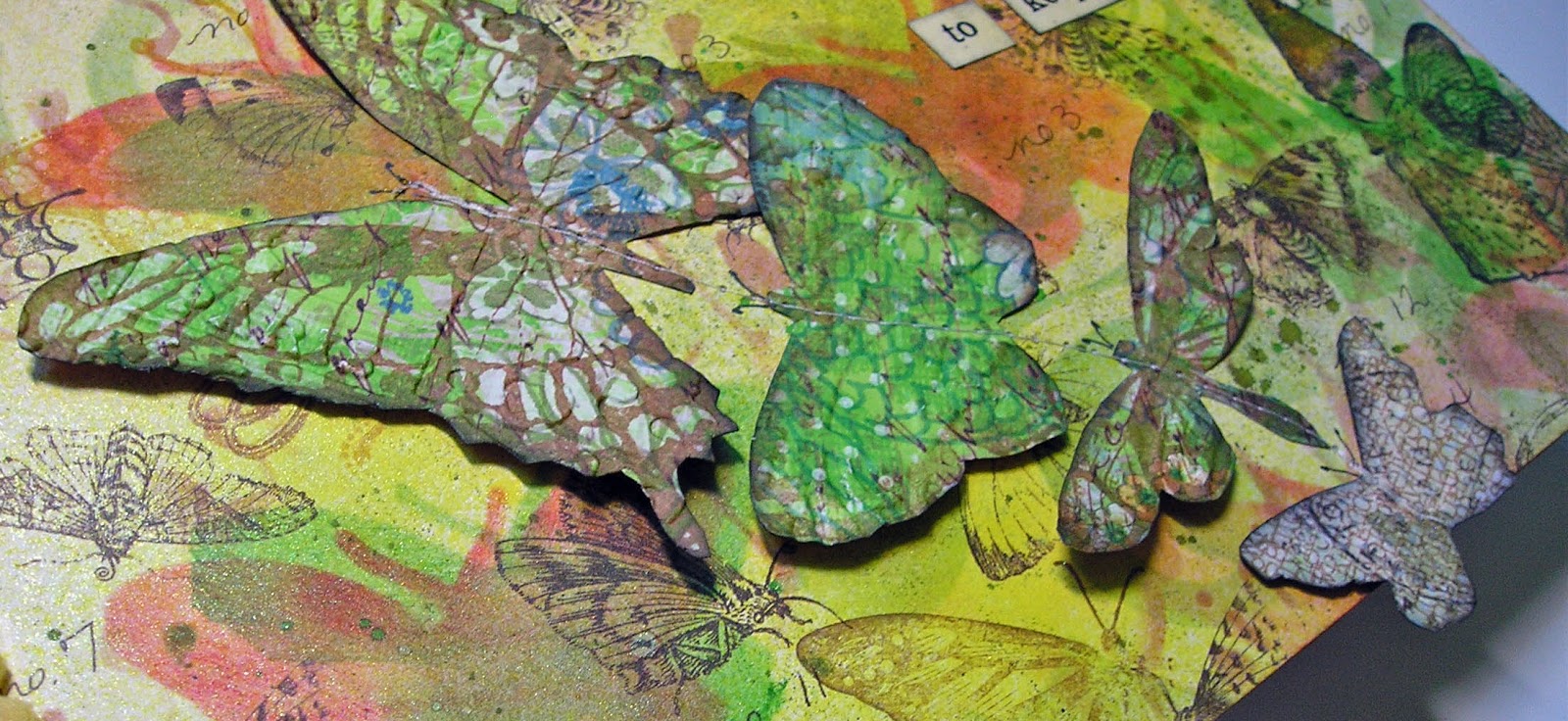


And this is a closer look at the butterfly created with a stencil and modeling paste.


Looks like I'm all caught up with my journals.  Guess it's time to start thinking about some holiday cards.


Tuesday, October 23, 2012

New Journal Pages

As two collaborative journal groups approach the finish line, another begins its journey.  The Asian themed journal and the artistic evolution journal are just about done, so we launched our latest project, Vintage Ancestors.  We each created books and started things off with a cabinet card (real, copied, or invented) and a story.  While we could use actual family photos and stories, what's the fun in that?  So, most of us went online, began collecting images and thinking up some juicy family secrets.

Last week I received Elena's book.  It is already amazing.  She found an actual cabinet card scrapbook and took it apart and reworked it.  Her story began with a group photo and the tale of a family separated by politics and circumstance, and leaving their native Spain for the United States and Cuba.  The year was 1899.  The family consisted of the two parents and their nine children.

I thought that was a great way to begin.  While we're free to do as we please, there are enough family members for each of us to choose one and continue their story.

I chose Miriam, aged 19, and here are the pages I did about her. (You can click on the photo for a better view).


Along with this book, Elena also sent me Sarah's artistic evolution journal to work in.  This is the book where the pages go up and down in size and each artist evolves in some way from the artist that came before.  Elena and I have very different styles.  Her page that is partially visible when looking at mine has lots of circles, so I took that as my inspiration.  My pages have embossed circle stamps, circle stencils, etc.  Oh, and Sarah requested purple, yellow and green as our primary color palette.
 
 
Believe it or not, I started with black paper, over which I samped my variety of circles with clear embossing powder.  Then came many layers of watered down perfect pearls, followed by paint, ink, and more stencils.  The shimmer of the perfect pearls makes it hard to photograph the pages without a lot of glare.
 
I outlined my text and the stenciled figures with white to 1) make them pop and 2) make them relate better to Elena's pages, as she used quite a bit of white outlining.
 
Here's what it looks like with Elena's page visible behind mine.


I think it looks like the girl is peeking out, trying to get a look at my pages.  Well, that's my theory and I'm sticking to it.
 
In December we're starting another round robin called Vintage Lace.  It's going to be a fabric journal.  I am hardly queen of the needle workers, so that should be interesting.  You ever notice how people use the word interesting to replace some other, usually negative word?  Just asking.


Thursday, September 27, 2012

Follow Your Own Path

One of my most interesting collaborative journal groups is Artistic Evolution, in which each artist's pages must evolve in some way from the pages that came before.  What inspires the evolution is up to the artist and it can be anything; color, theme, image.  The other unique thing about this journal is that the pages step up and down in size, so bits of prior or later pages can be seen behind your own.  Makes for a fun creative challenge.

I've been working on Inge's book, and I am the next to last person to do so.  Which means I get to see all the glorious pages that came before.  Very cool. 

Inge's preferred colors are blues in the aqua/teal family, greens and purples.  The person who went before me was Elena, and her pages had some bird images and a quote: "you are right where you should be."  This is what her work inspired me to do:


Two of the birds (the second one on the left page and the one on the right page) were done by spreading fiber paste through a stencil.  The others were cut (using the same stencils as a template) from some papers left over from the Lynne Perrella/Anne Bagby workshop I did last May.  They were collages done on deli wrap paper.
 
I didn't plan this out ahead of time, but when I started attaching the birds, I realized that the one done with the fiber paste on the right page was the only one facing in that direction.  At first I thought I'd cut a few more from the collage to put on that page, also facing towards the left.  Then I had a little "aha" moment. The majority heading in one direction, but one going its own way.  So I left it as is, and that's how "follow your own path" evolved.


The background began by applying a crumbled decorative napkin (blue and green) to the chipboard substrate, then adding MANY stencil designs using regular acrylics, metallic paint, and fluid acrylics.  There is also quite a bit of splattering.
 
The decorative edge you see on the right page was cut from cardboard using Tim Holtz's Distressed Doily die.  It was colored with blue and green ink, covered with clear embossing powder and heat set.  Afterwards some french script was stamped across it with deep purple archival ink.
 
The letters are actually Heidi Swapp rub-ons, and I love the fact that they are already distressed looking, so I didn't have to mess with them too much to make them look like they aren't rub-ons.  I did ink over them a little so they aren't as starkly white as they started out.
 
Just one more person to do their thing and this beauty of a book will head back to Inge in Belgium!


Tuesday, June 19, 2012

Art Journal Marathon

You know that expression, "when you're hot you're hot.....," well nowhere does that apply more than in what we do in the mixed media world.  Sometimes you stare at blank paper for hours without a bit of inspiration, and sometimes you just can't stop creating.

When I sat down at my work space Saturday afternoon my intention was to work on one of the three asian themed collaborative journals I had in my to-do pile (along with other stuff).  Saturday rolled into Sunday into Monday, and I had finished all three, plus one Artistic Evolution journal as well.  When the muse is so willing, the body just better cooperate.

First up, the pages I did for Sox.


Golden fluid acrylics and Dylusions sprays on text for the background, then lots of stenciling and some stamping.  The fish are from Wendy Vecchi's Art For Men set, and were stamped with black archival ink and colored with distress markers.

The next two pages are for Val's journal.


Some paper collage and stencils over text for the background.  The female figure on the left is a stamp, colored with a variety of things, not all of which I remember.  I know I used watercolors and distress markers.  I also did some stenciling on top of the clothing.

The male figure on the right was cut from a Japanese catalog my pal Kyoko gave me on the last Tim cruise.  I've been using it lots in these journals as it is a treasure trove of beautiful images.  The little pocket sewn onto the page is actually fabric, and it was part of a gift from Naomi, another cruise pal, this one given to me on the New England Tim cruise.  I love being able to incorporate things I've received from one friend in something for another friend.  It just feels good.

Sue's book was created with signatures of four pages.  We were only obliged to work in the center two, but if we wanted, we could do something on the first and last pages of the signature as well.  Sue said she has plenty of beautiful paper to fill in the blank pages, so no worries.  As I was definitely on a roll, I did all four pages.  The first was a no brainer.  Ever since I did this tag I knew it would find its way into someone's asian journal.  All I did for the background was spray some color on a page of text, then stamp the grass with pigment ink and add some embossing powder.


This is the two page spread followed by each page individually.


The stones were created by scraping gesso through a stencil.  When dry they were inked with a variety of brown, gray, and black.  The seated woman is a stamp.  The bamboo was done with a cuttlebug embossing folder, colored with distress inks and carefully cut out.  Other stamping (the foliage) was heat embossed.

The last page in the signature was done with another embossing folder.  On this one I applied broken china ink directly to the folder before running it through my machine to create the water.  The koi were colored with distress markers.  The piece was matted on a piece of decorative paper.


The last journal I worked in was Sue's Artistic Evolution journal.  Her colors are the colors of Provence, green, amber and purple.    I was thinking of fields of flowers, and did a lot of stamping, added texture by applying fiber paste through stencils, sprayed, doodled, and created some flowers with bits of canvas.  The decorative edge on the right was done with Tim's tissue paper,which I first inked with dusty concord and chipped sapphire.


It's good I'm finished, because I just heard that two more asian journals are heading my way!


Saturday, June 16, 2012

I'm Going In Circles!

Not in my life so much, but in my art for sure.  Circle stamps, circle stencils, circle punches....I'm circle crazy, I tell you.  And this all manifested itself in the pages I did in my friend Marita's Artistic Evolution journal.  That's the one where the pages are different widths and we have to evolve our pages from the ones that came before.  I'd refer you to a link on my blog, but I haven't fixed all my back posts yet, and all you'll see are those dreadful ugly icons instead of photos.  Some day.....

Anyway, the pages that came before mine were playful and full of stylized flowers, but all I saw were the circles.  Here is my two page spread, followed by the individual pages.


Using Marita's color scheme of purple, burnt orange and cream, I sprayed, I inked, I stenciled.  I added light modeling paste through one of the stencils, I added some purple netting in spots, punched circles from scraps, even used some circular rub ons.  Then I went for the circle stamps, and used black archival ink with those.  The last thing I did was add some of those little people stencils, because I just love the way they look "standing" on circles.  Oh, and I did a little bit of writing with one of my new favorite toys, the parallel pen.  That is calligraphy pen that uses india ink cartridges, and it can make anyone's handwriting look good.

Because of the varying widths of the pages, we have the opportunity to add edging that often can be seen from behind other pages or with the edges of other pages behind them.  So we really have to think about how the edges look coming and going.  Here's what I did:


I used metal rimmed paper labels, cut them in half, colored them, embossed them and punched tiny holes in them. 

I have another AE journal in the wings, along with three asian journals I received yesterday.  You know what I'll be doing tomorrow!


Friday, April 27, 2012

Let The Good Times Roll

One of my favorite collaborative art journal groups is the Artistic Evolution.  That's the one in which our pages are supposed to evolve in some way from the pages that came before.  If you'd like to know more, click HERE.  It's been a while since I've received a book to work on, so I was thrilled to get Gina's from Elena last week. 

Gina's colors (the ones she'd like to be predominant in her book) are purple, emerald green and deep blue.  So, I immediately thought of Mardi Gras.  The pages that came right before mine had lots of gold, and the text mentioned silk and gold dust.  That just reinforced the Mardi Gras theme in my mind.  So, I used some of my favorite phrenology head images (including Wendy Vecchi's art chick stamp, an Invoke Arts stamp, and some from an Alpha Stamps sheet), and dressed them up in Mardi Gras finery.

Here are my two side by side pages:


The backgrounds were done with Color Wash sprays, distress stains, Inktense pencils, stencils and both glaze and gel pens.  The revelers were colored with Portfolio water soluble oil pastels, metallic craft paint, and lots of glaze pens.  They all wear collars made from bits of left over ribbon that I shredded into tiny pieces.

Here are some closer looks.


Thursday, June 30, 2011

We Interrupt this Interruption......

......I am home for a few days before family business takes me away again, and as the name of my blog attests, doing art is an absolute necessity, no matter what other drama is going on.  Before I left last week I started work on pages in my friend Lill's Artistic Evolution journal, and finished them yesterday.  This morning I went to the post office and the book is on its way to the next contributor.  Yes, I just love being a part of these collaborative projects.

Lill's only request was that the color turquoise be part of our work, and most of the artists who did pages before me had an aquatic theme.  I continued that, but with a bit of a twist.  Here they are:


There are lots of layers under the blue that wound up being covered, which happens a lot.  But even if you can't see the text, the music sheets, etc., they do add lots of texture.  As for my version of koi fish, I did a rough sketch with pencil and filled that in with.....are you ready?.......scraps of that black and white patterned paper you find on the insides of security envelopes.  They're pretty much covered up in the largest fish on page 1, but you can still see some of the pattern on the second page fish.  I can't even tell you all that went on top of the paper.  I know there I used a blue glaze, wild honey distress stain, gold paint, orange glaze.....until I got a look I was happy with.  

I was most excited though, about the quote I found. 

Speaking of collaborations (I was, wasn't I?), if you're not already a follower of Seth Apter's blog (The Altered Page), you ought to visit.  Seth is a NYC artist who has been widely published, and has been involved in many collaborative projects, some lasting years!  Seth is very dedicated to fostering an online community for all us mixed media peeps, and one way he does this is through something he calls The Pulse, which appears on his blog.  He sent out a list of questions for a variety of artists to answer and the results will be published beginning this weekend.  There will be posts Saturday, Sunday, and Monday, and then every Sunday thereafter.  Questions like, what is your go-to technique?  what art supply can't you live without?  if you could take a class with any artist living or dead, who would it be?  And other equally interesting things to ponder.  I've always enjoyed reading the responses of other artists, and this year, my responses will be part of The Pulse.  So please do check it out.


Wednesday, June 8, 2011

I'm In Love.......With Stencils

As I've mentioned before, I returned from that Lynne Perrella workshop obsessed with stencils and I even noted on this blog:  buy more stencils.  Hah!  Did I ever!  I now just might have every Crafter's Workshop stencil out there.  Well, if not all, then surely most.  Thank you Lynne for opening my eyes to all the ways that stencils can enhance and freshen up the look of a collage.

The other day, after some whining and complaining, I FINALLY received another Artistic Evolution journal to work on.....Tracy's.  Remember, this is the journal with pages that vary in size so that you can see the edges of some pages behind others.  Easier to show than explain.  Here is a picture of the edges done so far in Tracy's book:


Mine is the last one, the pinkish roses.  Pretty cool, huh?  After my page, there is a repetition of these sizes, and then another.  Math gives me a headache, but Val, who designed the books (and assembled them for us) worked it out just perfectly for the number of artists in this group.

I didn't pick up on the theme of the pages that came before mine, but took a cue from some of the colors.  OK, honestly, I have no idea how my pages evolved from those that preceded them.  I just followed my muse.  And came up with these, chock full of layers, collage elements, and yes.....lots and lots of stenciling.


I started with texture by gluing some handmade papers randomly on my base.  Over this, squares of asian newspapers.  Then I applied some metallic paint by scraping it over everything with an old credit card.  When all this was dry, I covered the page with one of my new stencils and dabbed black acrylic paint over the whole thing.  That's how the metallic flowers with the black background came to be.  You really have to look at it closely to see the layers that lie beneath, but they are there.  On top of all this, I laid some sequin waste (squares instead of round holes) and dabbed some gold paint through it.

As for the images......again, I have to credit Lynne for sharing so many ways for me to take an available image and make it my own.  I found the black and white pictures on the internet, printed them out, resized them, and then made toner copies (so there's no ink to smear later on).  These are colored with Portfolio water soluble oil pastels, and enhanced with stamping, even more stenciling, and in the case of the woman, a whole lot of bling (in the form of micro beads and stickles).  I also did some doodling with glaze pens.


Tuesday, May 3, 2011

In The Pink

In the world of collaborative art journals we're sometimes called upon to work with colors or themes that we don't necessarily love.  I really don't mind stepping outside my comfort zone, but a challenge it is.

Enter Jen's Artistic Evolution journal......gorgeous to be sure, but an explosion of pinks and purples.  I don't have a bit of either color in my home and almost none in my wardrobe.  I can admire those hues on others but am rarely attracted to them.

BTW, this is a fascinating journal, with pages of varying sizes so that the previous artist's work peeks out from behind your own.  Click here to learn more about it.

In this journal, our pages are to evolve from those that came before.  Elena's pages had to do with transformation and there were a few butterflies, so I ran with that.  Here are my two pages, side by side, followed by individual shots.


The backgrounds consist of a whole lot of spraying.....glimmer mist, homemade mist, perfect pearls mist, colorwash.....if it even resembled pink, I used it.  There was also a lot of masking, some stamping, rub-ons, gesso dabbed through sequin waste, and every butterfly die I owned worked overtime.

I'm not sure if it shows up, but the lavendar flower that Elena used and that I can see behind my left hand page inspired me to add lavendar to my pink pages.  I think of this concept like the art version of the old telephone game.  Who knows what the last pages will look like?  Maybe there won't be any pink left at all!

What will peek through to the other side, and what the next artist will have to work with, is the edge on the right hand page.  I cut it with Tim's on the edge scallop die and tied yarn and ribbon through the holes.


Monday, February 28, 2011

Another Artistic Evolution

My latest collaborative art journal project, The Artistic Evolution is under way, and I've been working on pages for Ali.  She included a  color guide with her book, so though I could do anything, my first page was to be done with dark red, purple, mustard, and olive.  The second (facing) page would be dark red, mustard, olive and turquoise.  An interesting idea.  Each page dropped one color and added a new one.  By the time her book is complete, Ali will have the entire rainbow, but each page will evolve gradually and beautifully into the next.

If you need reminding, this journal is made up of pages of different sizes so that you can see bits of them behind one another.  Click here to see my original post on this project.

There is only a bit of paper on my pages.  I mainly used fabric, ribbon, trimmings, netting, and some beads.  Here are the two pages as they will appear in the book (I haven't glued them in yet):


Page one:


Basically, I covered a piece of  cardstock with mustard colored fabric, then added strips of other fabrics, a bit of purple netting and tacked them down with some machine stitching.  The tag and ATC were done on a recent weekend art retreat (which I have yet to blog about....coming soon!), and they just so happened to be the right colors to use here.  Don't you love when that happens?

Page two:


This page started with the same mustard colored fabric.  Then roughly cut squares of dark red and turquoise, a bit of 7 Gypsies paper on the left, a strip of Japanese fabric down the middle, and then the whole thing covered with olive netting.   More machine stitching and some beads on the right edge, and another ATC from the retreat.

My next journal to work in will be Elena's, but I won't be getting that in the mail.  I'll be picking it up in person NEXT WEEK when I fly to Key Largo (well, I'll actually be flying to Miami if you want to be technical) for our second annual Keys4Art.....six days of wonderful art, fabulous friends, great food, and more than a few excellent mojitos.  Click here for the first of several posts I did last year.