Showing posts with label tissue paper. Show all posts

Sunday, August 25, 2013

What's Black and Sepia and......

.....gorgeous all over?  Sox's World of Color journal (from the Kindred Souls group), that's what.  It arrived from Stephen's talented hands just two days ago, and I've already finished my page.  I was inspired by the journal itself (lace and fabric and paper and bling), as well as the pages already done.  I think that black and sepia is one of the most elegant color palettes, and I just dove right in.

First I filled my work table with everything (well, that's an exaggeration, so let's just say a lot) in my stash that supported Sox's colors, and gradually came up with a plan.  It began by covering both the front and back with different 7Gypsies tissue paper, because the patterns are printed in black on sepia paper.  Or so I thought.  It became clear that the sepia was really more like a gold, and that annoyed me.  I solved that problem by concocting a mixture of glaze medium and tan paint which toned down the gold and brought the background to a more sepia-ish look.  After that it was just a matter of layering papers, sewing them down, and adding some stenciling, stamping, and a tag as the focal point.


The tag itself is made of kraft cardstock.  The background was done by first layering on some tan, cream, and beige paints, letting that dry, then stamping (a Hero Arts background stamp) with black archival ink.  When that was good and dry a very thin layer of rock candy clear stickles was applied with a fingertip, which is what gives it a subtle sparkle.
 
The dress form was cut with Tim Holtz's Sewing Room die.  The phrase is a Wendy Vecchi stamp, and the dress form is covered with Claudine Hellmuth's sticky back canvas.


The buttons were sewn onto fabric that had been stamped with a tape measure stamp.  As for the thimble and scissors charms.....they dangle from Tim's memo pin.  They began life as a very cheap and garish looking gold, which was toned down by tapping them with a black archival ink pad.
 
The back of the page is much simpler, but there was just too much good stuff left on my table, so it was decorated a bit more than I had to.


Again, the tissue paper was treated with that glaze/paint mixture.  On top of that, archival ink (black and coffee) through two different Prima stencils.  Then I sewed on the fabric and paper that would hold a little tag.


The tag was created from some Graphic 45 embellishments, and on it, my information.


While searching for items to use, I came upon some Heidi Swapp designs printed on acrylic.  They must have been in my stash for years; she called them "clear extras".  I used a few of them.  I love it when something I bought and never used finally gets its chance.


I look forward to the next journal arriving at my door.


Sunday, September 30, 2012

Distress Markers/Inspired by Asia

Before I sat down to work on my friend Lori's (no, not Lori of I Been Thinkin' 'Bout Inkin' fame; another Lori) Asian inspired journal, I decided to head over to Linda's blog to check out this week's Compendium of Curiosities 2 challenge.  As luck would have it, the technique (on page 50 of Tim's book) coincided with my plans for the journal.

It's all about distress markers this week; using them for coloring, using them for stamping.  Here is the page where I used them on just about everything:

 
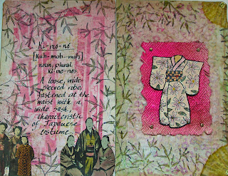
The kimono (a Judikins stamp I've had forever) was stamped on Ranger's specialty paper.  I used embossing ink and black powder.  I like to emboss the outline of a stamp I plan to color; the embossing helps keep each color from straying into other areas.  The color palette used:  tattered rose, worn lipstick, scattered straw, shabby shutters, crushed olive, and wild honey.
 
You can also see those colors in the background, which is layered.  I started with paper run through a Cuttlebug folder (from their Asian set).  I highlighted the raised areas with worn lipstick and shabby shutters, which came out way too bright.  So I covered the whole thing with tissue paper.  That helped a little, but not enough, so I then dry brushed some gesso until I got the look I was after.  Then the bamboo leaves (a Stampin' Up stamp) were applied around the edges and colored with crushed olive.
 
The kimono was attached with pop dots to paper that had been embossed with another folder from that Cuttlebug set, colored with worn lipstick (and then some vintage photo to tone that down), then sprayed with Perfect Pearls Mists in forever red for a little sparkle.  Here's a closer look at the kimono:


This is what the two page spread looks like.  The background for the other page is similar.  Bits of joss paper were applied and covered with dry brushed gesso to soften the bright colors.


The photos on the bottom came from an old Japanese catalog, given to me by my friend Kyoko on the last Tim Holtz cruise.  I've made great use of that gift in this particular journal group.  And by the way, the bits of color in those photos came from.....you guessed it.....distress markers.


I haven't said it lately, but thanks to Linda for hosting these challenges; they always inspire me.  And if that isn't motivation enough, this week Linda is going to randomly select a participant to receive a gift, courtesy of Mario and Tim.


Sunday, July 8, 2012

Toss The Smokes; Alter The Box

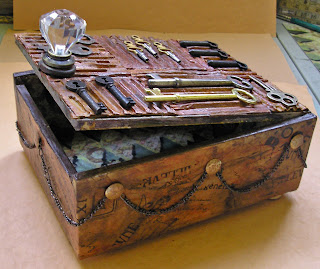
The Kindred Souls group is in the midst of a cigar box swap, and I was lucky enough to be paired with Neil, an awesome artist from England.  We briefly communicated and both decided that whatever each of us did would be fine.  I was happy to be making a box for a man, because I don't often get to do that,  and I did what I love to do......a little bit vintage, a little bit steampunk, a little bit grunge, and a whole lot of texture.   I just mailed the completed box the other day, and it will take about two weeks to reach Neil.  So, Neil, if you're reading this and would like to be surprised, step away from the computer or go visit another blog!


Above, a look at the box with the lid partially opened (yes, it closes nicely).  And now for some closer looks.  First, the top.


I took some corrugated cardboard and ripped off the paper covering one side, then cut it into different sized pieces for the mosaic look.  I used inks and stains to color the pieces until I thought they looked suitably grungy, and adhered them with a strong glue.  Then I went through my stash of keys, selected some and glued them down.  I wanted to attach some sort of knob to the top to aid in opening the box, but the craft knobs I had on hand (lots of them!) didn't have a screw long enough to go through the lid, and I had no screws in my junk drawer that would fit, so I wound up using a finial from an old lamp that worked perfectly.  It took a while to get the hole made, but an awl worked fine.


The sides of the box were covered with many scraps of patterned tissue paper and sealed with Ranger's Glue N Seal.  Oh, I used that on the top of the box too, by the way.  The chain goes all the way around the box and the swags were created by attaching the chain with plain old thumb tacks....which I banged up and colored with permanent ink to get a rusty look.


Decorating the inside of the box was optional, but I just couldn't leave it naked.  Here's what it looks like fully opened.  And next, photos of the inside of the box and inside of the lid.


For the bottom and sides of the inside I took some patterned paper and altered it with stamps and stencils.


The underside of the lid was covered with Tim Holtz's tissue tape, which was then colored with both Golden's fluid acrylics and distress inks.  And yes, everything was sealed and protected with more Glue N Seal.


I think boxes look nicer if they have some lift, so I added feet.....made from bingo markers.  The paper on the bottom of the box is plain old kraft from a disassembled grocery bag.  It was inked, crumbled, inked some more and glued down, without smoothing it too much so some of the wrinkles remained.  It may not look it in the photos, but I think it resembles leather. 

I left this out and opened for DAYS before packing it up (carefully enough, I hope) and sending it across the ocean.  Even though everything seemed dry after a few hours, you really want to make sure of that before shipping something like this.  I wouldn't want Neil to be unable to open it.  Speaking of which, before packing it up I did put a little something inside for Neil to discover.  No photo of that, so even if Neil decided to look, something will still be a surprise.


Tuesday, June 19, 2012

Art Journal Marathon

You know that expression, "when you're hot you're hot.....," well nowhere does that apply more than in what we do in the mixed media world.  Sometimes you stare at blank paper for hours without a bit of inspiration, and sometimes you just can't stop creating.

When I sat down at my work space Saturday afternoon my intention was to work on one of the three asian themed collaborative journals I had in my to-do pile (along with other stuff).  Saturday rolled into Sunday into Monday, and I had finished all three, plus one Artistic Evolution journal as well.  When the muse is so willing, the body just better cooperate.

First up, the pages I did for Sox.


Golden fluid acrylics and Dylusions sprays on text for the background, then lots of stenciling and some stamping.  The fish are from Wendy Vecchi's Art For Men set, and were stamped with black archival ink and colored with distress markers.

The next two pages are for Val's journal.


Some paper collage and stencils over text for the background.  The female figure on the left is a stamp, colored with a variety of things, not all of which I remember.  I know I used watercolors and distress markers.  I also did some stenciling on top of the clothing.

The male figure on the right was cut from a Japanese catalog my pal Kyoko gave me on the last Tim cruise.  I've been using it lots in these journals as it is a treasure trove of beautiful images.  The little pocket sewn onto the page is actually fabric, and it was part of a gift from Naomi, another cruise pal, this one given to me on the New England Tim cruise.  I love being able to incorporate things I've received from one friend in something for another friend.  It just feels good.

Sue's book was created with signatures of four pages.  We were only obliged to work in the center two, but if we wanted, we could do something on the first and last pages of the signature as well.  Sue said she has plenty of beautiful paper to fill in the blank pages, so no worries.  As I was definitely on a roll, I did all four pages.  The first was a no brainer.  Ever since I did this tag I knew it would find its way into someone's asian journal.  All I did for the background was spray some color on a page of text, then stamp the grass with pigment ink and add some embossing powder.


This is the two page spread followed by each page individually.


The stones were created by scraping gesso through a stencil.  When dry they were inked with a variety of brown, gray, and black.  The seated woman is a stamp.  The bamboo was done with a cuttlebug embossing folder, colored with distress inks and carefully cut out.  Other stamping (the foliage) was heat embossed.

The last page in the signature was done with another embossing folder.  On this one I applied broken china ink directly to the folder before running it through my machine to create the water.  The koi were colored with distress markers.  The piece was matted on a piece of decorative paper.


The last journal I worked in was Sue's Artistic Evolution journal.  Her colors are the colors of Provence, green, amber and purple.    I was thinking of fields of flowers, and did a lot of stamping, added texture by applying fiber paste through stencils, sprayed, doodled, and created some flowers with bits of canvas.  The decorative edge on the right was done with Tim's tissue paper,which I first inked with dusty concord and chipped sapphire.


It's good I'm finished, because I just heard that two more asian journals are heading my way!


Monday, May 14, 2012

Two Projects, Three Challenges, and a Cool Technique

I know I said no more challenges or swaps until I finished some old projects, but I couldn't resist this month's tag in Tim's 12 Tags of 2012.  It features the beautiful faux porcelain technique, and it found me in the mood to haul out the melt pot.

I don't like copying Tim's tags exactly, so I just concentrate on the techniques, and my tag includes the faux porcelain flowers (I also used Primas, plus some others found in my stash), as well as the tissue paper background.  Instead of a spool, I placed my bouquet in one of Wendy Vecchi's art parts....the flower pot, which was gessoed, inked with the new peacock feathers distress ink, dusty concord and (also new) shaded lilac.  It was then stamped with one of Wendy's fab backgrounds with berry purple archival ink.


The sentiment is a Wendy stamp.  Next, a close up of the flowers.  The small ones started out purple, but the others were white, and I tinted them with two of the new distress inks.....shaded lilac and squeezed lemonade (which is a great yellow) before dipping them in the melted UTEE.  Please click on the link to Tim's blog (above) to see the step by step details for this technique.


Since digging out the melt pot and actually using it is not an everyday event around here, I wound up making way more flowers than I needed, so I thought this would be a great opportunity to participate in the current challenge over at the Wendy yahoo group.  The theme is ATCs and the only rule, other than sticking to the theme is to use at least one of Wendy's stamps.  I did that, and more, and also included more art parts than you'd think would fit on a 2 1/2 x 3 1/2" piece.


The scallops, leaves and vase are all art parts.  Actually the vase started out in life as the base for a lamp, but I easily sliced off the lampshade.  I used pretty much the same colors on it as I did on the flower pot and added a dusting of lemon sparkle perfect pearls (which goes so well with the touches of squeezed lemonade distress ink I used throughout the ATC. 

I tried faux porcelain flowers once before with less success.  The difference this time, I think, is that I really filled the melt pot with UTEE.  It works much better if you can actually submerge the flowers into the UTEE.  It still requires a little finesse, and Tim's blog has some helpful hints,.

As luck would have it, this week's challenge at Simon Says Stamp and Show is "anything goes."  So, I'm submitting the ATC there as well.

And now, back to working on some of my unfinished "masterpieces," LOL.


Tuesday, January 24, 2012

Cracked and Bricked

I'm happy to report that yesterday I managed to create a birthday card that is also OK for Grungy Monday Challenge 34, and the Simon Says Stamp and Show challenge.
The lovely Linda Ledbetter of GM, asked us to do something that incorporates Tim's crackle resist technique.  And over at Simon Says, we're to do a piece inspired by a song title.

I know this is not a card for everyone, but I'm pretty sure its recipient will like it.  It's grungy and graffiti inspired.


It started with black cardstock, which I embossed with Tim's bricked embossing folder.  I then applied a coat of antique linen distress crackle paint, thick in some areas, thin in others, just like Tim demonstrated in the video.  While the paint was still wet I removed some around the bricks so they'd be more recognizable as bricks.  Then I just sat and waited for the paint to dry and the crackling to begin.

I added some shreds of 7 Gypsies tissue paper to look like the remnants of posters on the wall.  Adhered them with Ranger's Glue N Seal and being tissue paper, they really did kind of "melt" into the wall.

The writing, deliberately wonky (well, that's my story and I'm sticking to it), was done by dabbing black paint through Tim's stencil type.

The shadow of the woman staring at the wall is actually a Wendy Vecchi stamp, from her Regal Art set.

As for the song title.....are you old enough to guess, LOL?  Well, it's Another Brick in the Wall, by Pink Floyd, released in 1979.  And now you have a pretty good idea of just how old I am!

Wednesday, December 28, 2011

Grungy Monday -- Get Out the Tissues

This week's Grungy Monday is all about tissues.....Tim's tissue paper and tissue tape, that is.  The challenge is simple:  use either or both products on a project.  No other conditions or restraints.  So, remembering to be clever and multi-task, I decided to make a birthday card for my GM entry.


I started out with the idea in mind of using the tissue paper technique Tim used on tag 12 of the 12 Tags of Christmas this year.  Except that I didn't go back to review the steps.  I just plowed ahead, and as a result skipped a few along the way.  But no worries; my unintentionally simplified version works too.

I stamped the background with one of Tim's flourishy stamps, filling it up (using black archival ink), then covering it with a piece of the music tissue paper (using Ranger's matte Glue N Seal).  Since I skipped the step where you lighten the stamped images with Picket Fence Distress Stain, you can see quite a bit of the stamping under the music.  Which works for me.  I also skipped the wrinkling the tissue paper step as well as the cover it all with stickles step. 

To add even more tissue to the mix, the image I chose is actually cut from a decorative napkin, glued down with....you guessed it.....Glue N Seal.  I covered her printed feathers with some real ones and added a bit of bling in the center.

The bits of sparkle around the edges comes from Suze Weinberg's Beadazzles (in Purple Rain).  In case you don't know, Beadazzles are a great mix of micro beads and glitter, and I stocked up on a huge number of them at a Ranger Warehouse Sale a couple of years back.  I don't even know if they are still manufactured, but they are a very cool embellishment.  And a tip:  after adhering them to your project, a light coat over top with....yep.....Glue N Seal, will keep them all in their place forever.

The birthday greeting was made from Jenni Bowlin's mini letter stickers.

If you look closely, you can see some of the stamping/music tissue paper through the image of the dancer, and I think that is very very cool.


Monday, December 12, 2011

The 12 Tags of Christmas -- Day 12

So, it's the 12th and final tag of Christmas for 2011.  Kinda sad, but I think Tim and Mario need those 6+ hours back each day, not to mention running all over Prescott looking for a signal when their internet goes down.  Thanks for the fun, guys.  Your generosity is beyond measure.

Today's tag features one of Tim's little faux frozen Charlottas.  You know, those bizarre porcelain dolls with missing limbs.  I don't have any of his version, but I knew I had a bag full of some I'd gotten on the internet, but when I looked......no bodies, just heads.  Even more bizarre.  So, that caused me to change up my design quite a bit.  One head would have looked a bit lost sitting on top of the artful dwelling that Tim used.  So I did a rosette instead.  Which would lead to another change, and another......well, before I go into all that, here is my tag:

First, I should mention that I did use the background technique with Tim's tissue paper.  What I added after the stickles was some weathered wood distress stain.  And under the tissue paper I used the background stamp from the Papillon set.  Much of this is covered with the tag's embellishments, but it is a really lovely background.

I don't have the decorative strip die that Tim used to make the faux German scrap, so I thought I'd try one of my border punches.  Varied success.  The first one I tried, a Martha Steward punch, didn't cut through the metal tape all the way.  My second choice, also one of Martha's, worked perfectly.  Go figure.   If you don't have any decorative punches, maybe you still have one of these oldies but goodies lying around:


That's right, decorative scissors work like a charm.  And if you want more detail, you can pair them with a decorative hole punch.  Here are some examples.  The first is the border punch I wound up using; all the edges of the ones that follow were done with scissors.  The one in the middle also has my tiny flower shaped hole punch.


A closer view of my faux German scrap (the metal tape I used was glaringly bright so I toned it down just a bit with some black archival ink):


For the letters, I did use Tim's tip of cutting them twice; once from the cardstock covered with metal tape, and once from black cardstock.  They really do pop.   And I discovered that if you attach your metal to textured cardstock, when you run it through your die cut machine the letters take on that texture.  How cool is that!  Good way to use up those pieces of paper with nice texture but hideous color.  You know, like that neon paper pack that was such a big bargain.  :))


I made a tissue paper flower, following Tim's easy directions, and it is so sweet:


Too bad I couldn't find a use for it on this tag.  Remember, I opted for the rosette, and it and the flower were just too close in size and shape, and looked terrible together.  So, I adapted another of Tim's tissue paper techniques, and using my trusty fringe scissors (yes, I really do have a pair), I followed the pom pom directions, but stopped just shy of  making the pom pom and popped the fringe behind the rosette.


I haven't figured out yet what will occupy my early mornings now.  Sleep, maybe?????