Showing posts with label glaze pen. Show all posts

Monday, June 17, 2013

Air Travel

Well, you don't know what
We can find
Why don't you come with me little girl
On a magic carpet ride
 
 
The lyrics from that Steppenwolf classic stayed in my head the entire time I was working on this page.  Dating myself, aren't I?
 
I had the entire weekend to do my page for Sox's book in the Kindred Souls round robin.  Her theme is air travel, the time period, late nineteenth century, and her preference is steampunk.  Naturally, images of zeppelins, hot air balloons and the like immediately came to mind, but I wanted to do something a little different.  So I put Sox's heroine, Magdalena, on a magic carpet as she comes in for a landing in Persia.


The background was mainly done with stencils that I thought supported my location.  I found the carpet image and buildings online.  My Magdalena is from Graphic 45's Steampunk Debutante collection, and I enhanced her hair with some tiny watch parts.


The satchel was constructed from grungepaper, inked with walnut stain distress ink.  Some faux stitching, the strap, the slide and the "hardware" made with dots from a glaze pen, finish it off.  I think it looks like leather.  Oh, and that's an old map of Persia peeking out of the outside pocket.
 
That same map, only larger, covers the back of the page.  I stenciled over part of it with black and gold paint, and used that area for my information.


Let's see......according to the artists that preceded me, Magdalena has also been to Cuba, London, Paris, and the far east.  I wonder where she'll turn up next......and how she'll get there.
 
On an unrelated note, I may be missing for a few days.  On Wednesday I'm flying down to North Carolina where I'm meeting up with my pals Elena and Jacquie for a long weekend workshop with DJ Petit at Donna Downey's studio.  I have wanted to take a class with DJ for ages, and to be able to AND hang with my Florida peeps.....priceless!


Friday, May 17, 2013

Ornate Doors and Gates

That is the theme Pam chose for her book in the round robin happening in the Kindred Souls group.  The book itself is a masterpiece of creativity and paper engineering.  So much so, that each artist receiving it reported being at least a little intimidated.  Yep, me too.  We all wanted our pages to be as wonderful as the book Pam created.  So far, I think we've succeeded.  Just hope Pam agrees. :)

For this project, we are only doing one page, with our information and minor decoration on the back.
Here we go:


The image of the door comes from Graphics Fairy, a great site for free images, mostly vintage.  It was printed on plain copy paper, glued to cardboard, and enhanced with some ink, embossing powder, and a little metal on the top of the arch.  It is attached to the base with a combination of adhesive and brads, and it's a pretty strong connection.


The background is just a decorative napkin.  Some floral stamps were used to add some flowers from the background onto the door, and then a few very small Prima flowers with dots of stickles in the center finished that off.


The door does open.  I used one of those little photo tabs to hold it closed.


So, what lies beyond this garden door?  Why, a garden gate to a secret garden, that's what.


This door/gate is made of thin wood, but I covered it with micaceous iron oxide paint so it looks like old metal. I don't have the packaging it came in, so am not 100% sure of its origin, but I THINK I found it at Navel Jelly.   My apologies if I'm wrong.  So hard to keep track of all the supplies, you know.  The garden beyond is paint on deli paper;  the flowers were "painted" with both glaze and souffle pens.
 
Onto the back:


The background is some decorative paper from Stampin' Up that I've had for ages.  I stamped the LaBlanche garden gate stamp right over the text.  The little girl is another great image from Graphics Fairy, and I gave her some extra flowers to hold.  My personal information will go on this page.


Sunday, July 15, 2012

Getting Chunky

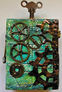
No, this is NOT a post about diet gone wrong.  It's about a chunky ATC.  If you don't know what that is, it's an ATC made of wood, and it is very dimensional and has not one, but SIX sides to decorate.  The "face" is the standard ATC size of 2 1/2" x 3 1/2", and the depth is 1 1/2", so there are many opportunities to embellish to your heart's content.

I completed mine a while back for a swap in my Kindred Souls group,  and just found out that I'm to send it to my great friend Elena, which is a relief, because the theme I chose, steampunk, is one I know she'll like.  So, Elena, you know the drill....if you'd like to be surprised, look no further!


I began by embossing two of Ranger's foil tape sheets with Tim's industrial look folders: diamond plate and riveted metal.  What's great about the tape is that it has a strong adhesive backing, so adhering it to the wood was easy.  Then I went crazy with the Ranger/Vintaj patinas I have come to love so much.  And then.....the real fun began.....finding just the right steampunkish elements to add to the piece.


Some gears and sprockets from Tim's idea-ology collection, including the newish mini gears, which I just love.  The focal image is from a stamp in his steampunk set.  I cut it and inserted it into whatever that doodad is (a 7 Gypsies doodad), filled the top with glossy accents, and surrounded it with some copper colored ball chain.  On the bottom, also cut from the foil sheet, a bit from Tim's washer border decorative strip.  The sentiment is also Tim...one of the word bands all patinaed (word???) up.

Here's a closer look of the main image:


On the flip side:


More gears, some from 7 Gypsies, and one I'm not sure of.  On the right edge, I used Tim's steampunk on the edge die to cut some real copper sheeting that my darling brother found and presented to me recently.  It's important to train all your non crafty friends and relatives so they know just what sort of junk will make your heart go pitter patter.  When I saw all the copper he'd found I definitely was on the verge of needing CPR.  It too, was altered a bit with the patinas.

Now, for the "sides" of the ATC:


The fellow with the camera is a Wendy Vecchi stamp, colored with distress markers, and enhanced with some glossy accents and a black glaze pen.  Behind him, some more of that washer border, and on top of that, a tiny lightbulb from my stash.  Here is a closer look of how I attached the bulb....wire and tiny copper nails (also courtesy of my bro).  Those nails appear all over this ATC!


Next side:


This side has a strip of metal, attached with more of those copper nails, and over top a piece of idea-ology with some scrap chain attached.

The top:


If you're wondering how I attached the watch key (so it would stay attached), this is what I did.  I first screwed it into the round piece of metal and then attached that metal to the top with a combination of strong glue and more copper nails.  I added the copper ball chain to finish it off.

No photo of the bottom.  Except for the metal it remains unadorned so that the piece will stand up nicely.  But I'm thinking of adding some little feet, if I can find just the right items to use for that purpose.

If you'd like to try your hand at a chunky ATC, all you need is a two by four from the lumber yard.  For some reason unknown to me (maybe it's a guy thing), the actual measurement of a two by four is
1 1/2 by 3 1/2".  So, all you need to do is make cuts on it every 2 1/2" and you have the exact right measurements for a chunky ATC!  Pretty cool, huh?


Tuesday, November 8, 2011

Grungy Monday Christmas Card

I always enjoy the Grungy Monday challenges, but this week even more so.  The inspiration for it comes from one of Tim's 2007 12 Tags of Christmas.  And, since I got onboard the 12 Tags train in 2008, this was a new one for me.  Please click HERE to get all the deets straight from the expert's blog.

Now, as I've mentioned, my intent is to use any challenges I enter to create some holiday cards.  Not wanting to seem like a copycat or anything, my first attempt used a snowman rather than the Santa that Tim used as the focal image.  I really don't love it.  At all.  But will share it so you can see where things can go so very wrong.


I probably should have used black ink on the snowman stamp.  There just wasn't enough contrast between the snowman and the background, which is what lead to my outlining the snowman with my black glaze pen.  Now it looks like the snowman was pasted onto the background instead of being the result of some wonderful technique.  The paint resist snowflakes came out nicely, however.

So, I went back to the Santa idea, and used a wonderful vintagey La Blanche stamp that I picked up recently at one of those deal of the day sites.

I'm much happier with this one.  The snowflakes and script are both Tim stamps; the sentiment is an old Stampin' Up stamp (done with black embossing powder).

I enhanced Santa's hat with fired brick and forest moss distress stickles, his face with rock candy distress stickles, and added some little pine cones and berries. 

By the way, I'm taking Jennifer McGuire's Holiday Card Boot Camp and if you need a little jump start to your holiday cards, I totally recommend it.  Although it already began, registration is open, and once you sign up you will have access to the class FOREVER (and you can download the files and videos if you like). 


Monday, September 12, 2011

Steampunk, Wendified

I can picture anyone new to this blog going, "huh?"  Well, in my world, Wendifying a theme just means using Wendy Vecchi's stamps to execute it.  It took me almost a week to create something for the current Making Art! challenge at EWV, but as it turns out, the delay worked in my favor, because the piece I did works perfectly with the new Simon Says Stamp and Show challenge.

The challenges:  at EWV, Lori says, make a tag and use stamps from no more than two of Wendy's sets; and Simon Says, show us some steampunk.

And here is my piece:


For the background, I ran one of Ranger's new (and fabulous) kraft tags through my Vagabond in Tim's steampunk embossing folder, and hit the high points with several distress inks....rusty hinge, vintage photo, and black soot.

The gears on the side were cut with Tim's on-the-edge die from grungepaper.  I painted it black, and when that was dry I dabbed it with brown and copper acrylic paint, very randomly so it looked like bits of rust.  And when that was dry, I covered the whole thing with a thick coat of rock candy crackle paint.  It is attached to the tag with glossy accents, applied only to the edge, so the gears sort of stand away from the tag and have a lot of dimension. (Especially since impatiently blasting the poor sucker with my heat gun made it kind of wonky.....sort of adds to the vintage charm, I think.  Well, that's my story and I'm stickin' to it.)

The steampunkish man and the words are all from Wendy's set Seriously Art, stamped on plain old white cardstock with black archival ink, then lightly colored with distress inks.  Mr. Serious got some enhancement (the shiny parts) with a black Sakura glaze pen....one of my most favorite art supplies, by the way.

The pointing hand (stamped on grungepaper with clear ink and embossed with black powder) is from another Wendy set, Mail Art.

By the way, the word seriously is actually part of the stamp of the man.....it appears right below the image.  I cut it off so it would fit on the brim of his hat instead.  It's always good to find variations when it comes to using your stamps.