Friday, June 29, 2012

Asian Art Journal Pages

One of my favorite collaborative journal projects is the one with the asian theme.  Everyone went all out in this group, creating their own books, and using some lovely and interesting bindings.  Last week I received journals made by my two local friends, Pat and Teri, and spent this week working on them.  They are both on the small side, easily held in one hand, and the pages done before me are, as usual, a combination of elegant, whimsical, classical and eclectic styles.  Pat receives journals from me, so when I hand these two to her next week, she will be seeing her journal for the first time in nearly a year.  And when Pat finishes Teri's book, that one will be going home as well.  My own book came home a couple of weeks ago, and that was a thrill.

Here are my pages for Teri's book.


I did the floral watercolor on the second page, and then selected some stamps that I thought complemented it for the facing page.  They were embossed with black powder.  The backgrounds for both pages were just me playing with sprays, stencils, pages of Japanese text, gesso, and probably a dozen other things I can't recall.  I was just grabbing whatever was on my table.  Many of us have added a haiku to our pages.

Pat's pages are quite a bit different, very shiny and bright.  I made a lot of use of my joss paper, which is where all the gold comes from.


The image of the woman is kind of a hybrid.  It started out as a xyrene transfer, which I heard about on the asian group message board.  Taking care to work in a well ventilated room, you lay a toner copy face down onto your surface and then rub the back with a xyrene filled blender pen (the kind used for blending alcohol based markers like Copics or Prismacolors).  As it turned out, I had one (never used) in my stash. 

Because I was trying to apply the image to a very textured surface, only parts of it actually transfered well.  Hence the word hybrid.  I used a Sharpie to fill in some of the missing lines.

There is also a bit of stamping, and I added the beaded edge as well.

I know there are several books in this group that I have not yet worked on, so I have something to look forward to.  Love these journals!

Tuesday, June 26, 2012

Filling In The Blanks

Sorry 'bout that; sometimes the clever titles come easily, sometimes you just gotta push it.  So, today's post is all about Vintaj brass blanks.  They are pieces of brass, different sizes, different shapes, different finishes, just waiting to be altered in some way.  The metal is thick enough to be sturdy, but thin enough to take embossing and hole punching (if you have a cropodile or japanese screw punch).  Well, I'm pretty sure you could also bang a hole in them with hammer and nail, though I haven't tried that.  According to the Vintaj website, the blanks can also be cut with metal shears and filed.  For more information and a look at the whole line, click on the link above.

Vintaj recently partnered up with Sizzix to manufacture little embossing folders (they look very much like the Sizzlits; more on that later).  What is unique about them, is that they have different designs on each folder, so you get several different looks from each one.  

Vintaj also got together with Ranger, and now there are MANY bottles of patina to choose from, should you want to totally alter the look of the metal.  And a sealer too, to make your colors permanent.

I've had some of the blanks, two embossing folders, and a handful of patinas for quite some time, and this past weekend I finally got around to experimenting with them.  First I made these dangly earrings.


Too much glare to really make out the design, but I used the folder with the leaves and ferns and isolted the area I wanted on my blanks.  Then I used my japanese screw punch to make an extra hole in the circles so that the little rectangles could be attached.  As for the patina....well, there are many layers and I used lots of colors.  You can apply one color at a time with a paintbrush, or several (the way you would alcohol inks), which I did, dabbing them onto the metal with a foam sponge.  The predominant color though, is verdigris. 

I wanted to see if I could use my Sizzlits, as I have a few of those.  The answer, yes and no.  I tried.  I got an impression, but I won't be doing it again.  The Sizzlit seems a tiny bit bent and the blank is also a little less than flat.  I just have a feeling that using one again and again with the metal will end in disaster.  Also, the Sizzlits aren't designed the same way; most are just one larger image or scattered smaller ones, and don't work well with the sizes of the blanks.  I have one of a dotted heart, and when I used it on the necklace I made (next photo) only the dots showed up.  The overall heart was too large, and the round blank I used just nestled inside it.  Not a problem; I like the dots, but that is just an example of the design differences between these two (at first glance identical) Sizzix products.


For this one, I punched three extra holes on the bottom to attach the charms and the key.  All were colored with verdigris, moss, jade, and onyx (that would be black) patinas, with just a touch of ochre.  Easy peasy, and a great way to unify metals that you might not normally put together.  And it's a totally different look than what you get with alcohol inks, so I consider these products to be a good addition to my (ever growing) stash.


Saturday, June 23, 2012

A Little of This and That

Just a few random things I've been busy with lately.  A few days ago, on the hottest day of the year (I don't know if it actually hit 100, but if not, it came close) Teri, Pat, and I ventured out to Wave Hill, a spectacular public garden very close to where I live.  Teri, who'd never been there, summed it up perfectly:  it's like a trip to one of the gardens in Europe without having to get on a plane.  We found some shade and spent a couple of hours sketching.  I was anxious to share with them one of the warm up exercises I used to do when I took drawing classes at the garden many years ago.  We did drawings of each other with two unusual rules:  you can't look at your paper, only at the person you're sketching, and your pen (yes, we used Sharpies) must not be lifted from the page.  So, as you can imagine, you wind up with lots of lines and very Picassoesque drawings.  Later, at home, I filled the many shapes with color, and I just love how these crazy pictures look.


And in case you were wondering, this is how my lovely friends actually looked that day.


Here's a watercolor I did after mangling those faces.


And here is only one of many reasons I think Wave Hill is one of the most beautiful places I've seen.


I signed up for an altered cigar box swap at the Kindred Souls group, and was paired up with Neil from England.  I really admire his work and wanted to do something special for him.  It's always a bit of an extra challenge to make something for a man, but I think I did OK.  No full reveals yet; I would like it to be a surprise, but here is a tiny little piece of it.


The other thing I've been busy with is Joanne Sharpe's online lettering class, Letter Love.  She actually launched it in February, and many of my friends have taken it, but I'm a little late to the party.  I am loving it, by the way.  I already decorated my composition book (which we use for practice), created my inspiration sign, and have been working on lessons each day.  It may be slight right now, but I do see improvement in my lettering.  I will be continuing with this class for sure.  Luckily, once you register you have lifetime access.


Now, for some exciting news.  My friend Michele has a wonderful studio in a great location (the upper west side of Manhattan), and she has started to reach out to some of the best mixed media artists to teach classes there.  So far, she has confirmed dates for Ingrid Dijkers and Dawn DeVries Sokol. The venue is a great space, the location convenient, and the class fees reasonable.  Space is limited, so if you live in the tri state area, check out Michele's Meetup site for all the details.  Ingrid is teaching three different all day classes in late August, and Dawn is teaching two different classes in mid November.  I'd love to see you there!  I was fortunate enough to take a class with Ingrid at the 2011 Keys4Art retreat, and both the class and the teacher were fantastic.

More excitement......recently Michael DeMeng started a FB group called Art Abandonment, and within days it has grown to over 2,000 3,500 members, including moi.  (Wow! Another 1,500 members since the last time I checked).  The idea is to leave some of your art in random places for complete strangers to find.  Some people like to do it anonymously, some include a little card explaining the concept, and some also add an email address so that whoever finds the art can (if they choose) let the artist know all about it.  It's actually more fun than it probably sounds, and I abandoned my first piece in the ladies room at Wave Hill.  When I checked back an hour later it was gone, so either the cleaning staff tossed it or it was found and taken by someone.  Restaurant bathrooms seem to be a popular place to leave art, but some folks have abandoned theirs on park benches, tucked into bushes, and one even tied hers to a tree.  I am not a big FB person, but I love to check back there to see what others are doing.  Wanna join us?

Tuesday, June 19, 2012

Art Journal Marathon

You know that expression, "when you're hot you're hot.....," well nowhere does that apply more than in what we do in the mixed media world.  Sometimes you stare at blank paper for hours without a bit of inspiration, and sometimes you just can't stop creating.

When I sat down at my work space Saturday afternoon my intention was to work on one of the three asian themed collaborative journals I had in my to-do pile (along with other stuff).  Saturday rolled into Sunday into Monday, and I had finished all three, plus one Artistic Evolution journal as well.  When the muse is so willing, the body just better cooperate.

First up, the pages I did for Sox.


Golden fluid acrylics and Dylusions sprays on text for the background, then lots of stenciling and some stamping.  The fish are from Wendy Vecchi's Art For Men set, and were stamped with black archival ink and colored with distress markers.

The next two pages are for Val's journal.


Some paper collage and stencils over text for the background.  The female figure on the left is a stamp, colored with a variety of things, not all of which I remember.  I know I used watercolors and distress markers.  I also did some stenciling on top of the clothing.

The male figure on the right was cut from a Japanese catalog my pal Kyoko gave me on the last Tim cruise.  I've been using it lots in these journals as it is a treasure trove of beautiful images.  The little pocket sewn onto the page is actually fabric, and it was part of a gift from Naomi, another cruise pal, this one given to me on the New England Tim cruise.  I love being able to incorporate things I've received from one friend in something for another friend.  It just feels good.

Sue's book was created with signatures of four pages.  We were only obliged to work in the center two, but if we wanted, we could do something on the first and last pages of the signature as well.  Sue said she has plenty of beautiful paper to fill in the blank pages, so no worries.  As I was definitely on a roll, I did all four pages.  The first was a no brainer.  Ever since I did this tag I knew it would find its way into someone's asian journal.  All I did for the background was spray some color on a page of text, then stamp the grass with pigment ink and add some embossing powder.


This is the two page spread followed by each page individually.


The stones were created by scraping gesso through a stencil.  When dry they were inked with a variety of brown, gray, and black.  The seated woman is a stamp.  The bamboo was done with a cuttlebug embossing folder, colored with distress inks and carefully cut out.  Other stamping (the foliage) was heat embossed.

The last page in the signature was done with another embossing folder.  On this one I applied broken china ink directly to the folder before running it through my machine to create the water.  The koi were colored with distress markers.  The piece was matted on a piece of decorative paper.


The last journal I worked in was Sue's Artistic Evolution journal.  Her colors are the colors of Provence, green, amber and purple.    I was thinking of fields of flowers, and did a lot of stamping, added texture by applying fiber paste through stencils, sprayed, doodled, and created some flowers with bits of canvas.  The decorative edge on the right was done with Tim's tissue paper,which I first inked with dusty concord and chipped sapphire.


It's good I'm finished, because I just heard that two more asian journals are heading my way!


Saturday, June 16, 2012

I'm Going In Circles!

Not in my life so much, but in my art for sure.  Circle stamps, circle stencils, circle punches....I'm circle crazy, I tell you.  And this all manifested itself in the pages I did in my friend Marita's Artistic Evolution journal.  That's the one where the pages are different widths and we have to evolve our pages from the ones that came before.  I'd refer you to a link on my blog, but I haven't fixed all my back posts yet, and all you'll see are those dreadful ugly icons instead of photos.  Some day.....

Anyway, the pages that came before mine were playful and full of stylized flowers, but all I saw were the circles.  Here is my two page spread, followed by the individual pages.


Using Marita's color scheme of purple, burnt orange and cream, I sprayed, I inked, I stenciled.  I added light modeling paste through one of the stencils, I added some purple netting in spots, punched circles from scraps, even used some circular rub ons.  Then I went for the circle stamps, and used black archival ink with those.  The last thing I did was add some of those little people stencils, because I just love the way they look "standing" on circles.  Oh, and I did a little bit of writing with one of my new favorite toys, the parallel pen.  That is calligraphy pen that uses india ink cartridges, and it can make anyone's handwriting look good.

Because of the varying widths of the pages, we have the opportunity to add edging that often can be seen from behind other pages or with the edges of other pages behind them.  So we really have to think about how the edges look coming and going.  Here's what I did:


I used metal rimmed paper labels, cut them in half, colored them, embossed them and punched tiny holes in them. 

I have another AE journal in the wings, along with three asian journals I received yesterday.  You know what I'll be doing tomorrow!


Wednesday, June 13, 2012

Layers Without Lumps

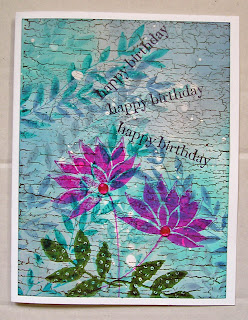
I love texture and layers and layers of embellishments as much as the next person, but sometimes (like when I want to send a birthday card without the extra cost of a padded envelope and additional postage) flat works best.  But it should only be flat, not look flat.

Just the other day I bought some masking fluid.  I know I made that purchase for a particular reason, but for the life of me can't remember exactly what the project was or where I saw it.  Sigh, story of my life.  Anyway, the universe decided to be nice to me today, and Splitcoast Stampers has a new tutorial on layering with masking fluid.  Bingo!  Rather than me trying to explain the technique, click on the link above and see for yourself.  It really is an easy way to create a richly layered look without adding a whole lot of bulk.

I was in the middle of working on a birthday card using this technique when I decided to take a break and check my email.  And once again, the universe was kind to me.  I'd been using rather bright colors on my card, and there, in my inbox, was a note from Lori, list mom of Everything Wendy Vecchi, announcing the new challenge......create something, use Wendy's stamps, and bright colors.  Bingo again.

Here's what my background looked like, after following the tutorial directions.


Except for the old wood background (a Stampin' Up stamp, stamped with coffee archival ink) all the stamping up to this point was done with one Wendy stamp (the leafy border stamp from It's Face Art) and several distress ink colors (broken china, faded jeans, peacock feathers and weathered wood).

Next step, some additional stamping.


The flower is from Wendy's Botanical Art set (I just stamped the flower, eliminating the leaves) stamped with magenta hue archival ink.  I decided to add leaves from another set (Nature's Art), and used olive archival ink.

Last step, adding the birthday wishes and just a tiny bit of bling.  Couldn't resist, but the sparklies don't add any real bulk, so I still consider this to be a flat piece.  That's my story, and I'm sticking to it.


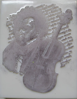
I recently received an order from one of the very best stores in the world, Absolutely Everything.  Patti, who fills all the orders always includes some extras, and not any cheapo ones either.  In that order I received this wonderful LaBlanche stamp:


These stamps are like no others.  They aren't rubber or acrylic, but are made of silicone.  They are definitely odd looking, but they stamp like a dream.  Here's what the stamping side looks like.


I used this stamp to make a birthday card for a musician friend.  All I had to do was add a bit of color, which I did with distress inks and markers.  Again, not a bit of bulk, but the stamp is so detailed and beautiful I think it doesn't really need any extra embellishing.


In addition to these two cards today I did something I've been wanting to do for some time.  I removed my large Stampin' Up background stamps from their wood mounts.  They were just taking up too much space.  I definitely feel I've accomplished a lot, so it is time to reward myself with some time on the couch and a few NCIS reruns.  What can I tell you?  Love me some Mark Harmon.

Monday, June 11, 2012

Artist's Choice

I'm in a small online group for sharing art, sometimes trading, and just hanging out with like minded people.  Membership is by invitation only, and not to sound snobbish, the point was to gather together some folks who have a good track record for quality work and responsible swapping.  Since we're not affiliated with any person, product, or store we're free to create whatever we want without constraints.  All we've agreed to is to always do our best work.

After a couple of weeks of getting to know one another, we've embarked on our first swap, and made it a simple one.  A tag.  Any theme.  Anything goes.  Artist's choice.  Works for me!

I actually completed my tag long before I knew who I'd be sending it to.  As it turns out, I'm mailing it to one of my cruise pals, Stephanie.  So, Steph, if you need to be surprised, stop now and go away!

I feel like this tag is a good example of my true style.  A little bit of grunge, a little bit of steampunk, a little bit of humor,  and a whole lot of texture and layering.


The background was done with lots of sprays, inks, paints, and stencils.  I'm not sure if it shows up in the photos, but I applied some light modeling paste through the harlequin stencil to raise it up and add some texture.

Hanging out around the clock, (Tim Holtz's weathered clock die) some stenciled people.


Does that little guy hanging onto the clock for dear life look familiar?


Well, he started out in life as a Wendy Vecchi stamp (from the gentlemen art set), about 4" high.  He was just what I wanted, but obviously way too big.  I stamped him, scanned the image and reduced it in size.  He was cut out, then completely covered with black ink, followed by a coat of glossy accents. 

Instead of using the usual clock hands I used two old keys, a rusty washer and a beat up brad.

And, since this week's Simon Says Stamp and Show challenge is 'anything goes,' I guess I have another twofer.


Sunday, June 10, 2012

A New Challenge and A Sentimental Piece

Keeping my fingers crossed that google/blogger is finished messing with my photos.  I knew I enjoyed having a blog, but I had no idea how much it meant to me until I discovered all my photos gone and replaced with those hideous icons.  But enough about me and my technology woes.  This post is about a piece that means a lot to me.

Linda Ledbetter, the lovely lady behind the Compendium of Curiosities challenges directed us to page 35 of Tim's second book, and the pocket watch technique.  We did a pocket watch pendant on the last cruise, and I even taught a class on it last year.  I had several extra watches, and an idea I've had for some time.  After my mom moved back north to be closer to us, my brother and I went to her Florida condo to clear it out of personal stuff and ready it for rental or sale.  I wound up with lots and lots of photos and other memorabilia.  I've wanted to do a shrine project for the longest time, and with Father's Day approaching, decided to make my dad the focus.  He's been gone for going on 19 years, but hardly a day goes by that I'm not reminded of him by something I see or hear.


The shrine was created using pieces from two of Wendy Vecchi's art parts packs, artful shrines and scallop trim.  The pieces were colored with walnut stain distress stain, then covered with rock candy crackle paint.  Except for the scallop trim, which is barely visible.  That was covered with irregular dabs of old paper crackle paint. It's the second shelf that the hankerchief and belt buckle are resting on.  For the background I chose the vintage subway sign paper from one of Tim's paper stacks.  It has Brooklyn subway stops, and since my family is from Brooklyn I thought it appropriate. 


Inside the watch is a photo of my dad as a very happy 20-something.  In fact, the picture was taken on the Atlantic City boardwalk by my mom.  They were on their honeymoon, and the year was 1946. The ring inside is my dad's wedding ring.  Because the word 'memories' was raised up with foam, the ring is kind of trapped there and won't wander around the watch.  It's not glued down or altered in any way, and can easily be removed if I ever want to do that.  Beneath the watch is one of my dad's handkerchiefs.  I added the little car (a mini movers and shakers die) because I have fond memories of our early family cars.  The first I can recall was a Studebaker.  Am I dating myself or what?


Peeking behind the handkerchief is an Israeli coin.  I included it because that was a trip my parents very much enjoyed, and was probably the last big vacation they went on before my dad got too sick to stray very far from home.  The belt buckle with his initials was attached with a bit of wire, so it too was in no way damaged or altered.  The little NYS license plate is actually just paper, again from one of Tim's paper stacks.  It was covered with a bit of glossy accents and four tiny brads were added to look like the screws that attach plates to cars.

I attached Tim's easel die cut to the back so the piece would stand, but I was worried that because of the heaviness of some of the embellishements that it might tip over.  I thought about what I could add to the bottom of the easel to give it more stability, and came up with what I think is a pretty clever solution.


Can you guess what those two discs are?  Super strong (and weighty) magnets!  Their attraction to each other keeps them in place, and they really do a great job of preventing any toppling.  By the way, I cut the easel from very thick cardboard, reinforced all the folds with tape, then covered it all with gesso and then stain.  It was attached to the shrine with very strong adhesive, so I'm pretty confident about its durability.

If you're inclined to participate in this challenge, an extra bonus (besides just creating something) is that Simon Says Stamp will be given away a $25 gift certificate to a randomly chosen entrant.

Happy Father's Day, dad.  I miss you!